jQuery Plugin To Scale Web Content Based On Specific Width - Smartzoom
| File Size: | 9.02 KB |
|---|---|
| Views Total: | 913 |
| Last Update: | |
| Publish Date: | |
| Official Website: | Go to website |
| License: | MIT |
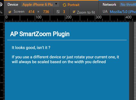
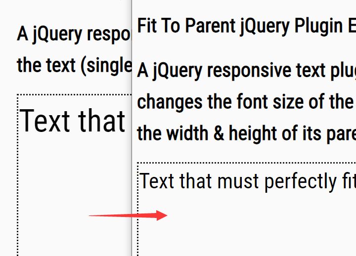
Smartzoom is a tiny jQuery plugin that automatically scales the web content based on the screen width you defined. Great for responsive and cross-platform webpage for better readability in mobile view.
Basic usage:
1. Add the following <meta> viewport element in all your web pages.
<meta name="viewport" content="width=device-width,initial-scale=1.0,maximum-scale=1.0,user-scalable=no">
2. Set the base font size for your web content.
body {
  font-size: 100%;
}

h1 {
  font-size: 3em;
}

p {
  font-size: 2em;
}
3. Add the jQuery Smartzoom plugin after you've added jQuery JavaScript library.
<script src="//code.jquery.com/jquery-1.12.0.min.js"></script>
<script src="jquery.ap-smartzoom.min.js"></script>
4. Define the breakpoint to trigger the plugin and set the font size you want to use.
ap.smartzoom.initialize({

  // 100%
  fontSize: 100,

  // 640px
  width:    640

});
Change log:
2016-02-17
- Fixing Android
This awesome jQuery plugin is developed by allianceport. For more Advanced Usages, please check the demo page or visit the official website.