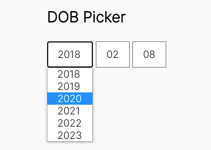
Fully Configurable jQuery Date Picker Plugin For Bootstrap
| File Size: | 752 KB |
|---|---|
| Views Total: | 36170 |
| Last Update: | |
| Publish Date: | |
| Official Website: | Go to website |
| License: | MIT |
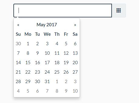
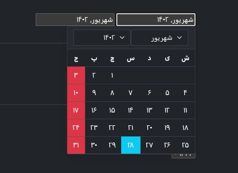
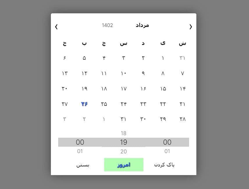
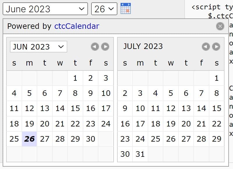
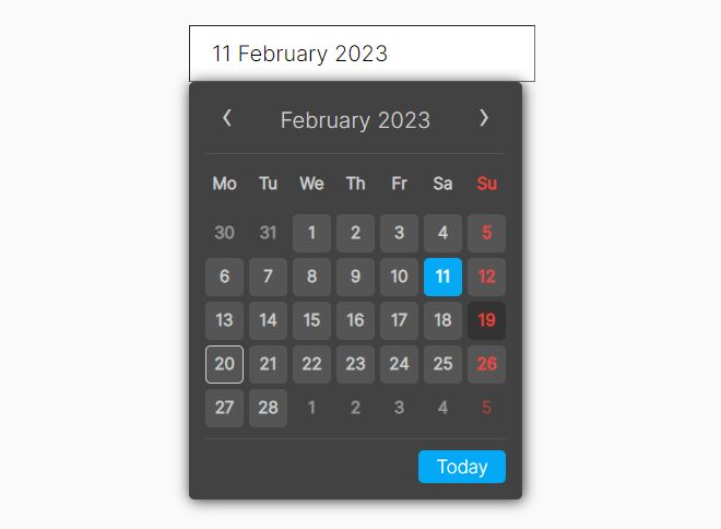
Yet another jQuery/Bootstrap date picker plugin that lets you create multi-language, highly customizable date picker, date range picker, inline calendar for your Bootstrap 5/4/3 powered web project.
Installation:
# Yarn
yarn add bootstrap-datepicker

# NPM
$ npm install bootstrap-datepicker

# Bower
$ bower install bootstrap-datepicker
View more:
How to use it:
1. Load the Bootstrap and Bootstrap Datepicker's style sheets in your html file.
<!-- Bootstrap Stylesheet -->
<link rel="stylesheet" href="/path/to/cdn/bootstrap.min.css">

<!-- For Bootstrap 5/4 -->
<link rel="stylesheet" href="/dist/css/bootstrap-datepicker.min.css" />

<!-- For Bootstrap 3-->
<link rel="stylesheet" href="/dist/css/bootstrap-datepicker3.min.css" />
2. Load jQuery library and other required JS files at the end of the document.
<script src="/path/to/cdn/jquery.min.js"></script>
<script src="/path/to/cdn/bootstrap.bundle.min.js"></script>
<script src="/path/to/dist/js/bootstrap-datepicker.min.js"></script>
3. Load an i18n file of your choice after jQuery.
<script src="/path/to/dist/locales/bootstrap-datepicker.de.min.js"></script>
4. Append the date picker to an input field.
<input type="text" class="form-control">
$('input').datepicker({
  // options here
});
5. Create an inline calendar on the webpage.
<div class="demo"></div>
$('.demo').datepicker({
  // options here
});
6. Create a date range picker as this:
<div class="input-daterange input-group" id="datepicker">
  <input type="text" class="input-sm form-control" name="start">
  <span class="input-group-addon">to</span>
  <input type="text" class="input-sm form-control" name="end">
</div>
$('.input-daterange').datepicker({
  // options here
});
7. Config the date picker as per your needs.
$('input').datepicker({

  // If true, manually-entered dates with two-digit years, such as “5/1/15”, will be parsed as “2015”, not “15”.
  // If the year is less than 10 years in advance, the picker will use the current century, otherwise, it will use the previous one.
  // For example “5/1/15” would parse to May 1st, 2015, but “5/1/97” would be May 1st, 1997.
  assumeNearbyYear: false,

  // Auto close the datepicker immediately when a date is selected
  autoclose: false,

  // Callback functions
  beforeShowDay: $.noop,
  beforeShowMonth: $.noop,
  beforeShowYear: $.noop,
  beforeShowDecade: $.noop,
  beforeShowCentury: $.noop,

  // Show week numbers to the left of week rows
  calendarWeeks: false,

  // Show a “Clear” button at the bottom of the datepicker to clear the input value
  clearBtn: false,

  // Selecting the currently active date in the datepicker will unset the respective date
  toggleActive: false,

  // Days of the week that should be disabled
  daysOfWeekDisabled: [],

  // Days of the week that should be highlighted
  daysOfWeekHighlighted: [],

  // Array of date strings or a single date string formatted in the given date format
  datesDisabled: [],

  // The latest date that may be selected; all later dates will be disabled
  endDate: Infinity,

  // Force parsing of the input value when the picker is closed
  forceParse: true,

  // Date format
  format: 'mm/dd/yyyy',

  // Only effective in a range picker.
  // If true, the selected value does not get propagated to other, currently empty, pickers in the range.
  keepEmptyValues: false,

  // Enable keyboard navigation
  keyboardNavigation: true,

  // Default language
  language: 'en',

  // Set a minimum limit for the view mode.
  // Accepts: 0 or “days” or “month”, 1 or “months” or “year”, 2 or “years” or “decade”, 3 or “decades” or “century”, and 4 or “centuries” or “millenium”.
  // Gives the ability to pick only a month, a year or a decade.
  // The day is set to the 1st for “months”, and the month is set to January for “years”, the year is set to the first year from the decade for “decades”, and the year is set to the first from the millennium for “centuries”.
  minViewMode: 0,

  // Set a maximum limit for the view mode.
  // Accepts: 0 or “days” or “month”, 1 or “months” or “year”, 2 or “years” or “decade”, 3 or “decades” or “century”, and 4 or “centuries” or “millenium”.
  // Gives the ability to pick only a day, a month, a year or a decade.
  // The day is set to the 1st for “months”, the month is set to January for “years”, the year is set to the first year from the decade for “decades”, and the year is set to the first from the millennium for “centuries”.
  maxViewMode: 4,

  // Enable multidate picking.
  // Each date in month view acts as a toggle button, keeping track of which dates the user has selected in order.
  multidate: false,

  // The string that will appear between dates when generating the input’s value.
  multidateSeparator: ',',

  // A space-separated string consisting of one or two of “left” or “right”, “top” or “bottom”, and “auto” (may be omitted)
  orientation: "auto",

  // Enable RTL
  rtl: false,

  // The earliest date that may be selected; all earlier dates will be disabled.
  startDate: -Infinity,

  // The view that the datepicker should show when it is opened.
  // Accepts: 0 or “days” or “month”, 1 or “months” or “year”, 2 or “years” or “decade”, 3 or “decades” or “century”, and 4 or “centuries” or “millenium”.
  // Useful for date-of-birth datepickers.
  startView: 0,

  // If true or “linked”, displays a “Today” button at the bottom of the datepicker to select the current date.
  // If true, the “Today” button will only move the current date into view; if “linked”, the current date will also be selected.
  todayBtn: false,

  // Highlight the current date.
  todayHighlight: false,

  // If false viewDate is set according to value on initialization and updated * if a day in last oder next month is selected or * if dates are changed by setDate, setDates, setUTCDate and setUTCDates methods.
  // If multidate option is true the last selected date or the last date in array passed to setDates or setUTCDates is used.
  updateViewDate: true,

  // Day of the week start. 0 (Sunday) to 6 (Saturday)
  weekStart: 0,

  // If true, no keyboard will show on mobile devices
  disableTouchKeyboard: false,

  // If false the datepicker will not show on a readonly datepicker field
  enableOnReadonly: true,

  // If false, the datepicker will be prevented from showing when the input field associated with it receives focus.
  showOnFocus: true,

  // The CSS z-index of the open datepicker is the maximum z-index of the input and all of its DOM ancestors plus the zIndexOffset.
  zIndexOffset: 10,

  // Appends the date picker popup to a specific element; eg: container: ‘#picker-container’
  container: 'body',

  // If true, selecting a year or month in the datepicker will update the input value immediately.
  // Otherwise, only selecting a day of the month will update the input value immediately.
  immediateUpdates: false,

  // The string that will appear on top of the datepicker. If empty the title will be hidden.
  title: '',

  // The templates used to generate some parts of the picker.
  // Each property must be a string with only text, or valid html.
  // You can use this property to use custom icons libs.
  templates: {
    leftArrow: '«',
    rightArrow: '»'
  },

  // If false, the datepicker will not append the names of the weekdays to its view.
  showWeekDays: true

});
8. API methods.
// shows the date picker
$('input').datepicker('show');

// hides the date picker
$('input').datepicker('hide');

// Clear the dates
$('input').datepicker('clearDates');

// Destroys the date picker
$('input').datepicker('destroy');

// Updates the date picker
$('input').datepicker('update', DATE);

// Sets a new date
$('input').datepicker('setDate', DATE);

// Sets a new date
$('input').datepicker('setUTCDate', DATE);

// Sets an array of dates
$('input').datepicker('setDates', DATE);

// Sets an array of UTC dates
$('input').datepicker('setUTCDates', DATE);

// Returns a localized date object
$('input').datepicker('getDate');

// Returns the internal UTC date object
$('input').datepicker('getUTCDate');

// Returns a list of localized date objects
$('input').datepicker('getDates');

// Returns the internal list of UTC date objects
$('input').datepicker('getUTCDates');

// Returns the lower date limit on the datepicker
$('input').datepicker('getStartDate');

// Returns the upper date limit on the datepicker
$('input').datepicker('getEndDate');

// Sets a new lower date limit on the datepicker
$('input').datepicker('setStartDate', DATE);

// Sets a new upper date limit on the datepicker
$('input').datepicker('setEndDate', DATE);

// Sets the days that should be disabled.
$('input').datepicker('setDatesDisabled', DATE);

// Sets the days of week that should be disabled.
$('input').datepicker('setDaysOfWeekDisabled', DATE);

// Sets the days of week that should be highlighted
$('input').datepicker('setDaysOfWeekHighlighted', DATE);
9. Events.
$('input').datepicker()
  .on('show', function(e) {
     // when the date picker is displayed
  });
  .on('hide', function(e) {
     // when the date picker is hidden
  });
  .on('clearDate', function(e) {
     // when the date is cleared
  });
  .on('changeDate', function(e) {
     // when the date is changed
  });
  .on('changeYear', function(e) {
     // when the view year is changed from decade view
  });
  .on('changeMonth', function(e) {
     // when the view month is changed from year view
  })
Changelog:
v1.10.0 (2013-05-14)
- Bugfixes
v1.9.0 (2019-05-20)
- Added clearDates for clears range
- Hide today button when before start or after end date
- Fix navigation buttons states
- Fix updateNavArrows bug
- Fix locals
v1.8.0 (2018-11-07)
- startDate and endDate bug
v1.7.1 (2017-07-06)
- Revert "move jquery to peerDependencies from dependencies"
2017-06-18
- Adding dateCells option
- Added keepEmptyValues option
- added "changeViewMode" event; also adds the current viewMode to events
- adds updateViewDate option
- Added hiding week day names functionality
- Allow customizing day cell value
- Lots of bug fixed.
This awesome jQuery plugin is developed by uxsolutions. For more Advanced Usages, please check the demo page or visit the official website.