Mobile-friendly Drag'n'Drop Event Calendar Plugin - CalenStyle
| File Size: | 3.45 MB |
|---|---|
| Views Total: | 26815 |
| Last Update: | |
| Publish Date: | |
| Official Website: | Go to website |
| License: | MIT |
CalenStyle is a robust jQuery plugin used to create a responsive, dynamic, mobile-friendly, draggable event calendar for both web and mobile applications. You will find more examples (including mobile views) in the zip.
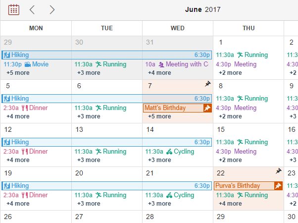
Calendar views available:
- "DetailedMonthView"
- "MonthView"
- "WeekView"
- "DayView"
- "AgendaView"
- "WeekPlannerView"
- "QuickAgendaView"
- "TaskPlannerView"
- "CustomView"
- "DayEventListView"
- "DayEventDetailView"
- "AppointmentView"
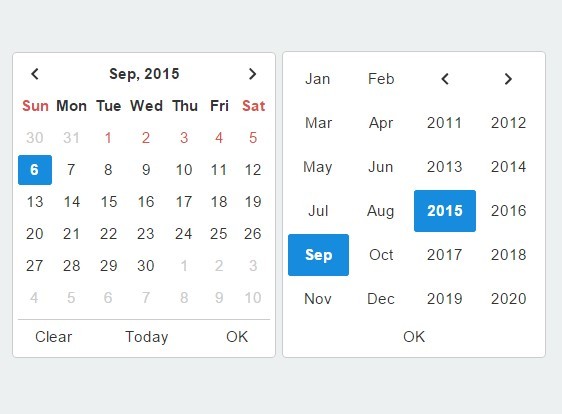
- "DatePicker"
Dependencies:
- jQuery(required; Javascript file)
- jQuery UI (required; You can use a Regular Build of jQuery UI or a Custom Build with Draggable, Droppable & Resizable Interactions and Tooltip Widget; Javascript and CSS files)
- Hammer.js (optional; Can be used to support swipe-based navigation on mobile or you can use any touch gestures library of your choice to fire navigation events; Javascript file)
- jQuery UI Touch Punch (required if you are using CalenStyle View which uses Drag-n-Drop and Resize functionality of jQuery UI for example "DetailedMonthView", "MonthView", "WeekView", "DayView", "CustomView" or "DayEventDetailView"; To enable Touch Event support for jQuery UI; Javascript file)
Installation:
# NPM
$ npm install CalenStyle

# Bower
$ bower install CalenStyle
Basic usage:
1. Load the necessary JavaScript and CSS files listed below into your document.
<!-- CSS -->
<link rel="stylesheet" href="/path/to/jquery-ui.min.css">
<link rel="stylesheet" href="/path/to/calenstyle.css">
<link rel="stylesheet" href="/path/to/calenstyle-jquery-ui-override.css">
<link rel="stylesheet"  href="/path/to/calenstyle-iconfont.css">

<!-- JavaScript -->
<script src="/path/to/jquery.min.js"></script>
<script src="/path/to/jquery-ui-custom.min.js"></script>
<script src="/path/to/calenstyle.js"></script>
2. To serve data to CalenStyle from URL, you can use sample DataServer provided in the CalenStyle folder. This Data Server is written in node.js. So you will have to follow steps mentioned below in order to make it work.
- Install node.js
- Change directory to path of DataServer
- Run command "npm install"
- Run command "npm start"
- Use following URL in CalenStyle Plugin Initialization code - http://localhost:3000 OR http://[IPv4 address of your machine]:3000
3. Create a container element for your event calendar.
<div class="myCalendar">
</div>
4. Initialize the plugin and pass the parameters as this:
$(".myCalendar").CalenStyle({
  // write settings parameters
});
5. This is a list of the plugin settings parameters. This list includes parameters, their default values, all possible values that you can set and describes how to use parameters.
$(".myCalendar").CalenStyle({
// the array of sections to add to the Calendar View
// "Header", "Calendar", "EventList", "FilterBar" and "ActionBar"
sectionsList: ["Header", "Calendar"],
// can be any language for which i18n strings are specified in "calenstyle-i18n.js". For example, "en", "de"
language: "",
// an array of Very Short Day Names from Sunday to Saturday
veryShortDayNames: ["Su", "Mo", "Tu", "We", "Th", "Fr", "Sa"],
// an array of Short Day Names from Sunday to Saturday
shortDayNames: ["Sun", "Mon", "Tue", "Wed", "Thu", "Fri", "Sat"],
// an array of Full Day Names from Sunday to Saturday
fullDayNames: ["Sunday", "Monday", "Tuesday", "Wednesday", "Thursday", "Friday", "Saturday"],
// an array of Short Month Names from January to December
shortMonthNames: ["Jan", "Feb", "Mar", "Apr", "May", "Jun", "Jul", "Aug", "Sep", "Oct", "Nov", "Dec"],
// an array of Full Month Names from January to December
fullMonthNames: ["January", "February", "March", "April", "May", "June", "July", "August", "September", "October", "November", "December"],
// an array numbers from 0 to 9 which will be used to display numeric values
numbers: ["0", "1", "2", "3", "4", "5", "6", "7", "8", "9"],
// content displayed on tooltip
eventTooltipContent: "Default",
// can be used to apply a custom datetime format.
// can be specified as an object with callback functions returning formatted datetime string named as format specifier.
formatDates: {},
// tooltip content for time slot in the AppointmentView
slotTooltipContent: function(oSlotAvailability)
{
if(oSlotAvailability.status === "Busy")
return "";
else if(oSlotAvailability.status === "Free")
{
if(oSlotAvailability.count === undefined || oSlotAvailability.count === null)
return "<div class=cavTooltipBookNow>Book Now</div>";
else
return "<div class=cavTooltipSlotCount>" + oSlotAvailability.count + " slots available</div><div class=cavTooltipBookNow>Book Now</div>";
}
},
// an object containing strings displayed on CalenStyle UI which can be customized
miscStrings:
{
today: "Today",
week: "Week",
allDay: "All Day",
ends: "Ends",
emptyEventTitle: "(No Title)",
emptyGoogleCalendarEventTitle: "Busy"
},
// To customize duration strings use duration as a callback function.
duration: "Default",
// Custom duration unit strings can be specified to replace default duration unit strings displayed on CalenStyle UI.
durationStrings:
{
y: ["year ", "years "],
M: ["month ", "months "],
w: ["w ", "w "],
d: ["d ", "d "],
h: ["h ", "h "],
m: ["m ", "m "],
s: ["s ", "s "]
},
// an array of views available to be displayed on the Calendar View
// a view specified in the array will be added as a menu item in the Header section
// a view specified as visibleView will be displayed first
// you can switch between Views by selecting menu item.
viewsToDisplay: [
{
viewName: "DetailedMonthView",
viewDisplayName: "Month"
},
{
viewName: "WeekView",
viewDisplayName: "Week"
},
{
viewName: "DayView",
viewDisplayName: "Day"
},
{
viewName: "AgendaView",
viewDisplayName: "Agenda"
}
],
// the Calendar View you want to display
// "DetailedMonthView", "MonthView", "WeekView", "DayView", "AgendaView", "WeekPlannerView", "QuickAgendaView", "TaskPlannerView", "CustomView", "DayEventListView", "DayEventDetailView", "AppointmentView", "DatePicker"
visibleView: "DetailedMonthView",
// the Date for which the Calendar View is rendered
selectedDate: new Date(),
// a set of components which can be added in Header Sections
headerComponents:
{
DatePickerIcon: "<span class='cContHeaderButton cContHeaderDatePickerIcon clickableLink cs-icon-Calendar'></span>",
FullscreenButton: function(bIsFullscreen)
{
var sIconClass = (bIsFullscreen) ? "cs-icon-Contract" : "cs-icon-Expand";
return "<span class='cContHeaderButton cContHeaderFullscreen clickableLink "+ sIconClass +"'></span>";
},
PreviousButton: "<span class='cContHeaderButton cContHeaderNavButton cContHeaderPrevButton clickableLink cs-icon-Prev'></span>",
NextButton: "<span class='cContHeaderButton cContHeaderNavButton cContHeaderNextButton clickableLink cs-icon-Next'></span>",
TodayButton: "<span class='cContHeaderButton cContHeaderToday clickableLink'></span>",
HeaderLabel: "<span class='cContHeaderLabelOuter'><span class='cContHeaderLabel'></span></span>",
HeaderLabelWithDropdownMenuArrow: "<span class='cContHeaderLabelOuter clickableLink'><span class='cContHeaderLabel'></span><span class='cContHeaderButton cContHeaderDropdownMenuArrow'></span></span>",
MenuSegmentedTab: "<span class='cContHeaderMenuSegmentedTab'></span>",
MenuDropdownIcon: "<span class='cContHeaderButton cContHeaderMenuButton clickableLink'>☰</span>"
},
// an array of components to include in each Header Section
// you can customize Header as per visual and functional requirements.
headerSectionsList:
{
left: ["DatePickerIcon", "PreviousButton", "NextButton"],
center: ["HeaderLabel"],
right: ["MenuSegmentedTab"]
},
// the Menu Items to display are specified in dropdownMenuElements
dropdownMenuElements: ["ViewsToDisplay"], // ["ViewsToDisplay", "DatePicker"]
// the CalenStyle object for which DatePicker is created
parentObject: null,
// the CalenStyle object of the DatePicker
datePickerObject: null,
// he DateTime Format Separator
formatSeparatorDateTime: " ",
// the Date Format Separator
formatSeparatorDate: "-",
// the Time Format Separator
formatSeparatorTime: ":",
// the time format in which the time is displayed inside the Calendar View
is24Hour: false,
// the DateTime Format specified in the Events
inputDateTimeFormat: "dd-MM-yyyy HH:mm:ss",
// indicates default event duration, which can be used to create end date of event for which end date is not supplied in the event source
eventDuration: 30, // In minutes
// indicates default event duration for all day event, which can be used to create end date of event for which end date is not supplied in the event source
allDayEventDuration: 1, // In days
// an interval after which Current Time Indicator position is auto updated to indicate Current Time
timeIndicatorUpdationInterval: 15,
// a value of a time slot(one row) in the Detail Views("WeekView", "DayView")
unitTimeInterval: 30, // [5, 10, 15, 20, 30]
// sets whether to display time labels (for example, 01:00) for Hour or time labels for Each Time Slot in the Detail Views("WeekView", "DayView")
timeLabels: "Hour", // ["Hour", "All"]
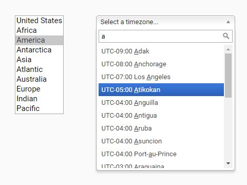
// the TZD string of timezone in which input dates from data sources is specified
inputTZOffset: "+05:30",
// used when you specify Google Calendar as a source, to send it as a Query Parameter
tz: "Asia/Calcutta", // For Google Calendar
// the TZD string of timezone in which input dates from data sources is specified
outputTZOffset: "+05:30", // +05:30
// start Day of the week
weekStartDay: 1,
// specifies Week Number Calculation Method - "US" or "Europe/ISO"
weekNumCalculation: "US", // ["US", "Europe/ISO"]
// a value of Number of Days To Display in DetailView
daysInCustomView: 4,
// a value of Days To Display in DayListView("DayEventListView", "DayEventDetailView")
daysInDayListView: 7,
// a value of Days To Display in AppointmentView
daysInAppointmentView: 4,
// the duration of AgendaView
agendaViewDuration: "Month", // ["Month", "Week", "CustomDays"]
// a value of days to display in the AgendaView if "agendaViewDuration: CustomDays"
daysInAgendaView: 15,
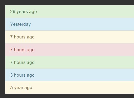
// theme of Agenda View
agendaViewTheme: "Timeline2", // ["Timeline1", "Timeline2", "Timeline3"]
// Set whether you want to show Days with no events in Agenda View.
// If you set it to true, "No Events" text is displayed below Date String.
showDaysWithNoEventsInAgendaView: false,
// Set whether you want to display a fixed height for each cell of "WeekPlannerView".
fixedHeightOfWeekPlannerViewCells: true,
// the duration of Quick Agenda View
quickAgendaViewDuration: "Week", // ["Week", "CustomDays"]
// a value of days to display in the Quick Agenda View if "quickAgendaViewDuration: CustomDays"
daysInQuickAgendaView: 5,
// the duration of Task Planner View
taskPlannerViewDuration: "Week", // ["Week", "CustomDays"]
// a value of days to display in the Task Planner View if "taskPlannerViewDuration: CustomDays"
daysInTaskPlannerView: 5,
// Set whether you want to display a fixed height for each cell of "TaskPlannerView".
fixedHeightOfTaskPlannerView: true,
// a value of View Transition Animation Speed in milliseconds
transitionSpeed: 600,
// perform view transition animations or simply replace a view
showTransition: false,
// If fixedNumberOfWeeksInMonthView is set to true, 6 weeks will be displayed in month views.
// Else, number of weeks for a selected month will be displayed.
fixedNumOfWeeksInMonthView: false,
// display Week Number in MonthView and DetailedMonthView
displayWeekNumInMonthView: false,
// defines action to perform on day click in MonthView
actionOnDayClickInMonthView: "ModifyEventList", // ["ModifyEventList", "ChangeDate", "DisplayEventListDialog"]
// used to set whether to add Events or Event Indicator Line or Custom Event View in the MonthView
eventIndicatorInMonthView: "Events", // ["DayHighlight", "Events", "Custom"]
// used to set the way to indicate the existence of Events for day
eventIndicatorInDatePicker: "DayNumberBold", // ["DayNumberBold", "Dot"]
// used to set whether to Event Indicator Line or Custom Event View in the DayListView
eventIndicatorInDayListView: "DayHighlight", // ["DayHighlight", "Custom"]
// width of the Day Highlighter Line is calculated as a percentage of averageEventsPerDayForDayHighlightView
averageEventsPerDayForDayHighlightView: 5,
// If set to true, height of all rows of DetailedMonthView is set equal and Events that fit into the Row are added.
// hiddenEventsIndicatorLabel is added in the days for which all events can not be added.
// hiddenEventsIndicatorAction will be taken on click of hiddenEventsIndicatorLabel.
// If set to false, height of each row in the DetailedMonthView will be increased to accommodate all events for the day.
hideExtraEvents: true,
// If hideExtraEvents is set to true, height of all rows of DetailedMonthView is set equal and Events that fit into the Row are added.
// hiddenEventsIndicatorLabel is added in the days for which all events can not be added.
// hiddenEventsIndicatorAction will be taken on click of hiddenEventsIndicatorLabel.
// You can set any string or html string as a hiddenEventsIndicatorLabel.
// If you want to show count of hidden events in the hiddenEventsIndicatorLabel you can use string "(count)".
hiddenEventsIndicatorLabel: "+(count) more",
// This is an action to be taken on click of hiddenEventsIndicatorLabel.
// With the default action, "ShowEventDialog", Event dialog listing all events will be displayed over a Month Day cell for which hiddenEventsIndicatorLabel is clicked.
// hiddenEventsIndicatorAction can also be used as a callback function with parameters (dDate, oArrEvents, bShow). Here, dDate is the date for which event is triggered, oArrEvents is the array of Events for dDate, bShow indicates whether callback is to show dialog/start action or hide dialog/end action.
hiddenEventsIndicatorAction: "ShowEventDialog",
// If set to false, events will not be displayed on the calendar even if calDataSource is specified.
addEventsInMonthView: true,
// If set to false, events will not be displayed on the calendar even if calDataSource is specified.
// But Event Dialog can be displayed. This View can be used where less space is available for displaying calendar.
displayEventsInMonthView: true,
// enable or disable Drag and Drop of Event in Month View.
isDragNDropInMonthView: true,
// show or hide Event Tooltip in Month View
isTooltipInMonthView: false,
// enable or disable Drag and Drop of Event in Detail View
isDragNDropInDetailView: true,
// enable or disable Resizing of Event in Detail View
isResizeInDetailView: true,
// show or hide Event Tooltip in Detail View
isTooltipInDetailView: false,
// enable or disable Drag and Drop of Event in Quick Agenda View
isDragNDropInQuickAgendaView: true,
// show or hide Event Tooltip in Quick Agenda View
isTooltipInQuickAgendaView: false,
// enable or disable Drag and Drop of Event in Task Planner View
isDragNDropInTaskPlannerView: true,
// show or hide Event Tooltip in Task Planner View
isTooltipInTaskPlannerView: false,
// show or hide tooltip in AppointmentView
isTooltipInAppointmentView: true,
// height Of Action Bar
actionBarHeight: 30,
// position of Filter Bar in the View
filterBarPosition: "Top", // ["Top", "Bottom", "Left", "Right"]
// height Of Filter Bar
filterBarHeight: 200,
// width Of Filter Bar
filterBarWidth: 200,
// an array used to set parameters of Filter to be applied on Events Array
eventFilterCriteria: [],
// an action to take when no filter criteria is selected by user
noneSelectedFilterAction: "SelectNone", //["SelectNone", "SelectAll"]
// If changeCalendarBorderColorInJS is set to true then, calendarBorderColor value will be set as a border-color of all calendar structure borders.
// Else, border-color specified in CSS will be rendered.
calendarBorderColor: "FFFFFF",
// If changeCalendarBorderColorInJS is set to true then, calendarBorderColor value will be set as a border-color of all calendar structure borders.
// Else, border-color specified in CSS will be rendered.
changeCalendarBorderColorInJS: false,
// a number of months for which data needs to be loaded
extraMonthsForDataLoading: 1,
// When extraMonthsForDataLoading is set to a value other than 0, data for specified number of extra months is loaded.
// If extraMonthsForDataLoading is set to 1 and Current Month is June(6), then data for May(6-1), June(6) and July(6+1) is loaded.
// If "Previous" button is clicked, then Current Month is May(5), Previous Month is April(5-1) and next Month is June(5+1). But data for May, June and July is already present so data for April is requested and the data for July is deleted.
// If you don't want to delete existing data while navigating then set deleteOldDataWhileNavigating to false.
// If you set datasetModificationRule as "ReplaceSpecified", then you need to set deleteOldDataWhileNavigating to false.
deleteOldDataWhileNavigating: true,
// ["Default", "ReplaceAll", "ReplaceSpecified"]
datasetModificationRule: "Default",
// ["Event", "EventCalendar", "EventSource"]
changeColorBasedOn: "EventCalendar",
// Default border-color of an event in case it is not specified in the Event, Event Source Array or Event Type Array.
// To get transparent borders, specify "transparent" or ""
borderColor: "",
// Default text-color of an event in case it is not specified in the eventSource, calDataSource or eventCalendarSource.
textColor: "FFFFFF",
// When onlyTextForNonAllDayEvents is set to true, Non All Day Event is displayed as a Text in nonAllDayEventsTextColor; else it is displayed same as All Day Event.
onlyTextForNonAllDayEvents: true,
// If Event Color is not specified in eventSource, calDataSource or eventCalendarSource, a Color from this array will be assigned to the Event.
// If all colors from this array are used up then, programmatically generated colors will be assigned.
eventColorsArray: ["C0392B", "D2527F", "674172", "4183D7", "336E7B", "36D7B7", "68C3A3", "E87E04", "6C7A89", "F9690E"],
// Default Event Indicator in case it event Icon is not specified in the eventSource, calDataSource or eventCalendarSource.
eventIcon: "Dot", // ["Dot", "cs-icon-Event"]
// Event Icon is displayed, if hideEventIcon is set to false for a particular view, otherwise it will not be displayed.
hideEventIcon: {
Default: false,
DetailedMonthView: false,
MonthView: false,
WeekView: false,
DayView: false,
CustomView: false,
QuickAgendaView: false,
TaskPlannerView: false,
DayEventDetailView: false,
AgendaView: false,
WeekPlannerView: false
},
// Event Time is displayed, if hideEventTime is set to false for a particular view, otherwise it will not be displayed.
hideEventTime: {
Default: false,
DetailedMonthView: false,
MonthView: false,
WeekView: false,
DayView: false,
CustomView: false,
QuickAgendaView: false,
TaskPlannerView: false,
DayEventDetailView: false,
AgendaView: false,
WeekPlannerView: false
},
// an array of business Hours for each Day of the Week
businessHoursSource: [
{
day: 1,
times: [{startTime: "10:00", endTime: "17:00"}]
},
{
day: 2,
times: [
{startTime: "09:00", endTime: "13:00"},
{startTime: "14:00", endTime: "18:00"}
]
},
{
day: 3,
times: [{startTime: "10:00", endTime: "17:00"}]
},
{
day: 4,
times: [
{startTime: "09:00", endTime: "13:00"},
{startTime: "14:00", endTime: "18:00"}
]
},
{
day: 5,
times: [{startTime: "10:00", endTime: "17:00"}]
},
{
day: 6,
times: [
{startTime: "09:00", endTime: "13:00"},
{startTime: "14:00", endTime: "18:00"}
]
}
],
// hide dates and times apart from business hours
excludeNonBusinessHours: false,
// allow events to be dropped on Non Business Hours
isNonBusinessHoursDroppable: true,
// allow events to be dropped on Restricted Section
isRestrictedSectionDroppable: true,
eventOrTaskStatusIndicators: [
{
name: "Overdue",
color: "E74C3C"
},
{
name: "Completed",
color: "27AE60"
},
{
name: "InProgress",
color: "F1C40F"
}
],
// JSON object set to source in calDataSource with sourceType as a JSON
calDataSource: [],
// used to define data source for DatePicker
datePickerCalDataSource: [
{
config:
{
sourceCountType: "Event"
}
}
],
// Set whether Calendar should be responsive to the Window Resize Event.
adjustViewOnWindowResize: true,
// Set whether Hammer.js should be used as a Touch Gesture Library. Default Gestures added will be "swiperight" for navigating to Previous View and "swipeleft" for navigating to Next View.
useHammerjsAsGestureLibrary: false,
});
6. Here is a list of callback functions that are triggered on reaching the specified condition.
{
  initialize: null,

  // Custom HeaderView Callbacks
  modifyHeaderViewLabels: null,
  addEventHandlersInHeader: null,

  // Data Loading Callbacks
  dataLoadingStart: null,
  dataLoadingEnd: null,

  // Calendar Navigation Callbacks
  cellClicked: null,
  viewLoaded: null,
  previousButtonClicked: null,
  nextButtonClicked: null,
  todayButtonClicked: null,
  visibleViewChanged: null,

  modifyCustomView: null,

  // Event List related Callbacks
  displayEventsForPeriodInList: null,
  displayEventsForPeriodInListInAgendaView: null,
  eventListAppended: null,

  // Event Dialog related Callbacks
  displayEventListDialog: null,
  eventInADialogClicked: null,

  // Events and Appointment Time Slots related Callbacks
  eventRendered: null,
  eventsAddedInView: null,
  timeSlotsAddedInView: null,
  eventClicked: null,
  timeSlotClicked: null,
  saveChangesOnEventDrop: null,
  saveChangesOnEventResize: null,

  modifyFilterBarView: null,
  modifyActionBarView: null,

  addDaySummaryInTaskPlannerView: null
}
This awesome jQuery plugin is developed by nehakadam. For more Advanced Usages, please check the demo page or visit the official website.