Multipurpose jQuery Date/Time/Range Picker Plugin - tinyDatePicker
| File Size: | 97.1 KB |
|---|---|
| Views Total: | 14256 |
| Last Update: | |
| Publish Date: | |
| Official Website: | Go to website |
| License: | MIT |
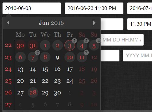
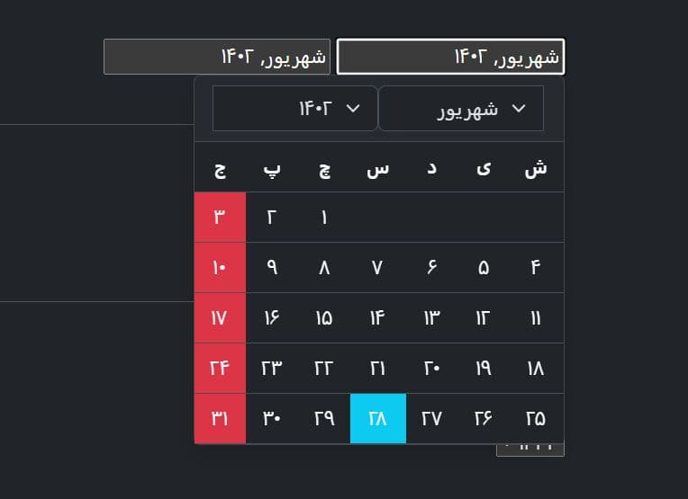
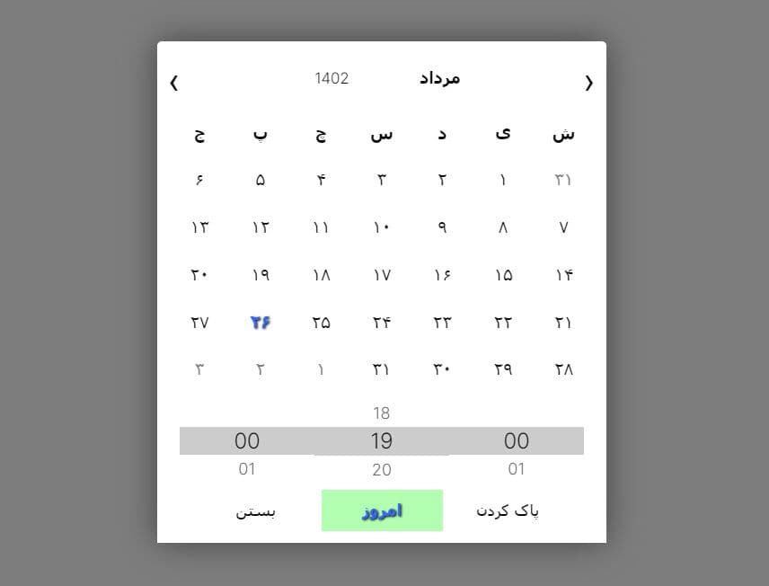
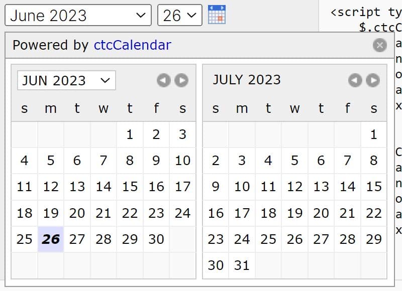
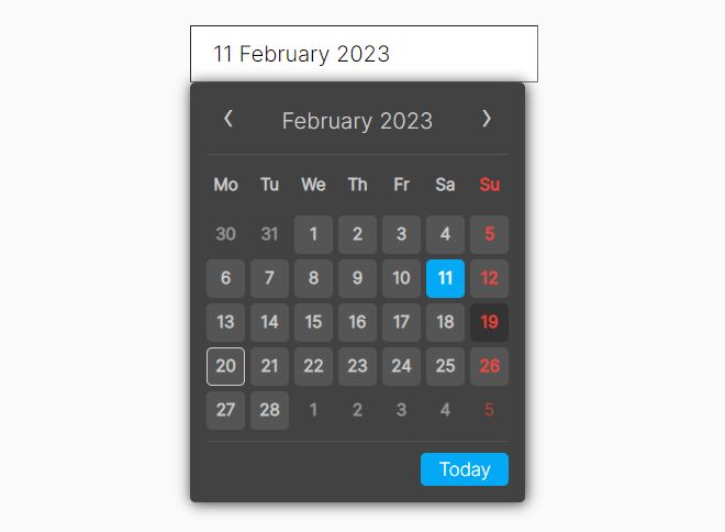
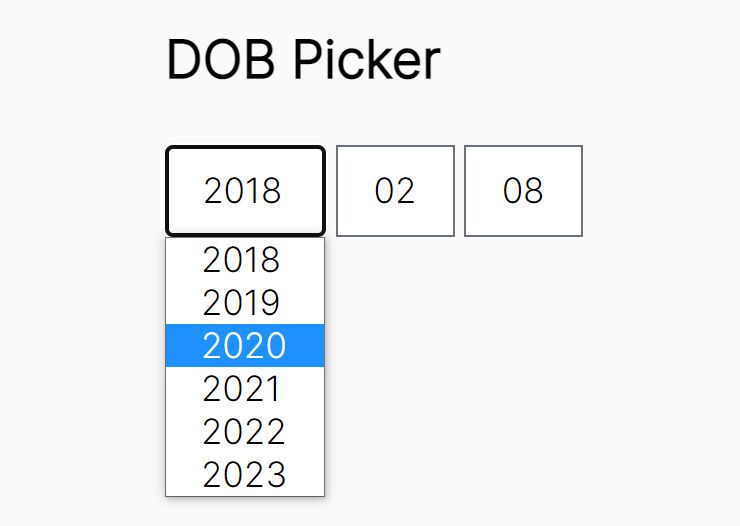
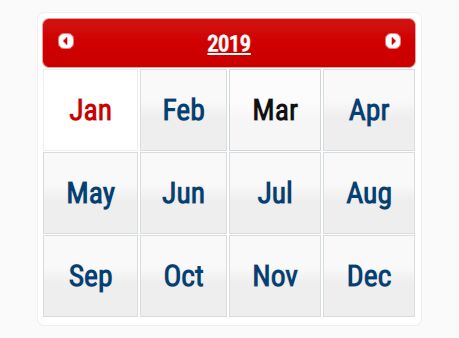
tinyDatePicker is a simple, flexible and highly customizable jQuery plugin for creating date / time / month / range pickers and inline event calendars with minimal effort. Also provides a pure JavaScript version which can be implemented without any 3rd-party libraries.
How to use it:
1. Add the necessary JavaScript and CSS files into your webpage as follows:
<link rel="stylesheet" href="month.css">
<link rel="stylesheet" href="week.css">
<link rel="stylesheet" href="datePicker.css">
<script src="//code.jquery.com/jquery.min.js"></script>
<script src="jqDatePicker.min.js"></script>
2. Call the function on the target input field and done.
$('.picker').datePicker();
3. Possible plugin options for the date/time/month pickers.
$('.picker').datePicker({

  // use cache
  useCache: false,

  // the selector for the input fields
  elements: [],

  // element the picker should be depended on
  body: document.body,

  // attribute used for internal date transfer
  pickerAttribute: 'data-picker',

  // class name of the datePicker wrapper
  datePickerClass: 'date-picker',

  // class name for date representing the value of input field
  selectedDayClass: 'selected-day',

  // class name for disabled events
  disabledClass: 'disabled',

  // called right after datePicker is instantiated
  initCallback: function(elements) {},

  // called every time the picker gets toggled or redrawn
  renderCallback: function(container, element, toggled) {
    var bounds = element.getBoundingClientRect();

    container.style.cssText = !this.isOpen ? 'display: none' :
      'left:' + (window.pageXOffset + bounds.left) + 'px;' +
      'top:' + (window.pageYOffset + element.offsetHeight + bounds.top) + 'px;';
  },

  // when date is picked, the value needs to be transferred to input
  renderValue: function(container, element, value) {
    element.value = value;
  },

  // when toggling the datePicker, this will pick up the value of the input field
  readValue: function(element) {
    return element.value;
  },


  // the HTML rendered before the display of the month. The following strings will be replaced:
  // {{disable-prev}}, {{prev}}, {{disable-next}}, {{next}}, {{day}}, {{month}}, {{months}}, {{year}}, {{years}}
  // look at the code (original option HTML) and it's clear what all those placeholders mean
  header:
    '<div class="dp-title">' +
      '<button class="dp-prev" type="button"{{disable-prev}}>{{prev}}</button>' +
      '<button class="dp-next" type="button"{{disable-next}}>{{next}}</button>' +
      '<div class="dp-label dp-label-month">{{month}}' +
        '<select class="dp-select dp-select-month" tabindex="-1">' +
          '{{months}}' +
        '</select>' +
      '</div>' +
      '<div class="dp-label dp-label-year">{{year}}' +
        '<select class="dp-select dp-select-year" tabindex="-1">' +
          '{{years}}' +
        '</select>' +
      '</div>' +
    '</div>',

  // label text for next month
  nextLabel: 'Next month',

  // label tetx for previous month
  prevLabel: 'Previous month',

  // min / max dates
  minDate: '1969-01-01',
  maxDate: '2050-12-31',

  // data attributes for min/max dates
  minDateAttribute: 'data-mindate',
  maxDateAttribute: 'data-maxdate',

  // classes for event listeners
  nextButtonClass: 'dp-next',
  prevButtonClass: 'dp-prev',
  selectYearClass: 'dp-select-year',
  selectMonthClass: 'dp-select-month',

  // the HTML rendered after the display of the month. The following strings will be replaced:
  // {{hour}}, {{hours}}, {{minute}}, {{minutes}}, {{second}}, {{seconds}}, {{am-pm}}, {{am-pms}}
  footer:
    '<div class="dp-footer">' +
      '<div class="dp-label">{{hour}}' +
        '<select class="dp-select dp-select-hour" tabindex="-1">' +
          '{{hours}}' +
        '</select>' +
      '</div>' +
      '<div class="dp-label">{{minute}}' +
        '<select class="dp-select dp-select-minute" tabindex="-1">' +
          '{{minutes}}' +
        '</select>' +
      '</div>' +
      '<div class="dp-label">{{second}}' +
        '<select class="dp-select dp-select-second" tabindex="-1">' +
          '{{seconds}}' +
        '</select>' +
      '</div>' +
      '<div class="dp-label">{{am-pm}}' +
        '<select class="dp-select dp-select-am-pm" tabindex="-1">' +
          '{{am-pms}}' +
        '</select>' +
      '</div>' +
    '</div>',

  // HH:MM:SS AM, HH:MM AM, HH:MM:SS or HH:MM
  timeFormat: '',

  // data attribute for time format
  timeFormatAttribute:'data-timeformat',

  // switch for standard AM / PM rendering
  doAMPM: false,

  // steps of minutes displayed as options in
  minuteSteps: 5,

  // steps of seconds displayed as options in
  secondSteps: 10,

  // rendered strings in picker options and input fields
  AMPM: ['AM', 'PM'],

  // classes for event listeners
  selectHourClass: 'dp-select-hour',
  selectMinuteClass: 'dp-select-minute',
  selectSecondClass: 'dp-select-second',
  selectAMPMClass: 'dp-select-am-pm',

  // data attributes for rangeStart & rangeEnd
  rangeStartAttribute: 'data-from',
  rangeEndAttribute: 'data-to'

});
Change log:
2017-07-02
- added optional event listener
2016-11-16
- fix Date.parse() issue
2016-08-09
- tiny bug fix
2016-07-26
- fixed event conversion
2016-07-25
- fixed closeOnSelect; swapped toggle()
2016-07-23
- more convenient callbacks
- bugfix: init events with given id
2016-07-22
- added toggle method
This awesome jQuery plugin is developed by PitPik. For more Advanced Usages, please check the demo page or visit the official website.