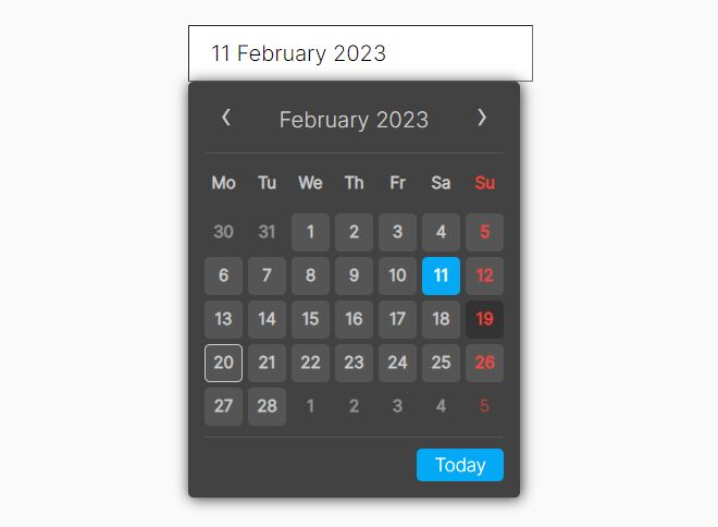
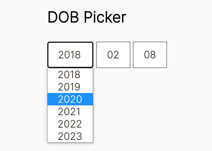
Stylish iOS 7-Style Date Picker with jQuery and CSS3
| File Size: | 5.05 KB |
|---|---|
| Views Total: | 8850 |
| Last Update: | |
| Publish Date: | |
| Official Website: | Go to website |
| License: | MIT |
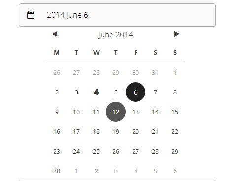
A tiny jQuery widget that allows to select a date from a stylish iOS 7 style date picker interface when you click the date input field.
How to use it:
1. Load the required google web fonts and font awesome icons in the head section of the document.
<link href="http://fonts.googleapis.com/css?family=Lato:100,300,400,700,900" rel="stylesheet" type="text/css">
<link href="http://fonts.googleapis.com/css?family=Open+Sans:400,300,600,700,800" rel="stylesheet" type="text/css">
<link href="http://fonts.googleapis.com/css?family=Montserrat:400,700" rel="stylesheet" type="text/css">
<link href="http://netdna.bootstrapcdn.com/font-awesome/4.1.0/css/font-awesome.css" rel="stylesheet" type="text/css">
2. Create a form with a date input.
<form>
<div class="formInput"> <i class="fa fa-user"></i>
<input type="input" name="name" value="Name" />
</div>
<div class="formInput"> <i class="fa fa-envelope-o"></i>
<input type="input" name="email" value="Email" />
</div>
<div class="formInput dateSelector"> <i class="fa fa-calendar-o"></i>
<input type="input" name="birthday" id="hbdsdf" value="Birth date" />
</div>
<input type="submit" class="button" value="Submit">
</form>
3. The CSS to style the form elements and the date picker.
form {
width: 400px;
padding: 80px 0 0 40px;
}
input.button {
box-sizing: border-box;
border: 0;
outline: 0;
height: 48px;
}
.button {
display: inline-block;
font: 100 1.2em/16px "Lato";
letter-spacing: 0.75px;
text-transform: uppercase;
text-align: center;
height: 16px;
margin: 8px 0 8px 8px;
padding: 16px 24px;
background: #808080;
color: white;
border-radius: 3px;
box-shadow: 1px 1px 3px rgba(0,0,0,0.25);
transition: background-color .1s, color .2s, box-shadow .3s;
}
.button:hover {
background: #404040;
color: white;
cursor: pointer;
cursor: hand;
box-shadow: 1px 1px 6px rgba(0,0,0,0.65);
}
.formInput {
position: relative;
font: 300 1em/48px "Open Sans";
margin: 0 0 8px;
padding: 0;
border-bottom: 1px solid #c0c0c0;
border-radius: 4px;
overflow: hidden;
color: #505050;
}
.formInput:hover {
color: black;
}
.formInput i {
display: block;
position: absolute;
z-index: -1;
top: 0;
left: 0;
width: 48px;
height: 47px;
line-height: 48px;
text-align: center;
/*background-color: #e0e0e0;
    box-shadow: 1px 1px 1px rgba(0,0,0,0.25);*/
font-size: 1em;
transition: box-shadow .2s, color .3s, background-color .4s;
}
.formInput input {
box-sizing: border-box;
z-index: 1;
display: block;
position: relative;
top: 0;
left: 0;
float: left;
font-size: 1em;
font: inherit;
border: 0;
margin: 0;
padding: 0 4px 0 56px;
border: 1px solid transparent;
border-radius: inherit;
width: 100%;
height: 47px;
line-height: 47px;
background: transparent;
color: inherit;
transition: border-color .2s, color .2s, background-color .4s;
}
.formInput.hasTextarea {
line-height: 24px;
height: 191px;
}
.formInput.hasTextarea i {
border-radius: 0 0 3px;
}
.formInput textarea {
box-sizing: border-box;
resize: none;
z-index: 1;
display: block;
position: relative;
top: 0;
left: 0;
float: left;
font-size: 1em;
font: inherit;
border: 1px solid transparent;
border-radius: inherit;
margin: 0;
padding: 12px 4px 6px 56px;
width: 100%;
height: 100%;
line-height: 24px;
background: transparent;
color: inherit;
transition: border-color .2s, color .2s, background-color .4s;
}
.formInput input[disabled]:active, .formInput input[disabled]:focus, .formInput input[disabled]:hover {
border-color: transparent;
background-color: transparent;
}
.formInput input:active, .formInput input:focus, .formInput textarea:active, .formInput textarea:focus, .formInput.dateSelector:hover input {
border-color: #b0b0b0;
outline: none;
color: black;
background-color: rgba(0,0,0,0.025);
}
.formInput.radioBtn {
padding-bottom: 24px;
}
.formInput.radioBtn .formInputChild {
font: 300 1em/28px "Open Sans";
}
.formInput.radioBtn input {
width: 14px;
height: 14px;
padding: 0;
margin: 7px 9px;
position: relative;
}
.formInput.radioBtn label {
font-size: 0.95em;
}
.formInput .formInputDescription {
position: relative;
padding: 0 0 0 56px;
}
.formInput .formInputChild {
font: 300 1em/48px "Open Sans";
position: relative;
padding: 0 0 0 56px;
}
.formInput.checkboxBtn {
}
.formInput.checkboxBtn input {
width: 14px;
height: 14px;
margin: 17px 16px 16px;
padding: 0;
}
.formInput.checkboxBtn i {
display: none;
}
.formInput.dateSelector {
transition: background-color .2s;
}
.calendar {
position: relative;
display: block;
font: 500 0.8em/30px "Open Sans";
-webkit-touch-callout: none;
-webkit-user-select: none;
-khtml-user-select: none;
-moz-user-select: none;
-ms-user-select: none;
user-select: none;
cursor: default;
padding: 0 0 0 57px;
color: #404040;
}
.calendar .view {
position: relative;
float: left;
}
.calendar .nav {
position: absolute;
top: 0;
left: 0;
width: 100%;
}
.calendar .nav .btn {
position: absolute;
display: block;
z-index: 1;
cursor: pointer;
cursor: hand;
width: 32px;
height: 32px;
line-height: 31px;
top: 0;
left: auto;
transition: opacity .5s;
border-radius: 4px;
}
.calendar .nav .btn:hover {
color: #808080;
background: #e0e0e0;
border-color: #606060;
}
.calendar .nav .prev {
left: 0;
}
.calendar .nav .prev-year {
opacity: 0;
left: 32px;
}
.calendar .nav:hover .prev-year {
opacity: 1;
}
.calendar .nav .next-year {
opacity: 0;
right: 32px !important;
}
.calendar .nav:hover .next-year {
opacity: 1;
}
.calendar .nav .next {
right: 0;
}
.calendar .head {
}
.calendar .head .title {
font: 300 1.2em/32px "Open Sans";
position: relative;
float: left;
width: 100%;
text-align: center;
}
.calendar .head span {
cursor: pointer;
}
.calendar .row {
clear: both;
}
.calendar .row.th {
font-weight: 700;
text-transform: uppercase;
height: 40px;
}
.calendar .row.th .C {
border-bottom: 1px solid #c0c0c0;
border-radius: 0;
}
.calendar .C {
text-align: center;
width: 40px;
height: 40px;
line-height: 40px;
float: left;
transition: background-color .05s, color .05s;
border-radius: 50%;
}
.calendar .C.mn {
cursor: pointer;
cursor: hand;
}
.calendar .C.mn:hover {
background: #565656;
color: white;
}
.calendar .C.g {
color: #a0a0a0;
font-weight: 300;
}
.calendar .C.slctd {
background: #202020;
color: white;
font-size: 1.15em;
font-weight: 300;
}
.calendar .C.today {
font-weight: 900;
font-size: 1.3em;
}
.calendar .selected {
margin: 0 0 0 64px;
float: right;
text-align: center;
width: 280px;
}
.calendar .selected .desc {
border-bottom: 1px solid #c0c0c0;
}
.calendar .selected .val {
padding: 0 8px;
background: #f0f0f0;
color: #808080;
}
.calendar .dayArea {
position: relative;
width: 280px;
height: 240px;
overflow: hidden;
}
.calendar .dayArea .mArea {
position: absolute;
top: 0;
left: 0;
width: 100%;
height: 100%;
}
4. Load the jQuery javascript library and the ios-7-date-picker.js at the end of the document.
<script src='http://ajax.googleapis.com/ajax/libs/jquery/1.11.0/jquery.min.js'></script>
<script src="ios-7-date-picker.js"></script>
5. Tweak the CSS and Javascript to create your own styles.
This awesome jQuery plugin is developed by ndne. For more Advanced Usages, please check the demo page or visit the official website.