User-friendly Date & Time Picker Plugin With jQuery - dateSelector
| File Size: | 13.1 KB |
|---|---|
| Views Total: | 2891 |
| Last Update: | |
| Publish Date: | |
| Official Website: | Go to website |
| License: | MIT |
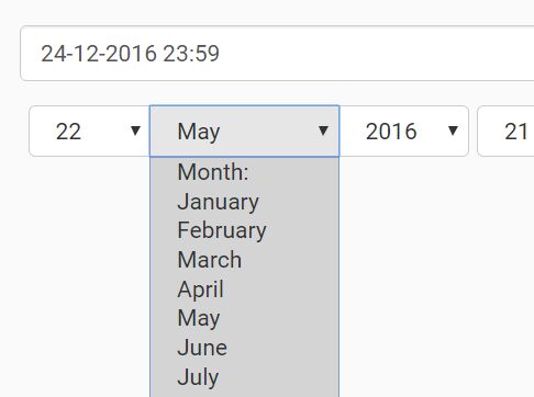
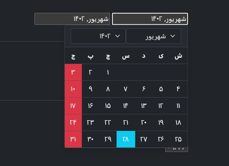
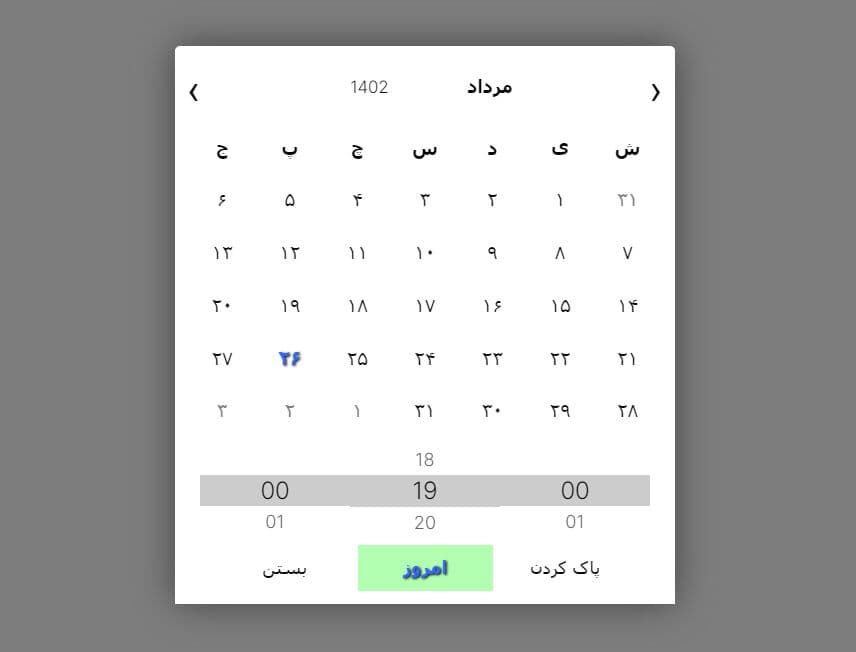
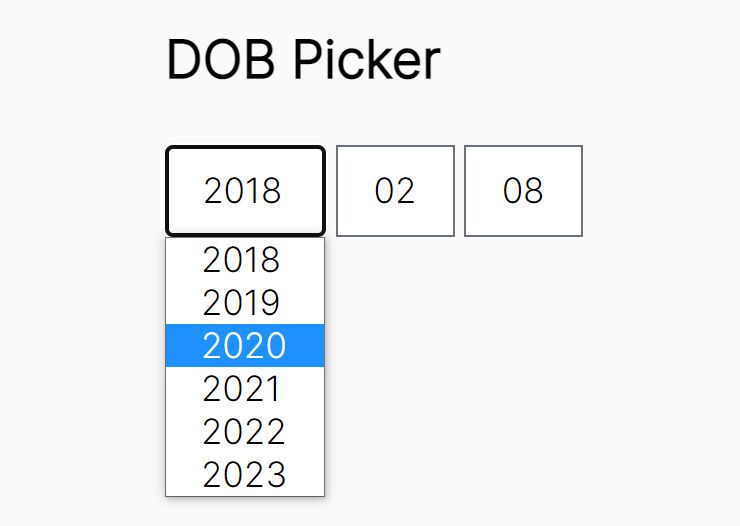
dateSelector is a jQuery based, mobile- and user-friendly date & time picker plugin which replaces the default date input with several select boxes for easier date and time selection. Value is set on the desired input, once complete date is set. A great plugin for generating a DOB (date of birthday) picker on your web application.
How to use it:
1. You first have to include the jQuery dateSelector plugin's script after including jQuery library.
<script src="//code.jquery.com/jquery.min.js"></script>
<script src="src/jquery.dateselector.min.js"></script>
2. Create a text input field for the date & time picker. The date-value attribute is used to specify the date format for the date & time picker.
<input date-value="d-m-Y H:i" value="25-12-2016 23:59" name="input[date_time]" id="date_time_input" type="text">
3. In this example we're going to generate date and time selectors as Bootstrap 3 button groups. Selectors order set with 'date-value' attribute on the input element.
var selectClass = 'btn btn-default';  // class of select elements
var dateOptions = {
  alertIncorrectDay: 'Select a correct day!', // alert message when bad date is selected (such a month day that doesn't exist)
  alertIncomplete: 'Date incomplete!',    // alert message when incomplete date is selected
  checkIncomplete: false,           // check if date is completed (if true and it's incomplete, alerts before message)

  // date and time group. In this example creates date and time selectors as Bootstrap 3 button groups
  dateContainerTag: 'div',          // container for date selectors
  dateContainerClass: 'btn-group date-group', // date container class
  dateContainerSeparator: false,        // removes date separators
  timeContainerTag: 'div',          // container for
  timeContainerClass: 'btn-group time-group', // time container class
  timeContainerSeparator: false,        // removes time separators

  // each selector
  dayAttr: {                  // day selector attributes
    class:    selectClass,          // applies the same class from the selected input to the day selector
    blankTxt: 'Day: '           // select blank text
  },
  monthAttr: {                // month selector attributes
    class:    selectClass,          // applies the same class from the selected input to the month selector
    blankTxt: 'Month: ',          // select blank text
    names: {                // options values and names (please note that begins at month 1 )
      1: 'January',
      2: 'February',
      3: 'March',
      4: 'April',
      5: 'May',
      6: 'June',
      7: 'July',
      8: 'August',
      9: 'September',
      10: 'October',
      11: 'November',
      12: 'December'
    }
  },
  yearAttr: {                 // year selector attributes
    class:    selectClass,          // applies the same class from the selected input to the year selector
    blankTxt: 'Year: '            // select blank text
  },
  hourAttr: {                 // hour selector attributes
    class:    selectClass,          // applies the same class from the selected input to the hour selector
    blankTxt: 'Hour: '            // select blank text
  },
  minAttr: {                  // minutes selector attributes
    class:    selectClass,          // applies the same class from the selected input to the minute selector
    blankTxt: 'Minutes: ',          // select blank text
    factor:   'fourth'            // shows only fourth (00, 15, 30, 45) minutes (str options: [halb|fourth|pair|odd])
  },
  secAttr: {                  // second selector attributes
    class:    selectClass,          // applies the same class from the selected input to the seconds selector
    blankTxt: 'Seconds: ',          // select blank text
    factor:   ''              // show al seconds (str options:[halb|fourth|pair|odd])
  }
};

// apply dateSelector when document is ready
$(document).ready(function(){
  // checking if element exists, prevents issues
  if( $('#date_time_input').length > 0)
  {
    $('#date_time_input').dateSelector(dateOptions);
  }
});
4. All default options.
/*
* selected and class gets default settings value when not set on the selected input
*/
dateformat: 'H:i:s d-m-Y',              // (str) when in input date-value is not set, set default select order
alertIncorrectDay: 'Select a correct day!', // (str) incorrect day alert message
checkIncomplete: true,                  // (bool) check if all has been selected
alertIncomplete: 'Date incomplete!',    // (str) incomplete alert message
firstOptionClass: 'first-option',       // (str) first option class

// date and time grouping with container
dateContainerTag:       '',                // (str) default date container tag
dateContainerClass:     '',        // (str) class for date selectors group
dateContainerSeparator: true,           // (bool) when false prevents before and after time selector tag separators char
timeContainerTag:       '',                // (str) default time container tag
timeContainerClass:     '',        // (str) class for time selectors group
timeContainerSeparator: true,           // (bool) when false prevents before and after time selector tag separators char


// date&time select/options settings
dayAttr: {
  selected :   0, // (int) selected day option position (default 0) [Range: 1-(28,29,30,31)]
  class:      '', // (str) select tag class attribute
  size:        1, // (int) viewed options (size attribute, such as multiple select list)
  blankTxt:   '', // (str) default text shown in blank option
  blankVal:   '', // (str) blank option default value
  beforeTag: ' ', // (mixed) before day select tag content (default  )
  afterTag:   ' '  // (mixed) after day select tag content (default  -)
},
monthAttr: {
  selected :   0, // (int) selected month option position (default 0) [Range: 1-12]
  class:      '', // (str) select tag class attribute
  size:        1, // (int) viewed options (size attribute, such as multiple select list)
  blankTxt:   '', // (str) default text shown in blank option
  blankVal:   '', // (str) blank option default value
  names: {         // (object) month names
      1: 'January',
      2: 'February',
      3: 'March',
      4: 'April',
      5: 'May',
      6: 'June',
      7: 'July',
      8: 'August',
      9: 'September',
      10: 'October',
      11: 'November',
      12: 'December'
  },
  beforeTag: ' ', // (mixed) before month select tag content (default  )
  afterTag:  ' '  // (mixed) after month select tag content (default  -)
},
yearAttr: {
  selected:    0, // (int) selected year option position (default 0) [Range: start-end year]
  class:      '', // (str) select tag class attribute
  size:        1, // (int) viewed options (size attribute, such as multiple select list)
  blankTxt:   '', // (str) default text shown in blank option
  blankVal:   '', // (str) blank option default value
  start: (new Date).getFullYear(),   // (int) start year (default current)
  end:   (new Date).getFullYear()+5,   // (int) end year (default current + 5)
  beforeTag: ' ', // (mixed) before year select tag content (default  )
  afterTag:  ' '  // (mixed) after year select tag content (default  )
},
hourAttr: {
  selected: null,  // (str) selected hour option (default null) [Range: '00'-'24' as string]
  class:      '', // (str) select tag class attribute
  size:        1, // (int) viewed options (size attribute, such as multiple select list)
  blankTxt:   '', // (str) default text shown in blank option
  blankVal:   '', // (str) blank option default value
  beforeTag: ' ', // (mixed) before year select tag content (default  )
  afterTag:   ' ',  // (mixed) after year select tag content (default  :)
  factor:     '' // (str:[pair|odd]) if set get pair or odd hours
},
minAttr: {
  selected: null,  // (str) selected minutes option (default null) [Range: '00'-'59' as string]
  class:      '', // (str) select tag class attribute
  size:        1, // (int) viewed options (size attribute, such as multiple select list)
  blankTxt:   '', // (str) default text shown in blank option
  blankVal:   '', // (str) blank option default value
  beforeTag:  ' ', // (mixed) before year select tag content (default  )
  afterTag:   ' ',  // (mixed) after year select tag content (default  )
  factor:     '' // (str:[halb|fourth|pair|odd]) if set get halb, fourth, pair or odd minutes
},
secAttr: {
  selected: null,  // (str) selected seconds option (default null) [Range: '00'-'59' as string]
  class:      '', // (str) select tag class attribute
  size:        1, // (int) viewed options (size attribute, such as multiple select list)
  blankTxt:   '', // (str) default text shown in blank option
  blankVal:   '', // (str) blank option default value
  beforeTag: ' ', // (mixed) before year select tag content (default  )
  afterTag:  ' ',  // (mixed) after year select tag content (default  )
  factor:     '' // (str:[halb|fourth|pair|odd]) if set get halb, fourth, pair or odd minutes
}
This awesome jQuery plugin is developed by egea1981. For more Advanced Usages, please check the demo page or visit the official website.