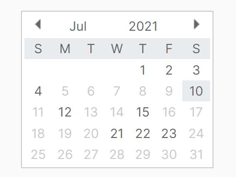
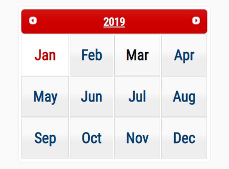
jQuery Plugin To Create A Modern Calendar - Sharp Calendar
| File Size: | 55.4 KB |
|---|---|
| Views Total: | 4739 |
| Last Update: | |
| Publish Date: | |
| Official Website: | Go to website |
| License: | MIT |
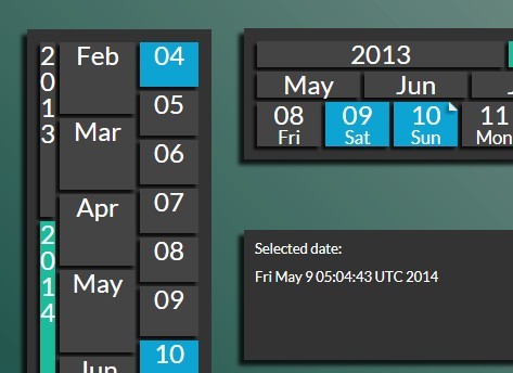
Sharp Calendar is a jQuery plugin used to create a modern, animated and highly customizable calendar widget on your website.
How to use it:
1. Add the jQuery library together with jQuery sharp calendar plugin's CSS and JS files in the document.
<link rel="stylesheet" href="sharpCalendar/css/jquery.sharpCalendar.css">
<script src="//ajax.googleapis.com/ajax/libs/jquery/1.11.1/jquery.min.js"></script>
<script src="sharpCalendar/script/jquery.sharpCalendar.js"></script>
2. Include the jQuery mousewheel plugin for mouse wheel support (Optional).
<script src="//cdnjs.cloudflare.com/ajax/libs/jquery-mousewheel/3.1.11/jquery.mousewheel.js"></script>
3. Create an DIV element to place the calendar widget.
<div class="wrapper-demo">
</div>
4. The Javascript to generate a fashion calendar widget into the container element you just created.
$(".wrapper-demo").SC({
selectedDatesObj: 'selectedDates',
animate: true,
useWheel: true,
vertical: false,
sizes: 'auto',
callbackDelay: 500,
years: 1,
months: 3,
days: 5,
invert: false,
combineMonthYear: false,
showDayArrows: false,
showDayNames: true,
monthNames: ["Jan", "Feb", "Mar", "Apr", "May", "Jun", "Jul", "Aug", "Sep", "Oct", "Nov", "Dec"],
dayNames: ["Sun", "Mon", "Tue", "Wed", "Thu", "Fri", "Sat"],
doubleDigitsDays: true,
allowSelectSpans: true
});
5. Some extra CSS to tweak the calendar widget.
.wrapper-demo {
  position: absolute;
  z-index: 2;
  height: 100px;
  width: 700px;
  bottom: 485px;
  left: 300px;
}

@-webkit-keyframes
fade-in {  0% {
 opacity: 0;
}
 100% {
 opacity: 1;
}
}

@-moz-keyframes
fade-in {  0% {
 opacity: 0;
}
 100% {
 opacity: 1;
}
}
 @keyframes
fade-in {  0% {
 opacity: 0;
}
 100% {
 opacity: 1;
}
}

@-webkit-keyframes
about-frames-fade {  0% {
 height: 0;
 font-size: 0;
}
 100% {
 height: 125px;
 font-size: 36px;
}
}

@-moz-keyframes
about-frames-fade {  0% {
 height: 0;
 font-size: 0;
}
 100% {
 height: 125px;
 font-size: 36px;
}
}
 @keyframes
about-frames-fade {  0% {
 height: 0;
 font-size: 0;
}
 100% {
 height: 125px;
 font-size: 36px;
}
}

@-webkit-keyframes
trans1 {  0% {
 opacity: 0;
}
 50% {
 opacity: 1;
}
 80% {
 opacity: 0;
}
 100% {
 opacity: 0;
}
}

@-moz-keyframes
trans1 {  0% {
 opacity: 0;
}
 50% {
 opacity: 1;
}
 80% {
 opacity: 0;
}
 100% {
 opacity: 0;
}
}
 @-o-keyframes
trans1 {  0% {
 opacity: 0;
}
 50% {
 opacity: 1;
}
 80% {
 opacity: 0;
}
 100% {
 opacity: 0;
}
}
 @keyframes
trans1 {  0% {
 opacity: 0;
}
 50% {
 opacity: 1;
}
 80% {
 opacity: 0;
}
 100% {
 opacity: 0;
}
}
 @-ms-keyframes
spin {  from {
 -ms-transform: rotate(0deg);
}

to { -ms-transform: rotate(360deg); }
}

@-moz-keyframes
spin {  from {
 -moz-transform: rotate(0deg);
}

to { -moz-transform: rotate(360deg); }
}

@-webkit-keyframes
spin {  from {
 -webkit-transform: rotate(0deg);
}

to { -webkit-transform: rotate(360deg); }
}
 @keyframes
spin {  from {
 transform: rotate(0deg);
}

to { transform: rotate(360deg); }
}

.wrapper,
.wrapperHor {
  background-color: #333;
  padding: 10px;
  -webkit-box-shadow: -5px 5px 5px rgba(0,0,0,0.8);
  -moz-box-shadow: -5px 5px 5px rgba(0,0,0,0.8);
  box-shadow: -5px 5px 5px rgba(0,0,0,0.8);
}

.SCElement {
  font-size: 24px;
  background-color: #444;
  color: #FFF;
  opacity: 1;
  -webkit-box-shadow: -3px 3px 3px rgba(0,0,0,0.8);
  -moz-box-shadow: -3px 3px 3px rgba(0,0,0,0.8);
  box-shadow: -3px 3px 3px rgba(0,0,0,0.8);
}

.SCSel,
.wrapperHor .SCSel {
  color: #FFF;
  font-weight: 400;
  /*border: 2px solid #333;*/
  border-radius: 0;
}

.SCMarked>div { position: relative; }

.wd_0 .SCElement,
.wd_6 .SCElement { background-color: #0DA4D3; }

.SCElement:hover { opacity: 0.5; }

.SCToday { background-color: #1CBB9B; }

.SCMarked>div:before {
  content: "";
  position: absolute;
  top: 0%;
  right: 0%;
  width: 0px;
  height: 0px;
  border-bottom: 8px solid #eee;
  border-right: 8px solid transparent;
  -webkit-box-shadow: -3px 3px 3px rgba(0,0,0,0.3);
  -moz-box-shadow: -3px 3px 3px rgba(0,0,0,0.3);
  box-shadow: -3px 3px 3px rgba(0,0,0,0.3);
}

.SCMarked>div:after {
  content: "";
  position: absolute;
  top: 0%;
  right: 0%;
  width: 0px;
  height: 0px;
  border-top: 7px solid #333;
  border-left: 7px solid transparent;
}
This awesome jQuery plugin is developed by JPedroMarques. For more Advanced Usages, please check the demo page or visit the official website.