Powerful & Interactive Tooltip Plugin with jQuery - Protip
| File Size: | 288 KB |
|---|---|
| Views Total: | 4716 |
| Last Update: | |
| Publish Date: | |
| Official Website: | Go to website |
| License: | MIT |
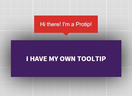
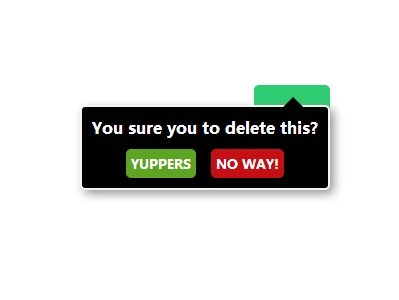
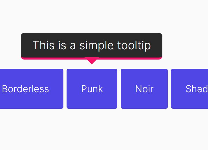
Protip is a powerful jQuery / HTML5 / CSS3 tooltip plugin used to display interactive, heavily customizable tooltips with fancy CSS3 animations based on Animate.css.
Basic usage:
1. Import the Protip's style sheet and animate.css into the head section of the webpage.
<link rel="stylesheet" href="animate.min.css">
<link rel="stylesheet" href="protip.min.css">
2. Import jQuery library and the Protip's JavaScript file at the bottom of the webpage.
<script src="jquery.min.js"></script>
<script src="protip.min.js"></script>
3. Initialize the Protip plugin.
$(document).ready(function(){
  $.protip();
});
4. Attach a tooltip to an element using html5 data attributes
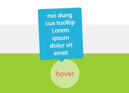
<a href="#" class="protip"
   data-pt-title="Tooltip content">
   Hover me
</a>
5. Default plugin options.
//  Selector for protips
selector:  C.DEFAULT_SELECTOR,

//  Namespace of the data attributes
namespace:  C.DEFAULT_NAMESPACE,

//  Template of protip element
protipTemplate:  C.TEMPLATE_PROTIP,

//  Template of the arrow element
arrowTemplate:  C.TEMPLATE_ARROW,

//  Template of protip icon
iconTemplate:  C.TEMPLATE_ICON,

//  Should we observe whole document for assertions and removals
observer:  true,

//  Default skin to use
skin:  C.SKIN_DEFAULT,

//  Default size to use (provided by the Default skin only)
size:  C.SIZE_DEFAULT,

//  Default color scheme to use (provided by the Default skin only)
scheme:  C.SCHEME_DEFAULT,

//  Global animation?
animate:  false,

//  Global offset of all tooltips.
offset:  0
6. You can pass the configuration options to the tooltips via html5 data-pt-OPTION attributes as in data-pt-trigger="click".
data-pt-trigger = 'hover': How you want to trigger this tooltip? Available values: hover, click, sticky (sticky will be shown on load)data-pt-title = null: The tooltip content text. Alternatively you may provide a selector (ID or class) starting with # or . to get data (even whole HTML) from another DOM element's content. Example: <div id="tooltipContent"><em>This is my tooltips content</em></div>data-pt-delay-in = 0: Delay of showing a tooltip. Handy in cases when you want to prevent tooltips on quick mouseovers.data-pt-delay-out = 0: Delay of hiding the tooltip. Handy in cases you have clickable content in the tooltip for example.data-pt-interactive = false: If true, protip will use a default 250ms as delayOut for clickable contents.data-pt-gravity = true: Gravity will check your tooltip before showing it and it will search for better positions if the tooltip won't fit to viewport. Gravity has multiple options available, there is a separate section in the documentation about gravity.data-pt-offset-top = 0: Adjust the Y position of the tooltip.data-pt-offset-left = 0: Adjust the X position of the tooltip.data-pt-position = 'bottom': Preferred position. Check Positions section for available options and details.data-pt-placement = 'outside': Placement of the tooltip inside the element. Available values are: outside, inside, border and center.data-pt-classes = null: These classes will be added to the tooltip which may enable additional styling for example.data-pt-arrow = true: Hide arrow from this tooltip. At initialization there is an option to set the size of the arrow. Protip will calculate this into positions.data-pt-width = 300: This is the default max-width for the tooltip. If you need fixed width, write as this: 300!data-pt-icon = false: Adds icon template to the tooltip markup with the specified icon class.data-pt-observer = false: If true, we will attach an observer to the source element and watch for changes. For example if you change the data-pt-title attribute, the tooltip title will be changed also.data-pt-target = 'body': We will append the tooltip to this selector. Use true if you want to append into the source element.data-pt-skin = 'default': Skin to apply only to this tooltip.data-pt-size = 'normal': tiny, small, normal, big, large (Provided only by the Default skin.)data-pt-scheme = 'pro': Default color scheme to use (provided by the Default skin only)data-pt-animate = undefined: Animation type based on Animate.css. See: Animationsdata-pt-auto-hide = false: Tooltip will hide itself automatically after this timeout (milliseconds).data-pt-mixin = undefined: Tooltip mixins to use. Separated by spaces.
7. API.
var el = $('.el');

// Set tooltip to the element.
el.protipSet([options]);

// Show the tooltip of this element. Same as set, but it won't show.
el.protipShow([options]);

// Hide the tooltip of this element.
el.protipHide();

// Toggle the tooltip of this element.
el.protipToggle();

// Hide all tooltips inside of this element.
el.protipHideInside();

// Show all tooltips inside of this element.
el.protipShowInside();

// Toggle all tooltips inside of this element.
el.protipToggleInside();

// Custom show event
el.on('protipshow', function(ItemInstance){});

// Custom hide event
el.on('protiphide', function(ItemInstance){});
Changelog:
v1.4.21 (2019-01-22)
- Bugfixed
v1.4.19 (2019-01-17)
- Fix calculation for broken browser behaviour.
This awesome jQuery plugin is developed by wintercounter. For more Advanced Usages, please check the demo page or visit the official website.