“Smart Alert 1.2” Documentation by “Lukáš Prvý”
Smart Alert 1.2
Created: 11/03/2013
Code: Lukáš Prvý
Design: Pierre Borodin
Thank you for purchasing this plugin. If you have any questions that are beyond the scope of this help file, please feel free to email via my user page contact form here. Thanks so much!
Table of Contents
A) Introduction
1) Preface - top
Default JavaScript alert can't be configured at all - it's impossible to set own title, customize buttons and other things that one would expect to be configurable. Usually it doesn't fit into the overall site look, plus it looks different across all browsers. Frankly I think it's pretty useless and therefore I made this plugin.
2) Features - top
- Easy to use
- Three creative themes included
- Crossbrowser(Firefox, Chrome, Safari, Opera, Internet explorer 7+)
- Compatible with every layout
- Fully themeable
- Fully configurable
- Localization support
- Retina ready
3) Included files - top
Included files description:
-
alert
-
css - styles
- alert.css - core styles
- alert.min.css - minified core styles
- PIE.htc - CSS3 PIE library(see chapter C4)
- PIE.php - CSS3 PIE wrapper
-
js - scripts
- alert.js - alert plugin
- alert.min.js - minified alert plugin
-
themes - theme files
-
default - default theme
-
img - images
- close.png - close icon
- confirm.png - confirm icon
- error.png - error icon
- info.png - info icon
- warning.png - warning icon
- prompt.png - prompt icon
- x2 - double-sized images for retina display
- theme.css - theme stylesheet
- theme.min.css - minified theme stylesheet
-
img - images
- dark - dark theme
- light - light theme
-
default - default theme
-
css - styles
- doc - this documentation
- quick-start - quick-start guide
-
psd - graphics
- themes.psd - included themes graphics
4) Getting started - top
Copy alert folder for example into your sites root folder:
-
root folder
- alert
- some other folder
- some other folder
- some file
- some file
- some file
jQuery and jQuery-UI are required. Put them into header together with plugin files:
<!-- JQUERY -->

<script src="//ajax.googleapis.com/ajax/libs/jquery/1.9.1/jquery.min.js"></script>
<script src="//ajax.googleapis.com/ajax/libs/jqueryui/1.10.1/jquery-ui.min.js"></script>

<!-- ALERT -->

<link href="alert/css/alert.css" rel="stylesheet" />
<link href="alert/themes/default/theme.css" rel="stylesheet" />
<script src="alert/js/alert.js"></script>
When jQuery-UI is missing, then alert will be still fully functional, except of drag&drop functionality.
B) Usage
1) Arguments - top
Usage:
$.alert.open([type], [title], content, [buttons], [callback]);or
$.alert.open({settings});Settings:
| Property | Type | Description | Values | Default |
|---|---|---|---|---|
| container | String, Object | Container for alert placement | Selector, DOM object | 'body' |
| type | String | Alert type | 'info', 'confirm', 'warning', 'error', 'prompt' or user-defined alert type | 'info' |
| title | String | Alert title | Default title for certain alert type | |
| cancel | Boolean | Show close icon(alert can be then closed also with ESC) | true, false | true |
| icon | String, Boolean | Set one of icons defined in theme stylesheet or hide icon by setting false | icon name, false | 'info' |
| content | String | Alert content | Empty string | |
| width | Number, String | Alert width | Number(in pixels) or any valid CSS value for width property | 'auto' |
| maxHeight | Number, String | Content maximum height | Number(in pixels) or any valid CSS value for max-height property | 160 |
| align | String | Content alignment | 'left', 'center', 'right' | 'left' |
| callback | Function | Function that will be called after button press. Value of callback parameter will be pressed button id or false in case of closing alert by click on close icon. | Empty function | |
| buttons | Object | Object with buttons | {id: 'label', ...} | Default buttons for certain alert type or {ok: 'Ok'} if default isn't defined |
| draggable | Boolean | Drag&drop(requires jQuery-UI) | true, false | true |
| pie | String | Determines whether to use PIE.htc directly or use its PHP wrapper | 'htc', 'php' | 'htc' |
2) Basic usage - top
Basic usage is the same as the default alert. Content can be plain text or HTML code.
Text
$.alert.open('Lorem ipsum dolor sit amet');or
$.alert.open({
    content: 'Lorem ipsum dolor sit amet'
});HTML
$.alert.open('<b>Lorem</b> <i>ipsum</i> <u>dolor</u><br /><a href="#">sit amet</a> consectetur.');or
$.alert.open({
    content: '<b>Lorem</b> <i>ipsum</i> <u>dolor</u><br /><a href="#">sit amet</a> consectetur.'
});
3) Alert type - top
Plugin contains four predefined alert types. Other types can be defined additionally(see chapter C3).
Info(default)
$.alert.open('info', 'Lorem ipsum dolor sit amet');or
$.alert.open({
    type: 'info',
    content: 'Lorem ipsum dolor sit amet'
});Confirm
$.alert.open('confirm', 'Lorem ipsum dolor sit amet');or
$.alert.open({
    type: 'confirm',
    content: 'Lorem ipsum dolor sit amet'
});Warning
$.alert.open('warning', 'Lorem ipsum dolor sit amet');or
$.alert.open({
    type: 'warning',
    content: 'Lorem ipsum dolor sit amet'
});Error
$.alert.open('error', 'Lorem ipsum dolor sit amet');or
$.alert.open({
    type: 'error',
    content: 'Lorem ipsum dolor sit amet'
});Prompt
$.alert.open('prompt', 'Lorem ipsum dolor sit amet');or
$.alert.open({
    type: 'prompt',
    content: 'Lorem ipsum dolor sit amet'
});4) Title - top
$.alert.open('My title', 'Lorem ipsum dolor sit amet');or
$.alert.open({
    title: 'My title',
    content: 'Lorem ipsum dolor sit amet'
});5) Close icon - top
The 'cancel' property determines whether alert may be cancelable(show close icon and alert can be then closed also with ESC) or not.
Cancelable(default)
$.alert.open({
    type: 'confirm',
    content: 'Lorem ipsum dolor sit amet',
    cancel: true
});Noncancelable
$.alert.open({
    type: 'confirm',
    content: 'Lorem ipsum dolor sit amet',
    cancel: false
});6) Icon - top
Select icon
Select one of icons defined in theme stylesheet:
$.alert.open({
    title: 'Alert',
    content: 'Lorem ipsum dolor sit amet',
    icon: 'warning'
});Hide icon
Don't show any icon:
$.alert.open({
    content: 'Lorem ipsum dolor sit amet',
    icon: false
});Set custom icon
Define your icon in theme stylesheet(see chapter D1):
#smartAlert[data-icon="hand"] #smartAlertIcon {
    background-image: url(img/hand.png);
}
Set double-sized icon for retina display:
@media only screen and (min-device-pixel-ratio: 2),
only screen and (-webkit-min-device-pixel-ratio: 2),
only screen and (-moz-min-device-pixel-ratio: 2),
only screen and (-o-min-device-pixel-ratio: 2/1) {

    #smartAlert[data-icon="hand"] #smartAlertIcon {
        background-image: url(x2/hand.png);
    }

}
Now you can simply use it:
$.alert.open({
    content: 'Lorem ipsum dolor sit amet',
    icon: 'hand'
});7) Width - top
Width can be set to number(in pixels) or any valid CSS value for width property.
$.alert.open({
    content: 'Lorem ipsum dolor sit amet',
    width: 400
});
8) Content maximum height - top
Content maximum height can be set to number(in pixels) or any valid CSS value for max-height property.
$.alert.open({
    maxHeight: 160,
    content: 'Lorem ipsum dolor sit amet, consectetur adipiscing elit. Ut egestas ligula ut nunc porttitor dictum. Pellentesque sit amet massa sapien. Lorem ipsum dolor sit amet, consectetur adipiscing elit. Mauris risus lectus, facilisis luctus consectetur dictum, posuere a urna. Curabitur bibendum nisi sem. Nam at lectus at ipsum suscipit consectetur vel at ante. Mauris risus metus, commodo vel volutpat vitae, eleifend nec diam. Nullam tempor tortor ut mi porttitor adipiscing. Curabitur vitae diam sem, sed mattis odio. Pellentesque pretium interdum odio ac tristique. Nunc accumsan mauris et lorem adipiscing vel pulvinar lacus auctor. Fusce euismod, turpis quis elementum interdum, lacus risus porta dui, ac viverra diam augue eu mi. Praesent id lacus sem, eget dictum dui. In scelerisque euismod tellus a tincidunt. Sed sodales ullamcorper viverra. Praesent semper ipsum ac tellus euismod semper bibendum libero lobortis. Vivamus placerat auctor congue. Lorem ipsum dolor sit amet, consectetur adipiscing elit. Morbi posuere mi vitae arcu aliquet pretium suscipit libero sollicitudin. Vivamus et ligula nisl. Fusce adipiscing porttitor lacus, et luctus dui ornare quis. Pellentesque luctus velit varius turpis egestas posuere. Phasellus et velit metus, at bibendum ante. Vivamus vel enim id est dapibus vestibulum. Nullam tincidunt risus non erat scelerisque cursus ac sed.'
});9) Content alignment - top
Content can be aligned to left, center or right.
Left(default)
$.alert.open({
    content: 'Lorem ipsum dolor sit amet',
    width: 400,
    align: 'left'
});Center
$.alert.open({
    content: 'Lorem ipsum dolor sit amet',
    width: 400,
    align: 'center'
});Right
$.alert.open({
    content: 'Lorem ipsum dolor sit amet',
    width: 400,
    align: 'right'
});10) Callback - top
Execute callback after closing alert:
$.alert.open('Lorem ipsum dolor sit amet', function() {
    $.alert.open('This alert was opened from callback!');
});
or
$.alert.open({
    content: 'Lorem ipsum dolor sit amet',
    callback: function() {
        $.alert.open('This alert was opened from callback!');
    }
});Get prompt value:
$.alert.open('prompt', 'Lorem ipsum dolor sit amet', function(button, value) {
    if (button == 'ok')
        $.alert.open(value || 'No value has been entered');
});
or
$.alert.open({
    type: 'prompt',
    content: 'Lorem ipsum dolor sit amet',
    callback: function(button, value) {
        if (button == 'ok')
            $.alert.open(value || 'No value has been entered');
    }
});11) Buttons - top
Define custom buttons
For defining custom buttons use object {id: 'label', ...}.
$.alert.open('Lorem ipsum dolor sit amet', {
    someId: 'Abc',
    otherId: 'Def'
});
or
$.alert.open({
    content: 'Lorem ipsum dolor sit amet',
    buttons: {
        someId: 'Abc',
        otherId: 'Def'
    }
});Handle button click
For handling button click use callback function. Value of callback parameter will be pressed button id or false in case of closing alert by click on close icon. Ids of predefined buttons are 'ok', 'yes' and 'no'.
$.alert.open('confirm', 'Lorem ipsum dolor sit amet', function(button) {
    if (button == 'yes')
        $.alert.open('You pressed the "yes" button.');
    else if (button == 'no')
        $.alert.open('You pressed the "no" button.');
    else
        $.alert.open('Alert was canceled.');
});
or
$.alert.open({
    type: 'confirm',
    content: 'Lorem ipsum dolor sit amet',
    callback: function(button) {
        if (button == 'yes')
            $.alert.open('You pressed the "yes" button.');
        else if (button == 'no')
            $.alert.open('You pressed the "no" button.');
        else
            $.alert.open('Alert was canceled.');
    }
});The same with custom buttons:
$.alert.open(
    'Lorem ipsum dolor sit amet',
    {
        A: 'A',
        B: 'B',
        C: 'C'
    },
    function(button) {
        if (!button)
            $.alert.open('Alert was canceled.');
        else
            $.alert.open('You pressed the "' + button + '" button.');
    }
);
or
$.alert.open({
    content: 'Lorem ipsum dolor sit amet',
    buttons: {
        A: 'A',
        B: 'B',
        C: 'C'
    },
    callback: function(button) {
        if (!button)
            $.alert.open('Alert was canceled.');
        else
            $.alert.open('You pressed the "' + button + '" button.');
    }
});12) Drag&drop - top
Drag&drop(requires jQuery-UI) can be enabled or disabled with 'draggable' property.
Drag&drop enabled(default)
$.alert.open({
    content: 'Lorem ipsum dolor sit amet',
    draggable: true
});Drag&drop disabled
$.alert.open({
    content: 'Lorem ipsum dolor sit amet',
    draggable: false
});13) Container - top
It's possible to place alert elsewhere than page body. The container must have a relative or absolute position and, of course, be large enough.
$.alert.open({
    container: '#example',
    content: 'Lorem ipsum dolor sit amet'
});C) Setup
1) Arguments - top
Get options
$.alert.setup();Set options
$.alert.setup({settings});Settings
| Property | Description |
|---|---|
| defaults | Global defaults |
| types | Alert types |
2) Defaults - top
Default values for every setting(see table in chapter B1) can be easily overriden:
$.alert.setup({
    defaults: {
        type: 'warning',
        cancel: false
    }
});

$.alert.open('Lorem ipsum dolor sit amet');3) Alert types - top
If predefined alert types doesn't fit your needs, then you can define your own. Suppose you want to define alert for showing tips:
CSS
Define the "tip" icon in theme stylesheet:
#smartAlert[data-icon="tip"] #smartAlertIcon {
    background-image: url(img/tip.png);
}
Set double-sized "tip" icon for retina display:
@media only screen and (min-device-pixel-ratio: 2),
only screen and (-webkit-min-device-pixel-ratio: 2),
only screen and (-moz-min-device-pixel-ratio: 2),
only screen and (-o-min-device-pixel-ratio: 2/1) {

    #smartAlert[data-icon="tip"] #smartAlertIcon {
        background-image: url(x2/tip.png);
        background-size: 48px, 48px;
        -webkit-background-size: 48px, 48px;
        -moz-background-size: 48px, 48px;
        -o-background-size: 48px, 48px;
    }

}
JS
Set the new type defaults:
$.alert.setup({
    types: {
        tip: {
            title: 'Tip',
            icon: 'tip',
            buttons: {
                cancel: 'Close'
            }
        }
    }
});
Usage
Now you can simply use the new type:
$.alert.open('tip', 'Lorem ipsum dolor sit amet');or
$.alert.open({
    type: 'tip',
    content: 'Lorem ipsum dolor sit amet'
});When calling $.alert.open function, options are merged as follows: (global defaults <= alert type settings) <= passed options.
4) Localization - top
For localization into your language simply alter alert types settings. German localization for example:
$.alert.setup({
    types: {
        error: {
            title: 'Fehler'
        },
        warning: {
            title: 'Warnung'
        },
        confirm: {
            title: 'Konfirmieren',
            buttons: {
                yes: 'Ja',
                no: 'Nein'
            }
        }
    }
});

$.alert.open('confirm', 'Lorem ipsum dolor sit amet');5) IE support - top
CSS3 support in IE is provided by CSS3 PIE library(PIE.htc file). IE requires that HTC behaviors are served up with a content-type header of "text/x-component", otherwise it will simply ignore the behavior. Many web servers are preconfigured to serve the correct content-type, but others are not. If you have problems with the PIE behavior not being applied, check your server configuration and if possible update it to use the correct content-type. For Apache, you can do this in a .htaccess file:
AddType text/x-component .htcIf for some reason you are unable to modify the server configuration (e.g. if you are on a shared host which does not allow custom .htaccess files), then you may also use a wrapper script(PIE.php file). This script simply serves up the PIE.htc file using the correct content-type header. To use it, simply set the 'pie' property to value of 'php':
$.alert.setup({
    defaults: {
        pie: 'php'
    }
});
This issue is particularly a problem in IE9, which seems more strict about the content-type than some other IE versions.
D) Themes
1) Theme files - top
Theme consists of these files:
-
alert
-
css
- alert.css - alert core styles(don't change them)
-
themes
-
mytheme - theme files
-
img - images
- info.png - info icon
- confirm.png - confirm icon
- warning.png - warning icon
- error.png - error icon
- prompt.png - prompt icon
- other.png - some other file used by theme
- x2 - double-sized images for retina display
- theme.css - theme stylesheet(good start point is copy of themes/default/theme.css)
-
img - images
-
mytheme - theme files
-
css
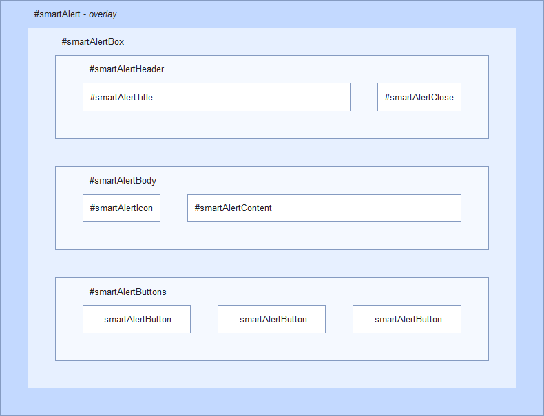
2) DOM structure - top
Alert elements are created dynamically. DOM structure looks as follows:
3) Crossbrowser optimization - top
Targeting styles for specific browser or engine is very easy. #smartAlert wrapper has attribute for determining which browser and version is used.
Attributes
| Attribute | Browser |
|---|---|
| data-mozilla | Gecko-based browsers(Firefox, Camino, ...) |
| data-webkit | Webkit-based browsers(Chrome, Chromium, Safari, ...) |
| data-chrome | Chrome, Chromium |
| data-safari | Safari |
| data-opera | Opera |
| data-ie | Internet explorer |
Examples
Target title styles for IE8:
#smartAlert[data-ie="8"] #smartAlertTitle {

    ...

}
Target button styles for webkit-based browsers:
#smartAlert[data-webkit] .smartAlertButton {

    ...

}
CSS3 backgrounds
Due to the use of the CSS3 PIE library(see chapter C4) is required to add -pie- prefix to every CSS3 background for its proper rendering in IE:
background: linear-gradient(#bbb, #ccc);
-pie-background: linear-gradient(#bbb, #ccc);
Lukáš Prvý