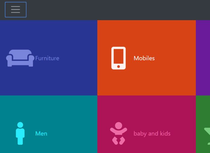
Sticky Mobile-compatible Navigation - GRT Responsive Menu
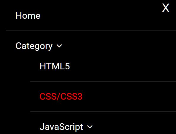
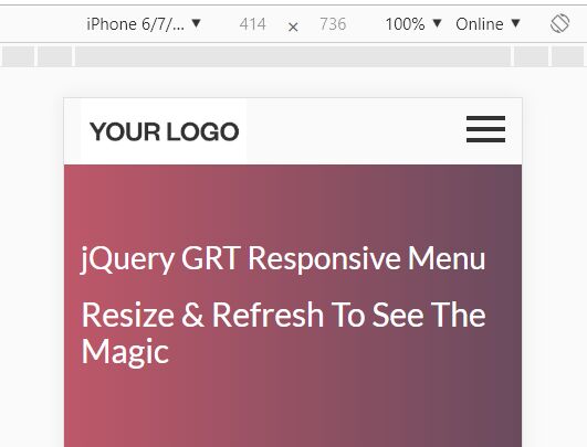
- Menu - 14162 ViewsThe GRT Responsive Menu jQuery plugin lets you create a fully responsive, mobile-friendly navigation system for your cross-platform web app.
The GRT Responsive Menu jQuery plugin lets you create a fully responsive, mobile-friendly navigation system for your cross-platform web app.
A fancy and creative Fullscreen navigation that enables a toggle button to reveal a set of differently sized menu blocks filling the screen in sequence.
A jQuery script for Bootstrap 4 that enables a hamburger button to toggle an animated, pretty nice, and fully responsive Fullscreen navigation on your Bootstrap project.
A small and mobile-friendly jQuery plugin to create a Fullscreen page slider or one page scroll webpage that enables the user to move between slides via mouse wheel or touch swipe events.
A jQuery plugin for creating a tiled photo gallery that allows to display the large images in a Fullscreen, responsive lightbox popup as you click on a thumbnail.
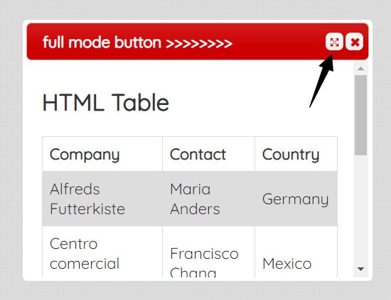
dialog.fullmode is a jQuery plugin to create an Expand button inside the jQuery UI dialog box that allows the end-user to toggle the Fullscreen mode in an easy way.
A dynamic, responsive, Fullscreen gallery where you can fade through a sequence of images by clicking on the thumbnail in the navigation carousel.
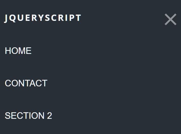
A modern responsive navigation concept that automatically collapses the horizontal header menu into a hamburger navigation on small screen devices.
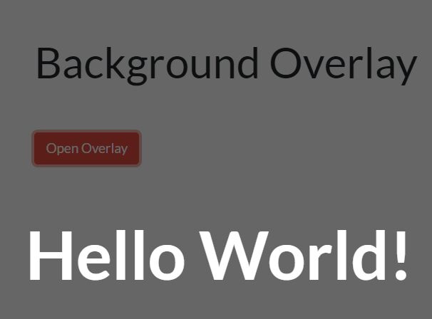
A minimal overlay system built with jQuery that displays any content in a Fullscreen overlay covering the whole page.
A smart, SEO-friendly navigation jQuery plugin that automatically transforms a nested HTML list into a Fullscreen, mobile-friendly, multi-level navigation menu.