AnythingSlider FX Demos
Demo 1: Thumbnails & A Lightbox
Demo 1 Notes
- Hover over the demo 1 slider to reveal the thumbnail navigation links - This sliding feature is part of the core AnythingSlider plugin (
toggleControlsis set to true). - Thumbnail images
- For this demo, the thumbnail images are premade; but with some server side scripting and modification to the
navigationFormattercode, you should be able to create and link to your own thumbnail images. - CSS is required to override the metallic theme CSS for thumbnail images to be visible (resize and remove negative text indentation), or you can make a new theme.
- Add images using the
navigationFormatteroption as follows:
 navigationFormatter : function(i, panel){
  return '<img src="demos/images/th-slide-' + ['civil-1', 'env-1', 'civil-2', 'env-2'][i-1] + '.jpg">';
 }
- For this demo, the thumbnail images are premade; but with some server side scripting and modification to the
- Lightbox Popup (Colorbox plugin)
- Click on the current slider image to open a light box. Press escape or click on the (X) in the lower right corner to close it.
- Additional CSS is required to modify the Colorbox plugin. The CSS expands the image to completely fill the inside the colorbox popup. Adjust as desired to keep the image proportional.
- The script attaches a colorbox popup to all images inside the slider. Add a class to the images to modify this behaviour.
- The colorbox popup will contain all the current slider images. In the script the name "group" is added to all images in the "rel" attribute. This can be done in the HTML to target only the images to be shown in the colorbox - then remove the
.attr('rel','group')in the script.
- The AnythingSlider FX extension is not required to add any of the above functionality.
Header
 <!-- jQuery -->
 <script src="http://ajax.googleapis.com/ajax/libs/jquery/1.8/jquery.min.js"></script>

 <!-- Anything Slider optional plugins -->
 <script src="js/jquery.easing.1.2.js"></script>

 <!-- Anything Slider -->
 <link href="css/anythingslider.css" rel="stylesheet">
 <script src="js/jquery.anythingslider.min.js"></script>

 <!-- ColorBox -->
 <link href="demos/colorbox/colorbox.css" rel="stylesheet">
 <script src="demos/colorbox/jquery.colorbox-min.js"></script>
CSS & HTML
 /* New in version 1.7+ */
 #slider1 {
  width: 400px;
  height: 300px;
  list-style: none;
 }
 /* CSS to expand the image to fit inside colorbox */
 #cboxPhoto { width: 100%; height: 100%; margin: 0 !important; }
 /* Change metallic theme defaults to show thumbnails */
 div.anythingControls {
  bottom: 25px; /* thumbnail images are larger than the original bullets; move it up */
 }
 .anythingSlider-metallic .thumbNav a {
  background-image: url();
  height: 30px;
  width: 30px;
  border: #000 1px solid;
  border-radius: 2px;
  -moz-border-radius: 2px;
  -webkit-border-radius: 2px;
  text-indent: 0;
 }
 .anythingSlider-metallic .thumbNav a span {
  visibility: visible; /* span changed to visibility hidden in v1.7.20 */
 }
 /* border around link (image) to show current panel */
 .anythingSlider-metallic .thumbNav a:hover,
 .anythingSlider-metallic .thumbNav a.cur {
  border-color: #fff;
 }
 /* reposition the start/stop button */
 .anythingSlider-metallic .start-stop {
  margin-top: 15px;
 }
<ul id="slider1">
  <li><img src="demos/images/slide-civil-1.jpg"></li>
  <li><img src="demos/images/slide-env-1.jpg"></li>
  <li><img src="demos/images/slide-civil-2.jpg"></li>
  <li><img src="demos/images/slide-env-2.jpg"></li>
</ul>
Script
$(function(){
 $('#slider1')
  .anythingSlider({
   toggleControls : true,
   theme          : 'metallic',
   navigationFormatter : function(i, panel){ // add thumbnails as navigation links
    return '<img src="demos/images/th-slide-' + ['civil-1', 'env-1', 'civil-2', 'env-2'][i - 1] + '.jpg">';
   }
  })
  // target all images inside the current slider
  // replace with 'img.someclass' to target specific images
  .find('.panel:not(.cloned) img') // ignore the cloned panels
   .attr('rel','group')            // add all slider images to a colorbox group
   .colorbox({
     width: '90%',
     height: '90%',
     href: function(){ return $(this).attr('src'); },
     // use $(this).attr('title') for specific image captions
     title: 'Press escape to close',
     rel: 'group'
   });
});
Demo 2: FX Extension Panel Effects
-
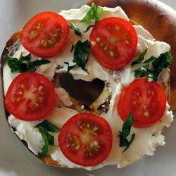
Queenie's Killer Tomato Bagel Sandwich
Ingredients
- 1 bagel, split and toasted
- 2 tablespoons cream cheese
- 1 roma (plum) tomatoes, thinly sliced
- salt and pepper to taste
- 4 leaves fresh basil
-
In awe I watched the waxing moon ride across the zenith of the heavens like an ambered chariot towards the ebon void of infinite space wherein the tethered belts of Jupiter and Mars hang forever festooned in their orbital majesty. And as I looked at all this I thought... I must put a roof on this lavatory.
~ Les Dawson
-

-
Life is conversational. Web design should be the same way. On the web, you’re talking to someone you’ve probably never met – so it’s important to be clear and precise. Thus, well structured navigation and content organization goes hand in hand with having a good conversation.
-
Demo 2 Notes
- The AnythingSlider FX extension is required to add this functionality.
- No additional CSS is required, unless it is used for a specific element (see the captions section).
- Effects Methods:
- The effects are set up so that the slider element on each panel is in its default (final) position in the "inFx" definition (element positions to zero, opacity to 1, etc) and the "outFX" definitions are set the other position the element is in to achieve the animation.
- The script binds to the "slide_init" (for "outFx" animation) and "slide_complete" (for "inFx" animation) anythingSlider events.
- The base effects are predefined shortcut methods. I have included the custom effect equivalents to these base effects in the script examples.
- Base effects:
- Base effects are standard effects:
top,bottom,left,right,fade,expand,listLR,listRL,caption-Top,caption-Right,caption-Bottom,caption-Left. - Use the base effects as follows:
 $('#slider2').anythingSliderFx({
  '.selector1' : [ 'effect(s)', 'size', 'time', 'easing' ],
  '.selector2' : [ 'effect(s)', 'size', 'time', 'easing' ]
 });
'size', 'time' and 'easing' are optional, but they must remain in that order. So if you want to add an effect time, you must also set a size -[ 'effect(s)', 'size', 'time' ]. To add an easing, all parameters must be included. - Defaults: If 'size', 'time' or 'easing' is not defined, it will be set to its default value:
- size : based on initial slider height and width
- 'inFx' time : 400 (ms)
- 'outFx' time : 350 (ms)
- easing : 'swing'
- How base effects are setup:
top,bottom,left,right: Default 'inFx' position is zero, 'outFx' position is based on the initial slider height and width.fade: Default 'inFx' has an opacity set to one, 'outFx' opacity is zero.expand: Default 'inFx' sets the width to 100%, left and right positions to 0%; the 'outFx' width is set to 10%, left and right set to 50% to somewhat center the image. When changing this size option, use percentage values, but anything more than 20% the image position will noticeably be not centered.listLR: Default 'inFx' left position is zero; 'outFx' position will make ':odd' elements move (L)eft and ':even' elements move (R)ight the width of the slider.listRL: Default 'inFx' left position is zero; 'outFx' position will make ':odd' elements move (R)ight and ':even' elements move (L)eft the width of the slider.caption-{direction}: This effect is opposite of the others. The default 'inFx' positions the element so it is in view while the 'outFx' positions the element out of view. See demo 3 for more details.
- Combine any of these standard effects as desired (e.g. "top fade"); but of course, using 'top bottom' will not work as you expect (unless you wanted to blow up your computer ;) LOL).
- Base effects are standard effects:
- Custom effects:
- Custom effects allow you to use any of the standard jQuery animation parameters (e.g. top, left, margin, padding, width, height, etc). See the examples below.
- Custom effects can be mixed in with base effects as desired.
- When using custom effects it is important that each element with an 'inFx' method has a matching 'outFx' method, or those elements will be abnormally positioned and/or disappear from view.
- Standard setup for custom effects is as follows (there is no specific order required):
$('#slider1').anythingSliderFx({ inFx : { '.selector1' : { top : 0, duration: 400, easing : 'easeOutBounce' }, '.selector2' : { left: 0, duration: 400 } }, // out = the animation that occurs when you slide "out" of a panel // (it also occurs before the "in" animation) outFx : { '.selector1' : { top : '-100px', duration: 350 }, '.selector2' : { left : '-200px' } } - Defaults: if 'time' or 'easing' is not defined in the custom effects code, it will be set to its default value:
- 'inFx' time : 400 (ms)
- 'outFx' time : 350 (ms)
- easing : 'swing'
Header
<!-- jQuery -->
 <script src="http://ajax.googleapis.com/ajax/libs/jquery/1.8/jquery.min.js"></script>

 <!-- Anything Slider optional plugins -->
 <script src="js/jquery.easing.1.2.js"></script>

 <!-- Anything Slider -->
 <link href="css/anythingslider.css" rel="stylesheet">
 <script src="js/jquery.anythingslider.min.js"></script>

 <!-- Anything Slider optional FX extension -->
 <script src="js/jquery.anythingslider.fx.min.js"></script>
CSS & HTML
/* New in version 1.7+ */
 #slider2 {
  width: 600px;
  height: 350px;
  list-style: none;
 }
There is no change from the standard HTML setup, unless you want to add more specific classes so you can target them with effects.<ul id="slider2">
<li class="panel1">
<div class="textSlide">
<img src="demos/images/251356.jpg" alt="tomato sandwich" style="float: right;
margin: 0 0 2px 10px;">
<h3>Queenie's Killer Tomato Bagel Sandwich</h3>
<h4>Ingredients</h4>
<ul>
<li>1 bagel, split and toasted</li>
<li>2 tablespoons cream cheese</li>
<li>1 roma (plum) tomatoes, thinly sliced</li>
<li>salt and pepper to taste</li>
<li>4 leaves fresh basil</li>
</ul>
</div>
</li>
<li class="panel2">
<div class="quoteSlide">
<blockquote>In awe I watched the waxing moon ride across the zenith of
the heavens like an ambered chariot towards the ebon void of infinite space
wherein the tethered belts of Jupiter and Mars hang forever festooned in
their orbital majesty. And as I looked at all this I thought... I must put
a roof on this lavatory.<br>-- Les Dawson</blockquote>
</div>
</li>
<li class="panel3">
<img class="expand" src="demos/images/slide-tele-1.jpg" alt="">
</li>
<li class="panel4">
<div class="quoteSlide">
<blockquote>Life is conversational. Web design should be the same way.
On the web, you’re talking to someone you’ve probably
never met – so it’s important to be clear and precise.
Thus, well structured navigation and content organization goes hand in hand
with having a good conversation.</blockquote>
<p>
- <a href='http://quotesondesign.com/chikezie-ejiasi/'>Chikezie Ejiasi</a>
</p>
</div>
</li>
<li class="panel5">
<img class="fade" src="demos/images/slide-tele-2.jpg" alt="">
</li>
</ul>
Script - FX addon, using base FX
$(function(){
 $('#slider2') // Demo 2 code, using FX base effects
  .anythingSlider({
   resizeContents      : false,
   navigationFormatter : function(i, panel){
    return ['Recipe', 'Quote', 'Image', 'Quote #2', 'Image #2', 'Test'][i - 1];
   }
  })
  .anythingSliderFx({
    // base FX definitions
    // '.selector' : [ 'effect(s)', 'size', 'time', 'easing' ]
    // 'size', 'time' and 'easing' are optional parameters, but must be kept in order if added
    '.quoteSlide:first > *' : [ 'grow', '24px', '400', 'easeInOutCirc' ],
    '.quoteSlide:last'      : [ 'top', '500px', '400', 'easeOutElastic' ],
    '.expand'               : [ 'expand', '10%', '400', 'easeOutBounce' ],
    '.textSlide h3'         : [ 'top fade', '200px', '500', 'easeOutBounce' ],
    '.textSlide img,.fade'  : [ 'fade' ],
    '.textSlide li'         : [ 'listLR' ]
  });
});
* Note: Each definition should end with a comma except for the last - see examples above.
Script - FX addon, using custom FX
$(function(){
 $('#slider2') // Demo 2 code, using FX full control
  .anythingSlider({
   resizeContents      : false,
   navigationFormatter : function(i, panel){
    return ['Recipe', 'Quote', 'Image', 'Quote #2', 'Image #2', 'Test'][i - 1];
   }
  })
  .anythingSliderFx({
   // base FX definitions can be mixed and matched in here too.
   '.fade' : [ 'fade' ],

   // for more precise control, use the "inFx" and "outFx" definitions
   // inFx = the animation that occurs when you slide "in" to a panel
   inFx : {
    '.textSlide h3'  : { opacity: 1, top  : 0, duration: 400, easing : 'easeOutBounce' },
    '.textSlide li'  : { opacity: 1, left : 0, duration: 400 },
    '.textSlide img' : { opacity: 1, duration: 400 },
    '.quoteSlide'    : { top : 0, duration: 400, easing : 'easeOutElastic' },
    '.expand'        : { width: '100%', top: '0%', left: '0%', duration: 400, easing : 'easeOutBounce' }
   },
   // out = the animation that occurs when you slide "out" of a panel
   // (it also occurs before the "in" animation)
   outFx : {
    '.textSlide h3'      : { opacity: 0, top  : '-100px', duration: 350 },
    '.textSlide li:odd'  : { opacity: 0, left : '-200px', duration: 350 },
    '.textSlide li:even' : { opacity: 0, left : '200px',  duration: 350 },
    '.textSlide img'     : { opacity: 0, duration: 350 },
    '.quoteSlide:first'  : { top : '-500px', duration: 350 },
    '.quoteSlide:last'   : { top : '500px', duration: 350 },
    '.expand'            : { width: '10%', top: '50%', left: '50%', duration: 350 }
   }
  });
});
* Note: Each definition should end with a comma except for the last - see examples above.
Demo 3: Sliding Captions
-
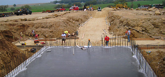
In Soviet Russia, concrete pours you!
-
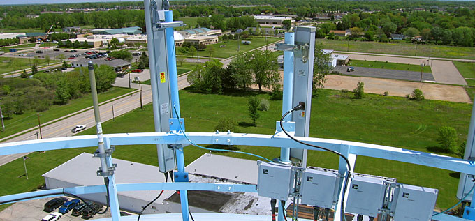
 How many supervisors are there? Wrong! 5, who is taking the picture?
 -
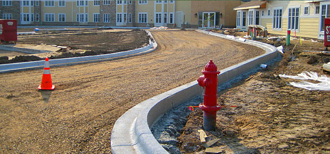 Alas, the pylon would never make it to the hydrant, her true love.
 -
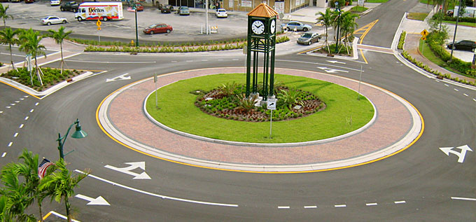 Take a left at the traffic circle.
Demo 3 Notes
- CSS
- The image needs to be set to 100% height and width because AnythingSlider will only automatically expand solitary objects; but here we have a caption!
- Note the caption widths & heights include the padding, so for example the top & bottom caption height is set to 30px instead of 50px to include the 10px padding... same goes for the height of all the captions.
- If you are using the close button script, make sure you use the full width and/or height (include padding) as well.
- In the HTML, note that the top caption comes before the image; whereas the bottom, left and right caption HTML comes after.
- Script
- Hover to show caption
- This code will reveal a caption when hovering over a slider panel, and hide on mouse out.
- There is a lot of extra code, for captions in multiple positions, so ideally remove the unused portions to maximize the efficiency of the code.
- This script does not need the AnythingSlider FX extension.
- Slide in caption on new panel
- This code reveals a caption when a new panel comes into view.
- Code examples are included below to show and reveal captions using base and custom FX. These code examples reveal the caption when the panel comes into view and hide it as it scrolls out of view.
- A short additional script adds a close button (x) to each caption to allow closing the caption while on a specific panel. CSS to position the button is needed and included.
- The script needs to hide the caption when out of view (especially for right and left captions) otherwise they interfere with other panels of the slider.
- Hover to show caption
Header
 <!-- jQuery -->
 <script src="http://ajax.googleapis.com/ajax/libs/jquery/1.8/jquery.min.js"></script>

 <!-- Anything Slider optional plugins -->
 <script src="js/jquery.easing.1.2.js"></script>

 <!-- Anything Slider -->
 <link href="css/anythingslider.css" rel="stylesheet">
 <script src="js/jquery.anythingslider.min.js"></script>

 <!-- Anything Slider optional FX extension -->
 <script src="js/jquery.anythingslider.fx.min.js"></script>
CSS
/* New in version 1.7+ */
 #slider3 {
  width: 500px;
  height: 400px;
  list-style: none;
 }
 /* images with caption */
 #slider3 img {
  width: 100%;
  height: 100%;
 }
 /* position the panels so the captions appear correctly */
 #slider3 .panel { position: relative; }
 /* captions */
 #slider3 .caption-top, #slider3 .caption-right,
 #slider3 .caption-bottom, #slider3 .caption-left {
  background: #000;
  color: #fff;
  padding: 10px;
  margin: 0;
  position: relative;
  z-index: 10;
  opacity: .8;
  filter: alpha(opacity=80);
 }
 /* Top caption - padding is included in the width (480px here, 500px in the script), same for height */
 #slider3 .caption-top {
  left: 0;
  top: 0;
  width: 480px;
  height: 30px;
 }
 /* Right caption - padding is included in the width (130px here, 150px in the script), same for height */
 #slider3 .caption-right {
  right: 0;
  bottom: 0;
  width: 130px;
  height: 180px;
 }
 /* Bottom caption - padding is included in the width (480px here, 500px in the script), same for height */
 #slider3 .caption-bottom {
  left: 0;
  bottom: 0;
  width: 480px;
  height: 30px;
 }
 /* Left caption - padding is included in the width (130px here, 150px in the script), same for height */
 #slider3 .caption-left {
  left: 0;
  bottom: 0;
  width: 130px;
  height: 180px;
 }
 /* Caption close button */
 .caption-top .close, .caption-right .close,
 .caption-bottom .close, .caption-left .close {
  font-size: 80%;
  cursor: pointer;
  float: right;
  display: inline-block;
 }
HTML
 <ul id="slider3">
  <li>
   <!-- Note this caption is before the image, all others it is after -->
   <div class="caption-top">
    In Soviet Russia, concrete pours you!
   </div>
   <img src="demos/images/slide-civil-1.jpg" alt="">
  </li>
  <li>
   <img src="demos/images/slide-env-1.jpg" alt="">
   <div class="caption-right">
    How many supervisors are there? Wrong! 5, who is taking the picture?
   </div>
  </li>
  <li>
   <img src="demos/images/slide-civil-2.jpg" alt="">
   <div class="caption-bottom">
    Alas, the pylon would never make it to the hydrant, her true love.
   </div>
  </li>
  <li>
   <img src="demos/images/slide-env-2.jpg" alt="">
   <div class="caption-left">
    Take a left at the traffic circle.
   </div>
  </li>
 </ul>
Script - Caption appears on hover (FX extension not required)
$(function(){
 $('#slider3')
  .anythingSlider()
  /* this code will make the caption appear when you hover over the panel
    remove the extra statements if you don't have captions in that location */
  .find('.panel')
    .find('div[class*=caption]').css({ position: 'absolute' }).end()
    .hover(function(){ showCaptions( $(this) ) }, function(){ hideCaptions( $(this) ); });

  showCaptions = function(el){
    var $this = el;
    if ($this.find('.caption-top').length) {
      $this.find('.caption-top')
        .show()
        .animate({ top: 0, opacity: 1 }, 400);
    }
    if ($this.find('.caption-right').length) {
      $this.find('.caption-right')
        .show()
        .animate({ right: 0, opacity: 1 }, 400);
    }
    if ($this.find('.caption-bottom').length) {
      $this.find('.caption-bottom')
        .show()
        .animate({ bottom: 0, opacity: 1 }, 400);
    }
    if ($this.find('.caption-left').length) {
      $this.find('.caption-left')
        .show()
        .animate({ left: 0, opacity: 1 }, 400);
    }
  };
  hideCaptions = function(el){
    var $this = el;
    if ($this.find('.caption-top').length) {
      $this.find('.caption-top')
        .stop()
        .animate({ top: -50, opacity: 0 }, 350, function(){
          $this.find('.caption-top').hide(); });
    }
    if ($this.find('.caption-right').length) {
      $this.find('.caption-right')
        .stop()
        .animate({ right: -150, opacity: 0 }, 350, function(){
          $this.find('.caption-right').hide(); });
    }
    if ($this.find('.caption-bottom').length) {
      $this.find('.caption-bottom')
        .stop()
        .animate({ bottom: -50, opacity: 0 }, 350, function(){
          $this.find('.caption-bottom').hide(); });
    }
    if ($this.find('.caption-left').length) {
      $this.find('.caption-left')
        .stop()
        .animate({ left: -150, opacity: 0 }, 350, function(){
          $this.find('.caption-left').hide(); });
    }
  };

  // hide all captions initially
  hideCaptions( $('#slider3 .panel') );
});
Script - FX addon, using base FX
$(function(){
 $('#slider3')
  .anythingSlider()
  .anythingSliderFx({
   // '.selector' : [ 'caption', 'distance/size', 'time', 'easing' ]
   // 'distance/size', 'time' and 'easing' are optional parameters
   '.caption-top'    : [ 'caption-Top', '50px' ],
   '.caption-right'  : [ 'caption-Right', '130px', '1000', 'easeOutBounce' ],
   '.caption-bottom' : [ 'caption-Bottom', '50px' ],
   '.caption-left'   : [ 'caption-Left', '130px', '1000', 'easeOutBounce' ]
  })
  /* add a close button (x) to the caption */
  .find('div[class*=caption]')
    .css({ position: 'absolute' })
    .prepend('<span class="close">x</span>')
    .find('.close').click(function(){
      var cap = $(this).parent(),
       ani = { bottom : -50 }; // bottom
      if (cap.is('.caption-top')) { ani = { top: -50 }; }
      if (cap.is('.caption-left')) { ani = { left: -150 }; }
      if (cap.is('.caption-right')) { ani = { right: -150 }; }
      cap.animate(ani, 400, function(){ cap.hide(); } );
    });
});
Script - FX addon, using custom FX
$(function(){
 $('#slider3')
  .anythingSlider()
  /* this "custom" code is the equivalent of the base caption functions */
  .anythingSliderFx({
   inFx: {
    '.caption-top'    : { top: 0, opacity: 0.8, duration: 400 },
    '.caption-right'  : { right: 0, opacity: 0.8, duration: 400 },
    '.caption-bottom' : { bottom: 0, opacity: 0.8, duration: 400 },
    '.caption-left'   : { left: 0, opacity: 0.8, duration: 400 }
   },
   outFx: {
    '.caption-top'    : { top: -50, opacity: 0, duration: 350 },
    '.caption-right'  : { right: -150, opacity: 0, duration: 350 },
    '.caption-bottom' : { bottom: -50, opacity: 0, duration: 350 },
    '.caption-left'   : { left: -150, opacity: 0, duration: 350 }
   }
  })
  /* add a close button (x) to the caption */
  .find('div[class*=caption]')
    .css({ position: 'absolute' })
    .prepend('<span class="close">x</span>')
    .find('.close').click(function(){
     var cap = $(this).parent(),
       ani = { bottom : -50 }; // bottom
      if (cap.is('.caption-top')) { ani = { top: -50 }; }
      if (cap.is('.caption-left')) { ani = { left: -150 }; }
      if (cap.is('.caption-right')) { ani = { right: -150 }; }
      cap.animate(ani, 400, function(){ cap.hide(); } );
    });
});