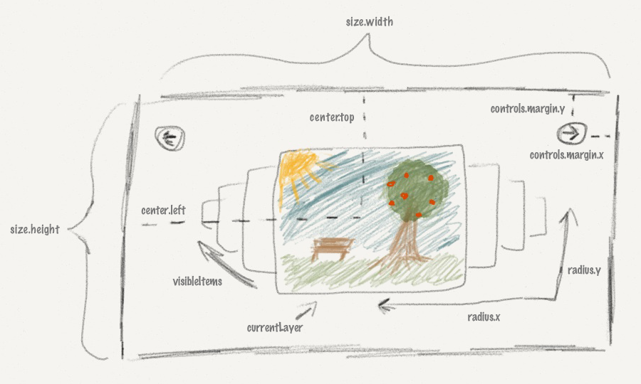
Options

| Key | Default value | Description |
|---|---|---|
| radius |
{ x: 300, y: 300 }
|
The radius the rondell animation will use |
| center |
{ left: 400, top: 350 }
|
The center of the rondell animation |
| size | { width: null, height: null } | Optional Will be computed by using the values of the center option if left unset |
| scaling | 2 | Scaled size of the focused item |
| opacityMin | 0.05 | Items with opacity smaller than this will be hidden |
| zIndex | 1000 | All elements of the rondell will use this z-index and add their depth to it |
| fadeTime | 300 | Animation time |
| keyDelay | 300 | Minimal time between keystrokes fire slide events |
| lightbox |
{
    enabled: true
}
|
Opens the integrated lightbox on click (disabled for presets pages and scroller) |
| currentLayer | 0 | Index of the item which should be focused at the start. If left at 0 it will automatically be set to half the item count. |
| resizeableClass | 'resizeable' | img tags with this class are resized when animated |
| smallClass | 'itemSmall' | css class for unfocused items |
| hiddenClass | 'itemHidden' | css class for hidden items |
| visibleItems | 'auto' | How many items should be visible in each direction |
| switchIndices | false | Enables switching the index of the last and new focused item. |
| keyDelay | 300 | Minimum time between keypress events are registered. |
| wrapIndices | true | Enabled index wrapping (used for carousels). |
| alwaysShowCaption | false | Should the overlay always be shown. By default it's only shown when hovering the rondell. |
| repeating | true | Rondell will cycle forever |
| itemProperties |
{
    delay: 100,
    cssClass: 'rondellItem',
    size: {
        width: 150,
        height: 150
    },
    sizeFocused: {
        width: 0,
        height: 0
    }
}
|
delay is an offset between the start of the animation for each item when all items shift. cssClass is the class which each item gets after initializing. size is the standard size for non-focused items. sizeFocused is the size of the focused element and will be calculated automatically from the scaling parameter if not set or 0. |
| autoRotation |
{
  enabled: false,
  direction: 0,
  once: false,
  delay: 5000
}
|
Set enabled to true if you want the rondell to spin every few seconds. Set direction to 1 if you want the rondell to rotate to the right in autorotation mode. Set once to true if the rondell should not start autorotation after the user has hovered the rondell. delay is the time between rotation steps. |
| controls |
{
  enabled: true,
  fadeTime: 400,
  margin: {
      x: 20,
      y: 20
  }
}
|
Set enabled to false if you want to use custom controls. fadeTime controls the animation speed for the built-in controls when hovering over the rondell. margin controls the distance of the prev and next button to the sides of the rondell. |
| strings |
{
  prev: 'prev',
  next: 'next'
}
|
Strings for the built-in controls. |
| funcEase | 'easeInOutQuad' | jQuery easing function name for the movement of items |
| touch |
{
  enabled: true,
  preventDefaults: true,
  threshold: 100
}
|
Touch controls for swiping on mobile devices are enabled by default. preventDefaults will prevent clicking and scrolling while your swipe. threshold is the distance in pixels the finger has to travel, before a swipe is registered. |
| theme | default | Theme which will be used for the rondell. The rondell css file already includes some themes: default, light, dark, page Take a look at the jquery.rondell.css if you want to customize a theme. |
| preset | - | The plugin contains some presets for the options to help you get started with your own rondell. The current presets are based on the examples on this page and include: carousel, scroller, pages, cubic, gallery, thumbGallery |
| randomStart | false | Will select a random item to start with. |
funcLeft funcTop funcOpacity funcSize funcDiff |
see presets source | These functions will be called by the plugin when animating the rondell items. At first funcDiff is called for each item with the absolute distance from the center item to calculate the relative distance between the items. The second parameter is the rondell object itself. The return value will be used to call the other four functions. Each with the new relative distance as first parameter and the rondell object as second parameter. The rondell object can be used to access all of the options in the rondell. I will provide an in-depth tutorial at a later date. In the meantime please use the advanced examples as a base for your own customization or send me a message and I'll try to help. |
| showContainer | true | When the plugin has finished loading it will automatically show the parent of the items you selected. This is for removing the glitch when the plugin takes to long to load and all your items are shown one under another. You should set the css of your items container to display:none. |
| scrollbar |
{
  enabled: false,
  orientation: "bottom",
  start: 1,
  end: 100,
  stepSize: 1,
  position: 1,
  padding: 10,
  style: {
    width: "100%",
    height: 20,
    left: "auto",
    right: "auto",
    top: "auto",
    bottom: "auto"
  },
  repeating: false,
  onScroll: undefined,
  scrollOnHover: false,
  scrollOnDrag: true,
  animationDuration: 300,
  easing: "easeInOutQuad"
}
|
Scrollbar options description will be updated later when it's final. |