Elements Stack Effect with Pure CSS3
| File Size: | 684 KB |
|---|---|
| Views Total: | 5620 |
| Last Update: | |
| Publish Date: | |
| Official Website: | Go to website |
| License: | MIT |
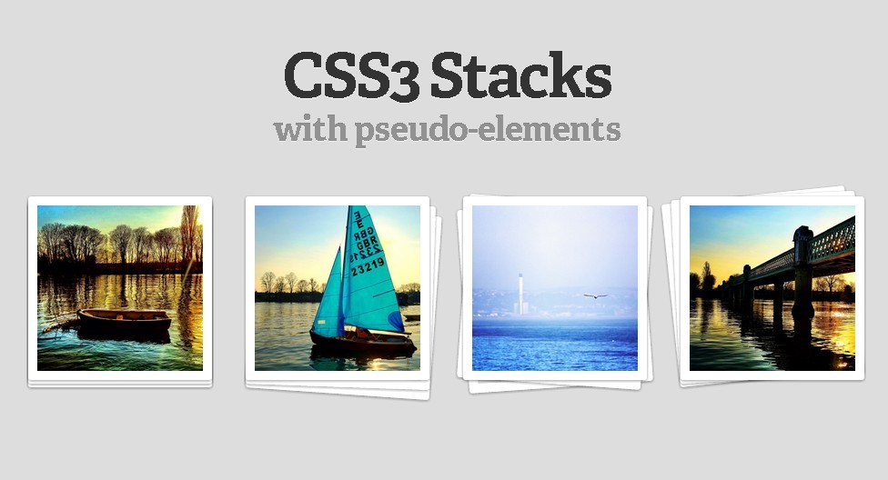
By using CSS3 Pseudo-Elements, we can create the Illusion of Stacked Elements.
How to use it :
1. Markup
<div class="stack">
    <img src="image1.jpg" />
</div>
2. The CSS
.stack { position: relative; z-index: 10; }

/* Image styles */
.stack img { max-width: 100%; height: auto; vertical-align: bottom; border: 10px solid #fff; border-radius: 3px;
    -webkit-box-sizing: border-box;
    -moz-box-sizing: border-box;
    box-sizing: border-box;
    -webkit-box-shadow: 0 1px 4px rgba(0, 0, 0, 0.4);
    -moz-box-shadow: 0 1px 4px rgba(0, 0, 0, 0.4);
    box-shadow: 0 1px 4px rgba(0, 0, 0, 0.4);
}

/* Stacks creted by the use of generated content */
.stack:before, .stack:after { content: ""; border-radius: 3px; width: 100%; height: 100%; position: absolute; border: 10px solid #fff; left: 0;
    -webkit-box-sizing: border-box;
    -moz-box-sizing: border-box;
    box-sizing: border-box;
    -webkit-box-shadow: 0 1px 4px rgba(0, 0, 0, 0.4);
    -moz-box-shadow: 0 1px 4px rgba(0, 0, 0, 0.4);
    box-shadow: 0 1px 4px rgba(0, 0, 0, 0.4);
    -webkit-transition: 0.3s all ease-out;
    -moz-transition: 0.3s all ease-out;
    transition: 0.3s all ease-out;
}
.stack:before { top: 4px; z-index: -10; } /* 1st element in stack (behind image) */
.stack:after { top: 8px; z-index: -20; } /* 2nd element in stack (behind image) */
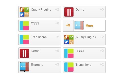
This awesome jQuery plugin is developed by unknown. For more Advanced Usages, please check the demo page or visit the official website.