Collection of 20+ Subtle & Modern Link Effects with Pure CSS3
| File Size: | 19KB |
|---|---|
| Views Total: | 12205 |
| Last Update: | |
| Publish Date: | |
| Official Website: | Go to website |
| License: | MIT |
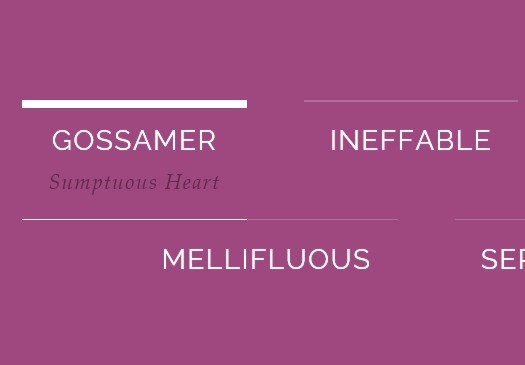
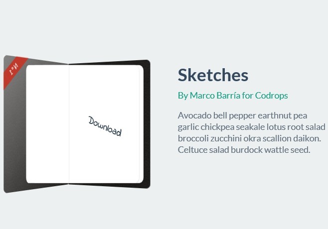
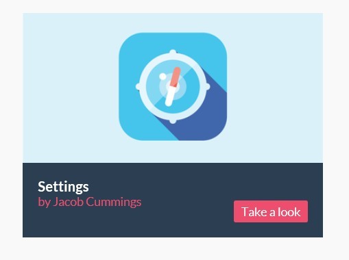
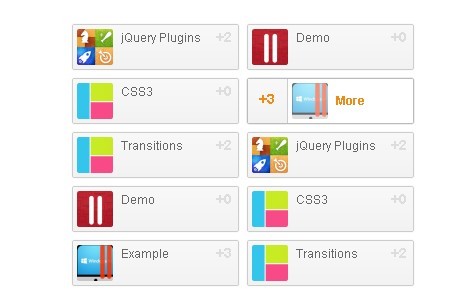
In this post written by MARY LOU we're going to creating more than 21+ subtle and modern link effects (sliding, flipping, 3D rotation, etc) using CSS3 transitions on pseudo-elements.
How to use it:
1. Create the html
<nav class="cl-effect-1" id="cl-effect-1">
<a href="#cl-effect-1">Link 1</a>
<a href="#cl-effect-1">Link 2</a>
<a href="#cl-effect-1">Link 3</a>
...
</nav>
2. The CSS
nav a {
position: relative;
display: inline-block;
margin: 15px 25px;
outline: none;
color: #fff;
text-decoration: none;
text-transform: uppercase;
letter-spacing: 1px;
font-weight: 400;
text-shadow: 0 0 1px rgba(255,255,255,0.3);
font-size: 1.35em;
}
nav a:hover, nav a:focus {
outline: none;
}
/* Effect 1: Brackets */
.cl-effect-1 a::before, .cl-effect-1 a::after {
display: inline-block;
opacity: 0;
-webkit-transition: -webkit-transform 0.3s, opacity 0.2s;
-moz-transition: -moz-transform 0.3s, opacity 0.2s;
transition: transform 0.3s, opacity 0.2s;
}
.cl-effect-1 a::before {
margin-right: 10px;
content: '[';
-webkit-transform: translateX(20px);
-moz-transform: translateX(20px);
transform: translateX(20px);
}
.cl-effect-1 a::after {
margin-left: 10px;
content: ']';
-webkit-transform: translateX(-20px);
-moz-transform: translateX(-20px);
transform: translateX(-20px);
}
.cl-effect-1 a:hover::before, .cl-effect-1 a:hover::after, .cl-effect-1 a:focus::before, .cl-effect-1 a:focus::after {
opacity: 1;
-webkit-transform: translateX(0px);
-moz-transform: translateX(0px);
transform: translateX(0px);
}
This awesome jQuery plugin is developed by codrops. For more Advanced Usages, please check the demo page or visit the official website.
