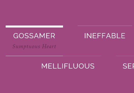
Pure CSS3 Animated Sliding Menu
| File Size: | 2.3 MB |
|---|---|
| Views Total: | 4824 |
| Last Update: | |
| Publish Date: | |
| Official Website: | Go to website |
| License: | MIT |
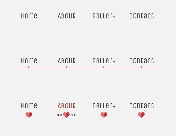
A Fancy Menu Effect using css3 transitions and the general sibling combinator selector that allows you to create a sliding menu with Lavalamp-like effect.
How to use it:
1. markup
<div class="ph-line-nav nav">
<a href="#">Home</a>
<a href="#">About</a>
<a href="#">Gallery</a>
<a href="#">Contact</a>
<div class="effect"></div>
</div>
2. CSS
/* --- for all three examples ----*/

.nav {
text-align: center;
overflow: hidden;
margin: 2em auto;
width: 480px;
position: relative;
}
.nav a {
display: block;
position: relative;
float: left;
padding: 1em 0 2em;
width: 25%;
text-decoration: none;
color: #393939;
-webkit-transition: .7s;
-moz-transition: .7s;
-o-transition: .7s;
-ms-transition: .7s;
transition: .7s;
}
.nav a:hover {
color: #c6342e;
}
.effect {
position: absolute;
left: -12.5%;
-webkit-transition: 0.7s ease-in-out;
-moz-transition: 0.7s ease-in-out;
-o-transition: 0.7s ease-in-out;
-ms-transition: 0.7s ease-in-out;
transition: 0.7s ease-in-out;
}
.nav a:nth-child(1):hover ~ .effect {
left: 12.5%;
}
.nav a:nth-child(2):hover ~ .effect {
left: 37.5%;
}
.nav a:nth-child(3):hover ~ .effect {
left: 62.5%;
}
.nav a:nth-child(4):hover ~ .effect {
left: 87.5%;
}
/* ----- line example -----*/

.ph-line-nav .effect {
width: 90px;
height: 2px;
bottom: 36px;
background: #c6342e;
box-shadow: 0 1px 0 white;
margin-left: -45px;
}/* --- for all three examples ----*/

.nav {
text-align: center;
overflow: hidden;
margin: 2em auto;
width: 480px;
position: relative;
}
.nav a {
display: block;
position: relative;
float: left;
padding: 1em 0 2em;
width: 25%;
text-decoration: none;
color: #393939;
-webkit-transition: .7s;
-moz-transition: .7s;
-o-transition: .7s;
-ms-transition: .7s;
transition: .7s;
}
.nav a:hover {
color: #c6342e;
}
.effect {
position: absolute;
left: -12.5%;
-webkit-transition: 0.7s ease-in-out;
-moz-transition: 0.7s ease-in-out;
-o-transition: 0.7s ease-in-out;
-ms-transition: 0.7s ease-in-out;
transition: 0.7s ease-in-out;
}
.nav a:nth-child(1):hover ~ .effect {
left: 12.5%;
}
.nav a:nth-child(2):hover ~ .effect {
left: 37.5%;
}
.nav a:nth-child(3):hover ~ .effect {
left: 62.5%;
}
.nav a:nth-child(4):hover ~ .effect {
left: 87.5%;
}
/* ----- line example -----*/

.ph-line-nav .effect {
width: 90px;
height: 2px;
bottom: 36px;
background: #c6342e;
box-shadow: 0 1px 0 white;
margin-left: -45px;
}
3. Done
This awesome jQuery plugin is developed by unknown. For more Advanced Usages, please check the demo page or visit the official website.
