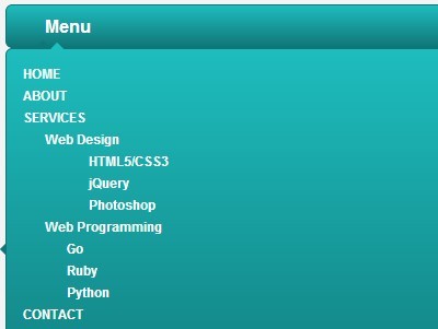
Mobile-Friendly & Multi-level Dropdown menu with jQuery
- Menu - 5892 ViewsA responsive, mobile-friendly, animated, multi-level navigation that automatically transforms to a vertical dropdown toggle menu when it reaches a CSS breakpoint.
A responsive, mobile-friendly, animated, multi-level navigation that automatically transforms to a vertical dropdown toggle menu when it reaches a CSS breakpoint.
Just another jQuery responsive menu plugin that turns the regular navigation menu into a mobile-friendly toggle menu when the screen size reaches a predefined breakpoint.
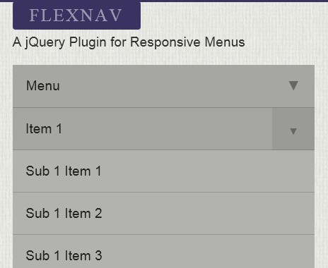
Flexnav is a responsive, Touch-Friendly and cross-browser jQuery drop down menu plugin that has support for unlimited sub-menus and works nice in both desktop and mobile layouts.
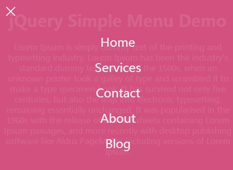
A simple responsive jQuery navigation plugin that allows you to reveal a fullscreen menu with an animated hamburger button powered by CSS3 transitions and transforms.
A jQuery responsive menu plugin which transform a normal horizontal navigation menu into an off-canvas toggle menu on smaller screen devices.
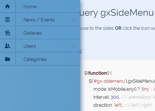
gxSidemenu is a responsive, mobile-friendly side menu plugin for revealing a multi-level sliding offscreen navigation triggered by custom events.
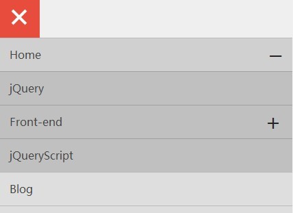
A small JQuery script that transforms a regular multi-level dropdown menu into a fixed navigation bar with a toggle icon on mobile devices.
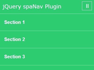
spaNav is a lightweight jQuery plugin for generating a sticky top navigation bar which allows to smoothly scroll to different sections of your one page website/App.
A jQuery & CSS3 based off-canvas navigation menu that pushes the main page to the right when toggled.
A stylish responsive jQuery navigation script that converts a horizontal navigation bar into a toggleable off-canvas menu on small screen devices.