Responsive jQuery Navigation For One Page Scrolling Website - spaNav
| File Size: | 8 KB |
|---|---|
| Views Total: | 5916 |
| Last Update: | |
| Publish Date: | |
| Official Website: | Go to website |
| License: | MIT |
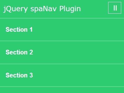
spaNav is a lightweight jQuery plugin for generating a sticky top navigation bar which allows to smoothly scroll to different sections of your one page website/App. The plugin is mobile-friendly and fully responsive so that you will see a dropdown toggle menu instead of horizontal nav bar on small screen devices.
How to use it:
1. Include jQuery library and the jQuery spaNav plugin at the bottom of your web page.
<script src="http://ajax.googleapis.com/ajax/libs/jquery/1.11.1/jquery.min.js"></script>
<script src="jquery.spaNav.js"></script>
2. Create the navigation bar as follows.
<nav>
  <div class="inner">
    <input id="navTrigger" type="checkbox" />
    <label for="navTrigger"><span>=</span></label>
    <ul>
      <li><a href="#section-1">Section 1</a></li>
      <li><a href="#section-2">Section 2</a></li>
      <li><a href="#section-3">Section 3</a></li>
    </ul>
  </div>
</nav>
3. Wrap your sections in a wrapper element.
<div id="wrapper">

  <section id="section-1">

    Section 1

  </section>

  <section id="section-2">

    Section 2

  </section>

  <section id="section-3">

    Section 3

  </section>

</div>
4. Initialize the plugin.
$('body > nav').spaNav({
wrapper: '#wrapper'
});
5. The sample CSS for the responsive navigation.
nav {
  position: relative;
  top: 0;
  left: 0;
  width: 100%;
  height: 4em;
  padding: 1em 0;
  background: #2ecc71;
  color: #fff;
  -webkit-transition: all 0.2s 0.2s ease-out;
  transition: all 0.2s 0.2s ease-out;
  overflow: visible;
  z-index: 2;
}

nav h1 { margin: 0; }

nav input#navTrigger { display: none; }

nav input#navTrigger + label {
  float: right;
  padding: 0 .25em;
  margin: -0.25em 0;
  font-size: 2em;
  border: 1px solid;
  opacity: 0.5;
  cursor: pointer;
}

nav input#navTrigger + label:hover { opacity: 1; }

nav input#navTrigger + label span {
  display: block;
  -webkit-transition: all 0.2s ease-out;
  transition: all 0.2s ease-out;
}

nav input#navTrigger:checked + label span {
  -webkit-transform: rotate(90deg);
  -moz-transform: rotate(90deg);
  -ms-transform: rotate(90deg);
  transform: rotate(90deg);
  margin: 0 -0.1em 0 0.1em;
}

nav ul {
  display: none;
  position: absolute;
  top: 3em;
  left: 0;
  right: 0;
  padding: 0;
}

nav ul li { display: block; }

nav ul li a {
  display: block;
  padding: 1.333em;
  font: bold 1.333em/1em "CentraleSans-Light", Arial, Helvetica, sans-serif;
  background: #2ecc71;
  border: 1px solid rgba(255, 255, 255, 0.5);
  border-width: 0 0 1px 0;
  color: #fff;
  outline: 0;
}

nav ul li a:hover { background: #27ae60; }

nav ul li:first-child a { border-width: 1px 0; }

nav input#navTrigger:checked ~ ul { display: block; }

/* Responsive styles */


html { min-width: 320px; }
 @media only screen and (min-width: 769px) {

section,
 header,
 footer { padding: 5em 0; }

header { padding: 16em 0 10em; }

nav {
  position: fixed;
  height: 6em;
  overflow: hidden;
}

nav h1 { text-align: center; }

nav h1 strong { display: block; }

nav label { display: none; }

nav.sticky {
  height: 4em;
  padding: 0;
}

nav ul {
  position: relative;
  top: 0;
  display: block;
  float: right;
  margin: -1em 0;
}

nav ul li {
  float: left;
  margin: 0 .2em;
}

nav ul li a {
  display: block;
  padding: 0 1em;
  height: 6em;
  line-height: 6em;
  font-size: 1em;
  background: none;
  color: #fff;
  border: 0;
}

nav ul li a.active {
  background: #fff;
  color: #222;
}

#wrapper {
  position: relative;
  z-index: 1;
}
}
6. All the default settings.
navOffset : $nav.css('position') == 'fixed' ? $nav.position().top : $nav.offset().top: breakpoint for adding/removing 'sticky' classsectionOffset : 0: offset (in px) added to sections - can be negativechangeHash : true: affect page address bar or notnavActivityClass : 'active': navigation activity classsectionActivityClass : 'active': sections activity classstickyClass : 'sticky': class added to navigation when body offest is bigger than nav heightscrollTime : 500: scroll time to element [ms]centerOffset : true: if true we activate/naviagate to section in middle of the page in case it's lower than viewportclearSectionActivity : false: whether to clear section activity class on section leave or not
Change logs:
2014-11-05
- Added option to configure additional sections offset
2014-11-05
- update and fix.
2014-09-26
- Added support for iOS scroll and fixed error with scrolling to bottom of the page when there are no sections
2014-09-16
- Fixed bug with script crush when there's a link with an anchor (#) to non-existing element
2014-08-05
- Added setting to indicate whether to remove activity class on section leave or not
2014-08-04
- resolved problem with sticky class adding
2014-07-29
- Bug fix [minor]: offset is now pared to int cause it used to happen that on $nav link click hash didn't change
This awesome jQuery plugin is developed by norin89. For more Advanced Usages, please check the demo page or visit the official website.


