Smart SEO-friendly Mobile Menu Plugin - jQuery smobileMenu
| File Size: | 9.67 KB |
|---|---|
| Views Total: | 1449 |
| Last Update: | |
| Publish Date: | |
| Official Website: | Go to website |
| License: | MIT |
A smart, SEO-friendly navigation jQuery plugin that automatically transforms a nested HTML list into a fullscreen, mobile-friendly, multi-level navigation menu.
How to use it:
1. To get started, include jQuery and other required resources on the web page.
<!-- Core -->
<link rel="stylesheet" href="dist/css/smart-mobile-menu.css">
<!-- Theme -->
<link rel="stylesheet" href="dist/css/smm-theme-default.css">
<!-- jQuery -->
<script src="/path/to/jquery.min.js"></script>
<!-- Plugin -->
<script src="dist/js/smart-mobile-menu.js"></script>
2. Add the following data attributes to the regular list based navigation menu:
- data-smart-menu: trigger element to toggle the mobile menu
- data-smart-menu-active-auto: auto open submenus
- data-smart-menu-dropdown: enable/disable submenus
- data-smart-menu-theme: theme name
- data-smm-hidden: hide the menu in the mobile menu
- data-smm-dropdown: enable/disable submenus in the mobile menu
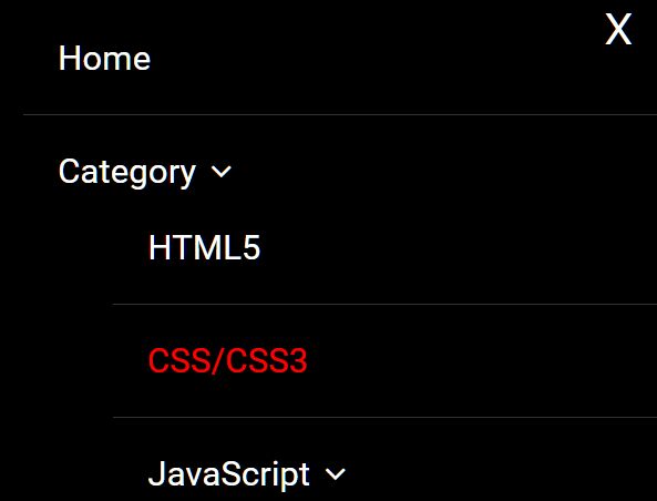
<ul id="menu"
    data-smart-menu="#open_mobile_menu"
    data-smart-menu-active-auto="true"
    data-smart-menu-dropdown="true"
    data-smart-menu-theme="default">
  <li><a href="#">Home</a></li>
  <li class='test' data-smm-hidden="true"><a href="#">Portfolio</a></li>
  <li>
    <a href="#">Category</a>
    <ul>
      <li><a href="#">HTML5</a></li>
      <li><a class="smm-active" href="#">CSS/CSS3</a></li>
      <li>
        <a href="#">JavaScript</a>
        <ul>
            <li><a href="#">jQuery</a></li>
            <li><a href="#">VueJS</a></li>
            <li><a href="#">ReactJS</a></li>
        </ul>
      </li>
    </ul>
  </li>
  <li>
    <a href="#">About</a>
    <ul data-smm-dropdown="false">
      <li><a href="#">About</a></li>
      <li><a href="#">Contact</a></li>
      <li><a href="#">Blog</a></li>
    </ul>
  </li>
</ul>
3. Create a trigger element to toggle the mobile menu.
<button id="open_mobile_menu" type="button">Open Menu</button>
4. You can also initialize the mobile menu in the JavaScript:
$('#open_mobile_menu').smobileMenu({
  dropdown: true,
  getMenu: '#menu',
  theme: 'default',
  dropdownIcon: '<i class="fa fa-angle-down"></i>', //requires Font Awesome
  linkActiveClass: 'smm-active',
  activeAutoOpen: true
});
5. Create your own themes as you see in the smm-theme-default.css.
ul.smobilemenu-theme-default {
  background: black;
  padding: 20px !important;
  overflow-y: auto;

}

ul.smobilemenu-theme-default li {
  border-bottom: #333 1px solid;
  padding: 25px;
}

ul.smobilemenu-theme-default li a {
  font-size: 25px;
  color: white;
  text-decoration: none;
  font-family: 'Roboto', sans-serif;
}

ul.smobilemenu-theme-default li a.smm-active {
  color: red;
}

ul.smobilemenu-theme-default li a > i {
  margin-left: 10px;
}

/* close button */
#smobileMenu-close-btn {
  position: absolute;
  right: 20px;
  top: 20px;
  color: white;
  font-size: 30px;
  text-decoration: none;
}
This awesome jQuery plugin is developed by oguzkulcu. For more Advanced Usages, please check the demo page or visit the official website.