Simple Flexible jQuery Dropdown Menu Plugin - Dropit
| File Size: | 2.9 KB |
|---|---|
| Views Total: | 7115 |
| Last Update: | |
| Publish Date: | |
| Official Website: | Go to website |
| License: | MIT |
Dropit is a jQuery plugin to create a simple clean dropdown toggle menu appending to any Html elements. Fully customizable and stylable via CSS and Javascript. Useful for creating action menus for your web/mobile applications.
Basic Usage:
1. Include dropit.css inside your head section and dropit.js after jQuery library but before the closing body tag.
<link href="dropit.css" rel="stylesheet" type="text/css">
<script src="http://ajax.googleapis.com/ajax/libs/jquery/1.11.0/jquery.min.js"></script>
<script src="dropit.js"></script>
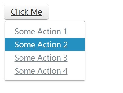
2. Create a dropdown menu with a toggle button using nested Html lists.
<ul id="demo" class="menu">
<li><a href="#" class="btn">Click Me</a>
<ul>
<li><a href="#">Some Action 1</a></li>
<li><a href="#">Some Action 2</a></li>
<li><a href="#">Some Action 3</a></li>
...
</ul>
</li>
</ul>
3. Call the plugin on the ul element.
$(document).ready(function() {
$('#demo').dropit();
});
4. Available options and callbacks.
$(document).ready(function() {
$('#demo').dropit({
action: 'click', // The open action for the trigger
submenuEl: 'ul', // The submenu element
triggerEl: 'a', // The trigger element
triggerParentEl: 'li', // The trigger parent element
afterLoad: function(){}, // Triggers when plugin has loaded
beforeShow: function(){}, // Triggers before submenu is shown
afterShow: function(){}, // Triggers after submenu is shown
beforeHide: function(){}, // Triggers before submenu is hidden
afterHide: function(){} // Triggers before submenu is hidden
});
});
4. Sample CSS to style the dropdown menu.
.menu ul {
display: none;
} /* Hide before plugin loads */
.menu ul.dropit-submenu {
background-color: #fff;
border: 1px solid #b2b2b2;
padding: 6px 0;
margin: 3px 0 0 1px;
-webkit-border-radius: 3px;
-moz-border-radius: 3px;
border-radius: 3px;
-webkit-box-shadow: 0px 1px 3px rgba(0,0,0,0.15);
-moz-box-shadow: 0px 1px 3px rgba(0,0,0,0.15);
box-shadow: 0px 1px 3px rgba(0,0,0,0.15);
}
.menu ul.dropit-submenu a {
display: block;
font-size: 14px;
line-height: 25px;
color: #7a868e;
padding: 0 18px;
}
.menu ul.dropit-submenu a:hover {
background: #248fc1;
color: #fff;
text-decoration: none;
}
Change log:
2015-04-09
- Fix 'mouseleave' for vertical Menus
- Make sure events are only bound once
This awesome jQuery plugin is developed by gilbitron. For more Advanced Usages, please check the demo page or visit the official website.