Accessible Multilevel Dropdown Menu with jQuery and CSS3
| File Size: | 3.43 KB |
|---|---|
| Views Total: | 7893 |
| Last Update: | |
| Publish Date: | |
| Official Website: | Go to website |
| License: | MIT |
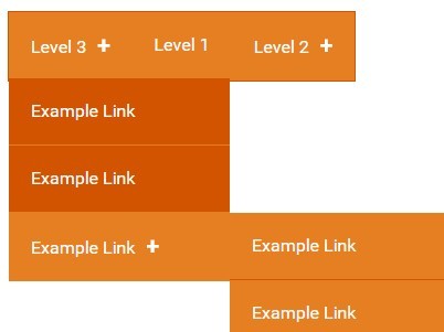
A simple jQuery & CSS3 powered navigation script that helps you create a responsive, accessible, multi-level dropdown menu for your site navigation.
How to use it:
1. Create a multi-level dropdown navigation from nested html lists as displayed below.
<nav id="nav">
  <ul>
    <li> <a href="#">Top Level 1</a>
      <ul>
        <li><a href="#">Level 1-1</a></li>
        <li><a href="#">Level 1-2</a></li>
        <li><a href="#">Level 1-3</a>
          <ul>
            <li><a href="#">Level 3-1</a></li>
            <li><a href="#">Level 3-2</a></li>
            <li><a href="#">Level 3-3</a></li>
          </ul>
        </li>
      </ul>
    </li>
  </ul>
</nav>
2. The primary CSS styles for the navigation.
#nav, #nav ul, #nav li {
  margin: 0;
  padding: 0;
  border: 0;
  list-style: none;
  box-sizing: border-box;
}

#nav {
  position: relative;
  min-height: 60px;
  max-width: 100%;
  background-color: #ffdb3a;
  color: #000;
  border: 1px solid #D9BA31;
}

#nav li { position: relative; }

#nav a {
  text-decoration: none;
  height: 100%;
  display: block;
  padding: 0 20px;
}

.plusMark {
  margin-left: 10px;
  font-size: 20px;
  font-weight: 700;
}

#nav > ul, .fa {
  height: 100%;
  line-height: 60px;
}

#nav > ul > li {
  position: relative;
  text-align: center;
}

#nav > ul > li > a { background-color: #ffdb3a; }

#nav > ul > li > a:hover, #nav > ul > li > a:focus, #nav > ul > li > a.js-openSubMenu { background-color: #D9BA31; }

span#toggleMenu-text {
  position: absolute;
  opacity: 0;
}
3. The CSS styles for second and third level menus.
#nav > ul > li > ul { background-color: #D9BA31; }

#nav > ul > li > ul { background-color: #D9BA31; }

#nav > ul > li > ul > li > a { background-color: #D9BA31; }

#nav > ul > li > ul > li > a:hover, #nav > ul > li > ul > li > a:focus { background-color: #ffdb3a; }

#nav > ul > li > ul > li:not(:last-child) a { border-bottom: 1px solid #ffdb3a; }

#nav > ul > li > ul > li > ul > li > a { background-color: #ffdb3a; }

#nav > ul > li > ul > li > ul > li > a:hover, #nav > ul > li > ul > li > ul > li > a:focus { background-color: #D9BA31; }

#nav > ul > li > ul > li > ul > li:not(:last-child) > a { border-bottom: 1px solid #D9BA31; }
4. Javascript classes.
#nav .js-hideElement { display: none; }

#nav .js-showElement { display: block; }
5. Fallback for users without javascript.
html.no-js li:hover > a + ul, html.no-js li:focus > a + ul { display: block; }
6. Make the dropdown navigation responsive.
@media screen and (min-width: 650px) {

#nav { display: inline-block; }
}

@media screen and (max-width: 650px) {

#nav { display: block; }
}

@media screen and (min-width: 650px) {

#nav a:focus { outline: none; }
}

@media screen and (min-width: 650px) {

#nav li {
  text-align: left;
  width: 200px;
}
}

@media screen and (max-width: 650px) {

#nav li {
  text-align: center;
  width: 100%;
}
}

@media screen and (min-width: 650px) {

a + ul { position: absolute; }

a + ul:not(.js-showElement) { display: none; }
}

@media screen and (max-width: 650px) {

a + ul { position: relative; }

a + ul:not(.js-hideElement) { display: block; }
}

@media screen and (min-width: 650px) {

#nav > ul > li {
  float: left;
  width: auto;
}
}

@media screen and (max-width: 650px) {

#nav > ul > li {
  float: none;
  display: block;
  width: 100%;
}
}

@media screen and (min-width: 650px) {

#nav > ul > li: not(: last-child) {
  border-right: 1px solid #D9BA31;
  border-bottom: none;
}
}

@media screen and (max-width: 650px) {

#nav > ul > li: not(: last-child) { border-right: none; }

#nav > ul > li:not(:last-child):not(:first-child) { border-bottom: 1px solid #D9BA31; }
}

#nav > ul > li:not(#toggleMenu):not(.js-showElement) { /* first level nav li except toggleMenu icon */ }

@media screen and (min-width: 650px) {

#nav > ul > li: not(#toggleMenu): not(.js-showElement) { display: inline-block; }
}

@media screen and (max-width: 650px) {

#nav > ul > li: not(#toggleMenu): not(.js-showElement) { display: none; }
}

@media screen and (min-width: 650px) {

#nav #toggleMenu { display: none; }
}

@media screen and (max-width: 650px) {

#nav #toggleMenu {
  display: block;
  width: 100%;
}

#nav #toggleMenu.js-open { border-bottom: 1px solid #D9BA31; }

#nav #toggleMenu.js-open .fa-times { display: block; }

#nav #toggleMenu.js-open .fa-bars { display: none; }

#nav #toggleMenu.js-open a { background-color: #D9BA31; }

#nav #toggleMenu:not(.js-open) .fa-times { display: none; }

#nav #toggleMenu:not(.js-open) .fa-bars { display: block; }
}

@media screen and (min-width: 650px) {

#nav > ul > li > ul {
  top: 60px;
  left: 0;
}
}

@media screen and (max-width: 650px) {

#nav > ul > li > ul {
  width: 100%;
  position: relative;
}

#nav > ul > li > ul:not(.js-showElement) { display: none; }
}

@media screen and (min-width: 650px) {

#nav > ul > li > ul > li > ul {
  top: 0;
  left: 200px;/* width of ul */
}
}

@media screen and (max-width: 650px) {

#nav > ul > li > ul > li > ul {
  width: 100%;
  position: relative;
}

#nav > ul > li > ul > li > ul:not(.js-showElement) { display: none; }
}

@media screen and (max-width: 650px) {

html.no-js #nav: hover > ul > li: not(#toggleMenu), html.no-js #nav: focus > ul > li: not(#toggleMenu) { display: block; }

html.no-js #nav:hover li:hover > a + ul, html.no-js #nav:hover li:focus > a + ul, html.no-js #nav:focus li:hover > a + ul, html.no-js #nav:focus li:focus > a + ul { display: block; }
}
7. Include the jQuery library at the bottom of your website.
<script src="//code.jquery.com/jquery-2.1.4.min.js"></script>
8. The core JavaScript to active the dropdown navigation.
$(document).ready(function() {

  // Remove no-js class
  $('html').removeClass('no-js');

  $('#toggleMenu').on('click', function() {

    if ($(this).hasClass('js-open')) {

      $('#nav > ul > li:not(#toggleMenu)').removeClass('js-showElement');
      $(this).removeClass('js-open');

    } else {

      $('#nav > ul > li:not(#toggleMenu)').addClass('js-showElement');
      $(this).addClass('js-open');

    }

    return false;
  })

  // Add plus mark to li that have a sub menu
  $('li:has("ul") > a').append('<span class="plusMark">+</span>');

  // sub menu
  // ------------------------

  // When interacting with a li that has a sub menu
  $('li:has("ul")').on('mouseover keyup click mouseleave', function(e) {

    // If either -
    // tabbing into the li that has a sub menu
    // hovering over the li that has a sub menu
    if (e.keyCode === 9 | e.type === 'mouseover') {

      // Show sub menu
      $(this).children('ul').removeClass('js-hideElement');
      $(this).children('ul').addClass('js-showElement');
    }

    // If mouse leaves li that has sub menu
    if (e.type === 'mouseleave') {

      // hide sub menu
      $(this).children('ul').removeClass('js-showElement');
      $(this).children('ul').addClass('js-hideElement');
    }

    // If clicking on li that has a sub menu
    if (e.type === 'click') {

      // If sub menu is already open
      if ($(this).children('a').hasClass('js-openSubMenu')) {

        // remove Open class
        $(this).children('a').removeClass('js-openSubMenu');

        // Hide sub menu
        $(this).children('ul').removeClass('js-showElement');
        $(this).children('ul').addClass('js-hideElement');

        // If sub menu is closed
      } else {

        // add Open class
        $(this).children('a').addClass('js-openSubMenu');

        // Show sub menu
        $(this).children('ul').removeClass('js-hideElement');
        $(this).children('ul').addClass('js-showElement');

      }

      return false;

    } // end click event

  });

  // Tabbing through Levels of sub menu
  // ------------------------

  // If key is pressed while on the last link in a sub menu
  $('li > ul > li:last-child > a').on('keydown', function(e) {

    // If tabbing out of the last link in a sub menu AND not tabbing into another sub menu
    if ((e.keyCode == 9) && $(this).parent('li').children('ul').length == 0) {

      // Close this sub menu
      $(this).parent('li').parent('ul').removeClass('js-showElement');
      $(this).parent('li').parent('ul').addClass('js-hideElement');

      // If tabbing out of a third level sub menu and there are no other links in the parent (level 2) sub menu
      if ($(this).parent('li').parent('ul').parent('li').parent('ul').parent('li').children('ul').length > 0 && $(this).parent('li').parent('ul').parent('li').is(':last-child')) {

        // Close the parent sub menu (level 2) as well
        $(this).parent('li').parent('ul').parent('li').parent('ul').removeClass('js-showElement');
        $(this).parent('li').parent('ul').parent('li').parent('ul').addClass('js-hideElement');
      }

    }

  })

})
This awesome jQuery plugin is developed by anon. For more Advanced Usages, please check the demo page or visit the official website.


