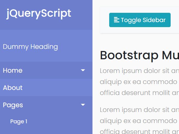
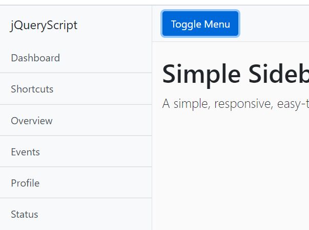
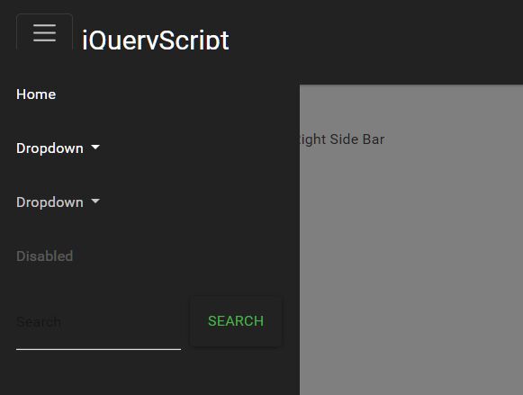
Slick Sliding Push Menu Plugin For jQuery - sliiide2
| File Size: | 525 KB |
|---|---|
| Views Total: | 16151 |
| Last Update: | |
| Publish Date: | |
| Official Website: | Go to website |
| License: | MIT |
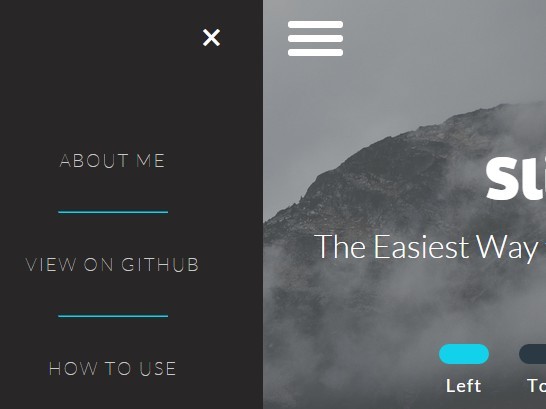
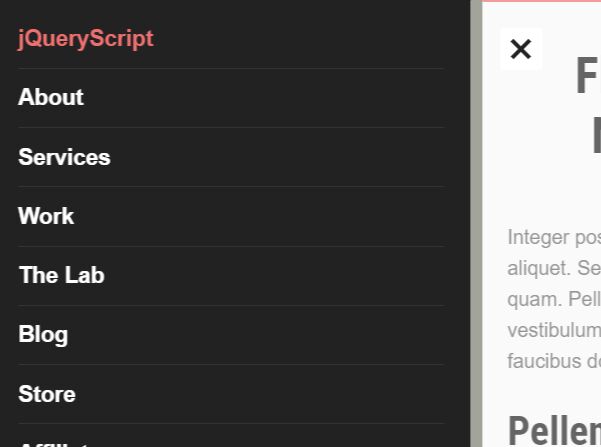
sliiide2 is a really small jQuery plugin that provides a simple way to create App-style sliding navigation menu for your website / web application.
Features:
- Can be placed anywhere on your web page.
- Custom sliding animations.
- Push the whole body to the other side or not.
- Disable page scroll when the sliding menu is opened.
How to use it:
1. Load the nav-icon.css in the header for the menu toggle icon.
<link href="nav-icon.css" rel="stylesheet">
2. Add the CSS classes 'flex-center-wrapper' and 'flex-column' to the body tag.
<body class="flex-center-wrapper flex-column">
3. Create a menu toggle.
<div id="nav-icon2">
  <span></span>
  <span></span>
  <span></span>
  <span></span>
  <span></span>
  <span></span>
</div>
4. Create a left menu that will slides out from the left side of your screen when toggled.
<div class="sliding-menu flex-center-wrapper flex-column left-menu">
<ul>
<li>
<a href="#">Home</a>
</li>
<li>
<hr>
</li>
<li>
<a href="#">Contact</a>
</li>
<li>
<hr>
</li>
<li>
<a href="#">About</a>
</li>
</ul><span class="sliiider-exit exit left-exit">×</span>
</div>
5. Load jQuery library and the jQuery sliiide2 plugin at the bottom of the web page.
<script src="jquery.js"></script>
<script src="sliiide.js"></script>
6. Initialize the plugin.
$('.left-menu').sliiide({/*OPTIONS*/});
7. Add your own CSS styles to the sliding menu.
.flex-center-wrapper {
  display: flex;
  display: -webkit-flex;
  align-content: center;
  align-items: center;
  -webkit-align-content: center;
  -webkit-align-items: center;
  justify-content: center;
  -webkit-justify-content: center;
  text-align: center;
}

.flex-row {
  -webkit-flex-direction: row;
  -ms-flex-direction: row;
  flex-direction: row;
}

.flex-column {
  -webkit-flex-direction: column;
  -ms-flex-direction: column;
  flex-direction: column;
}

.slider-toggle {
  display: block;
  margin: 10px 15px 10px 15px;
  color: white;
  font-size: 18px;
  border: none;
  letter-spacing: 1px;
  font-family: Lato;
  width: 50px;
  height: 20px;
  border-radius: 100px;
  text-align: center;
  background-color: rgb(43, 57, 69);
  transition: background-color 0.5s;
}

.buttons-container span {
  color: white;
  font-family: Lato;
  font-size: 18px;
  letter-spacing: 1.2px;
}

.selected { background-color: rgb(18, 209, 234); }

.sliding-menu {
  background-color: rgb(40, 38, 38);
  visibility: hidden;
  position: fixed;
  overflow: hidden;
}

.sliding-menu a, .sliding-menu p {
  font-family: Lato;
  font-weight: 100;
  letter-spacing: 2px;
  font-size: 18px;
  color: rgb(200, 200, 200);
  text-decoration: none;
  margin: 0 20px;
}

.sliding-menu ul {
  list-style: none;
  text-align: center;
  padding: 0;
}

.sliding-menu li { margin: 40px auto 40px auto; }

.sliding-menu hr {
  width: 50%;
  min-width: 100px;
  border-color: rgb(18, 209, 234);
}

.exit {
  position: absolute;
  font-size: 40px;
  color: white;
  cursor: pointer;
}
8. override the default options to customize the sliding navigation menu.
// menu toggle
toggle: "#sliiider-toggle",

// exit element
exit_selector: ".slider-exit",

// animation options
animation_duration: "0.5s",
animation_curve: "cubic-bezier(0.54, 0.01, 0.57, 1.03)",

// right, top, bottom, left
place: "right",

// slide the body
body_slide: true,

// disable page scroll
no_scroll: true,

// auto close
auto_close: false
Change log:
2016-10-29
- adding auto close option Failed to load resource: net::ERR_FILE_NOT_FOUND
2016-01-02
- disabling the no_scroll feature by default
2015-12-07
- Using a new positioning method to avoid the conflict between fixed elements and CSS translate. Now the menu scrolls smoothly on both desk top and mobile as a fixed menu. The overflow issue on mobile is also fixed, user can't scroll right or left on mobile when the menu is active as a normal 'overflow: hidden' behavior. There's now better support for dynamically changing the size of the menu
2015-11-07
- adjusting disable and enable scroll functions to support touch devices
2015-11-02
- workaround the browser bug of inability to properly apply transform to fixed elements
2015-10-27
- add IE support.
This awesome jQuery plugin is developed by ahmedrad. For more Advanced Usages, please check the demo page or visit the official website.