Off-canvas Sidebar Navigation For Bootstrap 4
| File Size: | 5.16 KB |
|---|---|
| Views Total: | 6606 |
| Last Update: | |
| Publish Date: | |
| Official Website: | Go to website |
| License: | MIT |
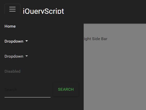
This is a small jQuery script that transforms the regular responsive Bootstrap4 navbar into a mobile-friendly off-canvas side menu with minimal effort.
Instead of using the default Bootstrap 4 responsive navbar behavior, the plugin collapses the menu items behind a toggle button which allows the visitor to toggle an off-canvas menu sliding from the left side of the screen.
How to use it:
1. Add the CSS class 'mobileMenu' to your Bootstrap 4 navbar.
<nav
  class="navbar navbar-expand-lg navbar-dark bg-dark justify-content-sm-start fixed-top"
>
  <div class="container-fluid">
    <a class="navbar-brand order-1 order-lg-0 ml-lg-0 ml-2 mr-auto" href="#"
      >jQuery Script</a
    >
    <button class="navbar-toggler align-self-start" type="button">
      <span class="navbar-toggler-icon"></span>
    </button>

    <div
      class="collapse navbar-collapse bg-dark p-3 p-lg-0 mt-5 mt-lg-0 d-flex flex-column flex-lg-row flex-xl-row justify-content-lg-end mobileMenu"
      id="navbarSupportedContent"
    >
      <ul class="navbar-nav align-self-stretch">
        <li class="nav-item active">
          <a class="nav-link" href="#"
            >Home <span class="sr-only">(current)</span></a
          >
        </li>
        <li class="nav-item dropdown">
          <a
            class="nav-link dropdown-toggle"
            href="#"
            id="navbarDropdown"
            role="button"
            data-toggle="dropdown"
            aria-haspopup="true"
            aria-expanded="false"
          >
            Dropdown
          </a>
          <div class="dropdown-menu" aria-labelledby="navbarDropdown">
            <a class="dropdown-item" href="#">Action</a>
            <a class="dropdown-item" href="#">Another action</a>
            <div class="dropdown-divider"></div>
            <a class="dropdown-item" href="#">Something else here</a>
          </div>
        </li>
        <li class="nav-item">
          <a
            class="nav-link disabled"
            href="#"
            tabindex="-1"
            aria-disabled="true"
            >Disabled</a
          >
        </li>
      </ul>
      <form class="form-inline my-2 my-lg-0 align-self-stretch">
        <input
          class="form-control mr-sm-2"
          type="search"
          placeholder="Search"
          aria-label="Search"
        />
        <button class="btn btn-outline-success my-2 my-sm-0" type="submit">
          Search
        </button>
      </form>
    </div>
  </div>
</nav>
2. Create a fullscreen overlay for the off-canvas menu.
<div class="overlay"></div>
3. The necessary CSS styles for the off-canvas menu.
@media (max-width: 992px) {
  .mobileMenu {
    -webkit-transform: translateX(-100%);
            transform: translateX(-100%);
    position: fixed;
    top: 0px;
    bottom: 0;
    margin: auto;
    left: 0;
    -webkit-transition: all ease 0.25s;
    transition: all ease 0.25s;
  }
  .mobileMenu.open {
    -webkit-transform: translateX(0%);
            transform: translateX(0%);
  }
  .mobileMenu .navbar-nav {
    overflow-y: auto;
  }
  .overlay {
    position: fixed;
    top: 0;
    bottom: 0;
    left: 0;
    right: 0;
    margin: auto;
    background-color: rgba(0, 0, 0, 0.5);
    display: none;
  }
  .overlay.open {
    display: block;
    z-index: 1029;
  }
}
4. The necessary jQuery script to enable the off-canvas menu. Copy and insert the following JS snippets after jQuery library and you're done.
$(document).ready(function() {
  var fixHeight = function() {
    $('.navbar-nav').css(
      'max-height',
      document.documentElement.clientHeight - 150
    );
  };
  fixHeight();
  $(window).resize(function() {
    fixHeight();
  });
  $('.navbar .navbar-toggler').on('click', function() {
    fixHeight();
  });
  $('.navbar-toggler, .overlay').on('click', function() {
    $('.mobileMenu, .overlay').toggleClass('open');
  });
});
This awesome jQuery plugin is developed by frontendfunn. For more Advanced Usages, please check the demo page or visit the official website.


