Collapsible Sticky Sidebar Navigation In jQuery - Next Sidebar
| File Size: | 17.5 KB |
|---|---|
| Views Total: | 7350 |
| Last Update: | |
| Publish Date: | |
| Official Website: | Go to website |
| License: | MIT |

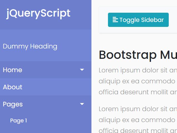
Next Sidebar is a simple jQuery plugin that helps you create a collapsible, sticky, multi-level sidebar navigation for admin panels and documentation websites.
Compatible with both Bootstrap 5 and Bootstrap 4 framework.
How to use it:
1. Load the required resources in the document. Dependencies:
- jQuery
- Bootstrap 5 or Bootstrap 4 framework
- An iconic font like Font Awesome
- Perfect Scrollbar plugin (Optional but recommended)
<!-- jQuery -->
<script src="/path/to/cdn/jquery.slim.min.js"></script>
<!-- Bootstrap -->
<link rel="stylesheet" href="/path/to/cdn/bootstrap.min.css" />
<script src="/path/to/cdn/bootstrap.bundle.min.js"></script>
<!-- Font Awesome -->
<link rel="stylesheet" href="/path/to/cdn/font-awesome/all.min.css" />
<!-- Perfect Scrollbar -->
<link rel="stylesheet" href="/path/to/cdn/css/perfect-scrollbar.css" />
<script src="/path/to/cdn/js/perfect-scrollbar.min.js"></script>
2. Add the CSS class 'app' to the body tag.
<body class="app">
  ...
</body>
3. The HTML structure for the multi-level sidebar navigation.
<div class="sidebar">
  <div class="sidebar-inner">
    <ul class="sidebar-menu scrollable position-relative pt-3">
      <li class="nav-item dropdown">
        <a class="nav-link wave-effect" href="#">
          <span class="icon-holder">
            <i class="fas fa-home"></i>
          </span>
          <span class="title">Dashboard</span>
        </a>
      </li>
      <li class="nav-item dropdown">
        <a class="nav-link dropdown-toggle" href="#">
          <span class="icon-holder">
            <i class="fas fa-folder-plus"></i>
          </span>
          <span class="title">Multiple Level</span>
          <span class="arrow">
            <i class="fas fa-angle-right"></i>
          </span>
        </a>
        <ul class="dropdown-menu">
          <li class="nav-item dropdown">
            <a class="nav-link dropdown-toggle" href="#">
              <span>Menu Item</span>
            </a>
          </li>
          <li class="nav-item dropdown">
            <a class="nav-link dropdown-toggle" href="#">
              <span class="title">Menu Items</span>
              <span class="arrow">
                <i class="fas fa-angle-right"></i>
              </span>
            </a>
            <ul class="dropdown-menu">
              <li>
                <a href="#">Menu Item</a>
              </li>
              <li>
                <a href="#">Menu Item</a>
              </li>
            </ul>
          </li>
        </ul>
      </li>
    </ul>
  </div>
</div>
4. Add a menu toggle button to the site nav.
<div class="container-wide">
  <nav class="navbar navbar-expand navbar-light bg-light">
    <ul class="navbar-nav me-auto">
      <li class="nav-item active">
        <a id="sidebar-toggle" class="sidebar-toggle nav-link" href="#">
          <i class="fas fa-bars"></i>
        </a>
      </li>
      <li class="nav-item">
        <a class="nav-link" href="#">Left</a>
      </li>
      <li class="nav-item">
        <a class="nav-link" href="#">Link</a>
      </li>
    </ul>
  </nav>
  ... Main Content Here ...
</div>
5. To collapse the sidebar navigation on page load, just add the CSS class 'is-collapsed' to the body tag. That's it.
<body class="app is-collapsed">
  ...
</body>
This awesome jQuery plugin is developed by Nelh. For more Advanced Usages, please check the demo page or visit the official website.