Sticky Sidebar Accordion Menu With jQuery And CSS3
| File Size: | 10.6 KB |
|---|---|
| Views Total: | 876 |
| Last Update: | |
| Publish Date: | |
| Official Website: | Go to website |
| License: | MIT |

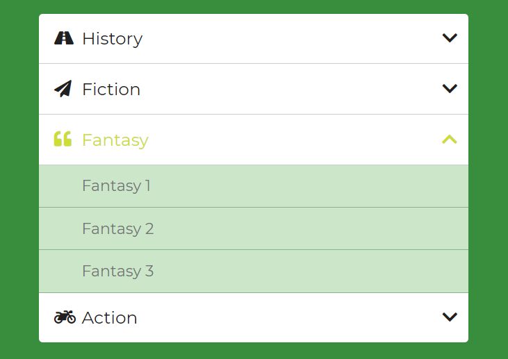
A sticky sidebar vertical accordion menu that can be used to switch between content sections within your document.
Built with jQuery library and CSS/CSS3. Perfect for single page web applications and storytelling websites. Have fun.
How to use it:
1. Create the HTML for the accordion menu that contains anchor links pointing to the page sections as follows:
<!-- Accordion Menu -->
<nav class="navWrapper">
  <div>
    <h2>The Cactus Who Could</h2>
    <p>Marty the cactus ended up hurting anyone who was close to him. Eventualy this left him feeling very alone and afraid. Marty decided that is was time to make a change and set out of life changing journey.  </p>
    <a href="story1">Read Story</a>
  </div>
  <div>
    <h2>All about knots</h2>
    <p>Bob Tetherball goes into great detail describing all of the knots that exist in this world. From the simple hitch knot to the tripple headed octopus dragon knot, Bob will teach you how to master each knot. </p>
    <a href="story2">Read Story</a>
  </div>
  <div>
    <h2>4<sup>th</sup> of July</h2>
    <p>It was the fouth of July in the year 1948. Carol was studying hard to be a nurse when she came across Peter, a simple farm hand. Little did they know but this small incounter would change their live forever. </p>
    <a href="story3">Read Story</a>
  </div>
  ... more menu items here ...
</nav>
<div class="storyWrapper">
  <div id="story1" class="open">
    <h2>Page Section 1</h2>
  </div>
  <div id="story2" >
    <h2>Page Section 2</h2>
  </div>
  <div id="story3" >
    <h2>Page Section 3</h2>
  </div>
  ... more page sections here ...
</div>
2. The necessary CSS styles.
/* Nav Styles */
.navWrapper {
  width: 40%;
  height: 100%;
  z-index: 100;
  float: left;
  position: fixed;
  left: 0;
  top: 0;
  display: flex;
  flex-direction: column;
  -webkit-box-shadow: 2px 0px 21px -2px rgba(0, 0, 0, 0.75);
  -moz-box-shadow: 2px 0px 21px -2px rgba(0, 0, 0, 0.75);
  box-shadow: 2px 0px 21px -2px rgba(0, 0, 0, 0.75);
}

.navWrapper div {
  width: 100%;
  height: 20%;
  min-height: 0%;
  transition: all 0.4s ease;
  -webkit-transition: all 0.4s ease;
  background-size: cover;
  background-position: 0% 100%;
  background-attachment: fixed;
  overflow: hidden;
  padding: 10px;
  position: relative;
}

.navWrapper div:hover {
  min-height: 50% !important;
  background-position: 100% 0% !important;
}

.navWrapper div:hover a {
  opacity: 1;
  transform: translateX(0px);
}

.navWrapper div:hover p {
  left: 0px;
  max-width: 100%;
  min-width: 0px;
  opacity: 1 !important;
}

.navWrapper div:nth-child(1) {
  background-image: url("1.jpg");
}
.navWrapper div:nth-child(2) {
  background-image: url("2.jpg");
}
.navWrapper div:nth-child(3) {
  background-image: url("3.jpg");
}

.navWrapper div h2 {
  color: #fff;
  text-transform: uppercase;
  letter-spacing: 2px;
  padding: 5px;
  float: left;
  background: rgba(0, 0, 0, 0.5);
  -webkit-transition: all 0.4s ease;
  transition: all 0.4s ease;
}

.navWrapper div h2 sup {
  text-transform: none;
}

.navWrapper div p {
  width: 100%;
  padding: 5px;
  color: #fff;
  float: left;
  font-size: 14pt;
  background: rgba(0, 0, 0, 0.7);
  margin-top: 0px;
  min-width: 400px;
  left: 120%;
  position: relative;
  opacity: 0 !important;
  -webkit-transition: all 0.4s ease;
  transition: all 0.4s ease;
  -webkit-transition-delay: 0.4s;
  /* Safari */
  transition-delay: 0.4s;
}

.navWrapper div a {
  float: left;
  padding: 0px;
  text-align: left;
  color: #fff;
  font-weight: 900;
  letter-spacing: 2px;
  font-size: 18pt;
  text-decoration: none;
  opacity: 0;
  transform: translateX(10px);
  transition: all 0.5s ease;
  -webkit-transition: all 0.5s ease;
  -webkit-transition-delay: 0.8s;
  /* Safari */
  transition-delay: 0.8s;
}

.navWrapper div a:hover {
  text-decoration: underline;
}
/* Story Styles */
.storyWrapper {
  width: 60%;
  float: right;
  padding: 0px;
  right: 0;
  position: relative;
}

.storyWrapper div {
  float: left;
  width: 100%;
  position: absolute;
  right: 0;
  padding: 20px;
  right: -100%;
  background-color: #fff;
  transition: all 0.4s ease;
  -webkit-transition: all 0.4s ease;
  max-width: 720px;
}

.storyWrapper div.open {
  right: 50%;
  margin-right: -360px;
}

.storyWrapper hr {
  width: 50%;
  float: left;
  margin: 15px 25% 15px 25%;
}

.storyWrapper h2 {
  float: left;
  width: 100%;
  font-size: 24pt;
  font-weight: 500;
  margin-top: 20px;
  padding-bottom: 0px;
  margin-bottom: 0px;
  text-align: center;
}

@media screen and (max-width: 1220px) {
  .storyWrapper div {
    max-width: 100%;
  }
  .storyWrapper div.open {
    right: 0%;
    margin-right: 0px;
  }
}
3. Load the latest jQuery library at the bottom of the page.
<script src="/path/to/cdn/jquery.slim.min.js"></script>
4. Add the following JS snippets after jQuery. That's it.
$('.navWrapper div a').click(function(event){
  event.preventDefault();
  var storyID = $(this).attr('href');

  $('.storyWrapper div').removeClass('open');
  $('#'+storyID).addClass('open');

  document.body.scrollTop = document.documentElement.scrollTop = 0;

});
This awesome jQuery plugin is developed by mattyfours. For more Advanced Usages, please check the demo page or visit the official website.