Popout Menu With Gooey Effects Using jQuery/SVG/CSS3
| File Size: | 5.05 KB |
|---|---|
| Views Total: | 2470 |
| Last Update: | |
| Publish Date: | |
| Official Website: | Go to website |
| License: | MIT |
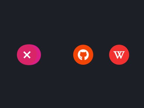
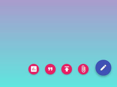
A creative FAB (Floating Action Button) system which uses SVG filters to apply a gooey-like effect to menu items when the user clicks the toggle button.
Built with JavaScript (jQuery), SVG, and CSS3 animations. Ideal for popout site menu & social sharing bar.
How to use it:
1. Create the HTML for the floating action button system.
<div class="menu">
  <!-- Toggle Button -->
  <ul class="toggle">
    <li class="ico01"></li>
    <li class="move-ico ico02"></li>
    <li class="move-ico ico03"></li>
    <li class="move-ico ico04"></li>
  </ul>
  <!-- SVG Filters -->
  <svg xmlns="http://www.w3.org/2000/svg" version="1.1" width="0" height="0">
      <defs>
      <filter id="goo">
          <feGaussianBlur in="SourceGraphic" result="blur" stdDeviation="12" />
          <feColorMatrix in="blur" mode="matrix" values="1 0 0 0 0  0 1 0 0 0  0 0 1 0 0  0 0 0 18 -7" result="joint" />
      </filter>
      </defs>
  </svg>
</div>
<div class="menu-object">
  <ul class="toggle">
    <li class="ico01"></li>
    <li class="move-ico ico02">
      <a href="#" target="_blank" class="link link01">
        Menu 1
      </a>
    </li>
    <li class="move-ico ico03">
      <a href="#" target="_blank" class="link link02">
        Menu 2
      </a>
    </li>
    <li class="move-ico ico04">
      <a href="#" target="_blank" class="link link03">
        Menu 3
      </a>
    </li>
  </ul>
</div>
2. The necessary menu styles.
.menu {
  width: calc(54px * 4 + 30px * 3);
  height: 54px;
  margin: 0 auto;
  -webkit-filter: url("#goo");
  filter: url("#goo");
}

ul {
  position: relative;
  margin: 0;
  padding: 0;
  list-style: none;
}

li {
  width: 54px;
  height: 54px;
  border-radius: 50%;
  cursor: pointer;
}

svg {
  overflow: hidden;
}

.ico01 {
  background-color: #d92567;
  position: relative;
  z-index: 4;
}

.ico02 {
  background-color: #d91e85;
  transition: transform 1.2s cubic-bezier(0.77, 0, 0.175, 1);
  z-index: 3;
}

.ico03 {
  background-color: #f24405;
  transition: transform 1.2s cubic-bezier(0.77, 0, 0.175, 1) 0.4s;
  z-index: 2;
}

.ico04 {
  background-color: #f23030;
  transition: transform 1.2s cubic-bezier(0.77, 0, 0.175, 1) 0.8s;
  z-index: 1;
}

.move-ico {
  position: absolute;
  top: 0;
}

.active .ico02 {
  transform: translateX(calc(54px + 30px));
  transition: transform 1.2s cubic-bezier(0.77, 0, 0.175, 1) 0.8s;
}

.active .ico03 {
  transform: translateX(calc(54px * 2 + 30px * 2));
  transition: transform 1.2s cubic-bezier(0.77, 0, 0.175, 1) 0.4s;
}

.active .ico04 {
  transform: translateX(calc(54px * 3 + 30px * 3));
  transition: transform 1.2s cubic-bezier(0.77, 0, 0.175, 1);
}
3. The necessary CSS styles of menu items.
.menu-object {
  position: absolute;
  top: 0;
  right: 0;
  bottom: 0;
  left: 0;
  margin: auto;
  width: calc(54px * 4 + 30px * 3);
  height: 54px;
}

.menu-object .ico01::before {
  content: "";
  position: absolute;
  top: 0;
  right: 0;
  bottom: 0;
  left: 0;
  width: 4px;
  height: 24px;
  margin: auto;
  background-color: #fff;
  transition: transform 0.8s cubic-bezier(0.77, 0, 0.175, 1);
}

.menu-object .ico01::after {
  content: "";
  position: absolute;
  top: 0;
  right: 0;
  bottom: 0;
  left: 0;
  width: 24px;
  height: 4px;
  margin: auto;
  background-color: #fff;
  transition: transform 0.8s cubic-bezier(0.77, 0, 0.175, 1);
}

.menu-object .link {
  display: block;
  width: 100%;
  height: 100%;
  color: #fff;
  line-height: 1;
}

.menu-object .link i {
  position: absolute;
  top: 50%;
  left: 50%;
  transform: translate3d(-50%, -50%, 0);
}

.menu-object .link01 {
  font-size: 26px;
}

.menu-object .link02 {
  font-size: 30px;
}

.menu-object .link03 {
  font-size: 24px;
  font-weight: bold;
}

.active .menu-object .ico01::before {
  transform: rotate(45deg);
}

.active .menu-object .ico01::after {
  transform: rotate(45deg);
}
4. Load the necessary jQuery JavaScript library in the document.
<script src="/path/to/cdn/jquery.slim.min.js"></script>
5. The jQuery script to enable the toggle button. That's it.
function toggle(){
  $('.ico01').click(function(){
    $('.wrapper').toggleClass('active');
  })
}
toggle();
This awesome jQuery plugin is developed by Hisami Kurita. For more Advanced Usages, please check the demo page or visit the official website.