Smooth Page Scroller With Hamburger Navigation
| File Size: | 3.57 KB |
|---|---|
| Views Total: | 2043 |
| Last Update: | |
| Publish Date: | |
| Official Website: | Go to website |
| License: | MIT |
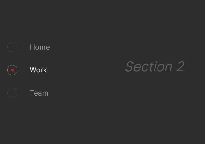
A smooth one page scroll website template with a hamburger side navigation built with HTML, CSS, and a little jQuery.
Click the menu items inside the navigation to smoothly scrolls between page sections within the document.
How to use it:
1. Create page sections in your document.
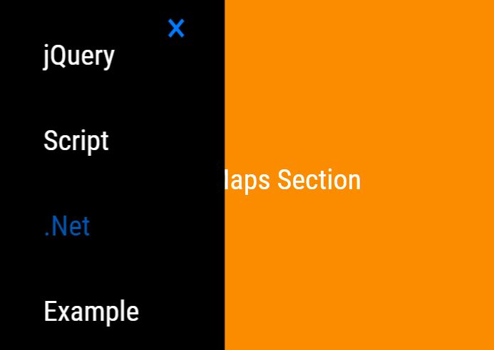
<section id="main">
  <h2 class="text-center">Main Section</h2>
</section>
<section id="news">
  <h2 class="text-center">News Section</h2>
</section>
<section id="feedback">
  <h2 class="text-center">Feedback Section</h2>
</section>
<section id="maps">
  <h2 class="text-center">Maps Section</h2>
</section>
2. Make the page sections fullscreen.
section {
  height: 100vh;
  display: flex;
  align-items: center;
  justify-content: center;
}
3. Build the HTML for the hamburger navigation.
<!-- Hamburger Toggle Button --> <div class="menu-link"> <span></span> <span></span> <span></span> </div> <!-- Menu List --> <menu> <a class="close-btn" href="#close">×</a> <ul> <li><a href="#main">Main</a></li> <li><a href="#news">News</a></li> <li><a href="#feedback">Feedback</a></li> <li><a href="#maps">Maps</a></li> </ul> </menu>
4. The necessary CSS rules for the hamburger navigation.
.menu-link {
  position: fixed;
  left: 20px;
  top: 20px;
  background-color: #fff;
  width: 50px;
  height: 50px;
  border-radius: 50%;
  box-shadow: 1px 1px 10px rgba(255, 255, 255, .3);
}

.menu-link span {
  position: absolute;
  width: 20px;
  height: 2px;
  background-color: #000;
  top: 50%;
  left: 50%;
  margin-top: -1px;
  margin-left: -10px;
}

.menu-link span:nth-child(1) {
  transform: translateY(-6px);
}

.menu-link span:nth-child(3) {
  transform: translateY(6px);
}

.menu-link:hover {
  cursor: pointer;
}

.menu-link:hover span:nth-child(3) {
  transform-origin: 0% 0%;
  transform: translateY(6px) rotate(-33deg);
  width: 10px;
  margin-left: 0;
}

.menu-link:hover span:nth-child(1) {
  transform-origin: 0% 0%;
  transform: translateY(-6px) rotate(31deg);
  width: 12px;
  margin-left: 0;
}

menu {
  position: fixed;
  width: 50%;
  height: 100vh;
  background-color: #000;
  left: 0;
  margin: 0;
  top: 0;
  z-index: 99;
  display: flex;
  align-items: center;
  justify-content: center;
  transform: translateX(-100%);
}

.active-menu {
  transform: translateX(-20%);
}

ul {
  list-style: none;
  padding: 0;
  margin: 0;
  line-height: 3;
}

li a {
  font-size: 2rem;
  color: #fff;
}

a:hover {
  text-decoration: none;
}

.close-btn {
  position: fixed;
  top: 30px;
  right: 30px;
  font-size: 3rem;
  transition: all 0.2s;
  transform-origin: 50% 53%;
  display: block;
  line-height: 3rem;
  text-align: center;
  width: 3rem;
  height: 3rem;
}

.close-btn:hover {
  transform: rotate(180deg);
}
5. Load the latest jQuery library at the end of the document.
<script src="/path/to/cdn/jquery.slim.min.js"></script>
6. Enable the hamburger navigation and smooth scrolling effect.
$(function() {
  var menuLink = $('.menu-link');
  var menu = $('menu');
  var close = $('.close-btn');
  var navLink = $('li a');

  menuLink.click(function() {
    menu.toggleClass('active-menu');
  });
  close.click(function() {
    menu.toggleClass('active-menu');
  });

  navLink.on('click', function(event) {
    event.preventDefault();
    var target = $(this).attr('href');
    var top = $(target).offset().top;
    $('html,body').animate({scrollTop: top}, 500)
  });
});
This awesome jQuery plugin is developed by Sepol. For more Advanced Usages, please check the demo page or visit the official website.