Material Inspired Radial Popup Menu With jQuery And CSS/CSS3
| File Size: | 3.57 KB |
|---|---|
| Views Total: | 2704 |
| Last Update: | |
| Publish Date: | |
| Official Website: | Go to website |
| License: | MIT |

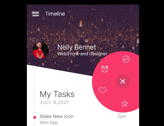
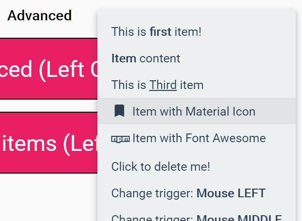
A stunning and user-friendly radial menu that pops up when the user clicks/taps on the trigger button. Inspired by Material Design and built using HTML/CSS/CSS3/jQuery. You can customize the placement of the menu to match your site's design and layout perfectly.
It can be used for various purposes, such as sharing content on social media platforms, showcasing important links, displaying product options, or providing quick access to frequently used tools or resources.
How to use it:
How to use it:
1. Add menu items and a toggle button to the menu container. In this example, we're going to use Font Awesome iconic font for menu icons.
<div class="menu-container">
  <div class="menu-toggle-btn">
    <i class="fa-solid fa-plus"></i>
  </div>
  <ul class="menu-list">
    <li class="menu-item">
      <a href="#"><i class="fa-brands fa-facebook"></i></a>
    </li>
    <li class="menu-item">
      <a href="#"><i class="fa-brands fa-twitter"></i></a>
    </li>
    <li class="menu-item">
      <a href="#"><i class="fa-brands fa-square-instagram"></i></a>
    </li>
  </ul>
</div>
2. Style & position the toggle button.
/* position the toggle button */
.menu-container {
  bottom: 0;
  right: 0;
  position: fixed;
}

/* position the toggle button */
.menu-toggle-btn {
  height: 56px;
  width: 56px;
  bottom: 0;
  right: 0;
  position: absolute;
  border-radius: 50%;
  display: flex;
  justify-content: center;
  align-items: center;
  background-color: #FF008B;
  box-shadow: 3px 3px 2px 1px rgb(0 0 0 / 20%);
  z-index: 2;
  cursor: pointer;
}

.menu-toggle-btn i {
  font-size: 2rem;
  color: #eeeeee;
  transition: 0.5s;
}

.menu-toggle-btn.effect i {
  transform: rotate(135deg);
}
3. Style the menu items that will be arranged around the toggle button when activated.
.menu-list {
  list-style: none;
  bottom: 0;
  right: 0;
  position: absolute;
  z-index: 1;
}

.menu-list .menu-item {
  height: 2.3rem;
  width: 2.3rem;
  bottom: 0.25rem;
  right: 0.25rem;
  position: absolute;
  border-radius: 50%;
  display: flex;
  justify-content: center;
  align-items: center;
  background-color: #6B48FF;
  transition: 0.5s;
}

.menu-list .menu-item a {
  text-decoration: none;
  color: #eeeeee;
}

.menu-list .menu-item:hover {
  background-color: #8864fd;
}

.menu-list.effect .menu-item {
  box-shadow: 3px 3px 2px 1px rgba(0, 0, 0, 0.2);
}

.menu-list.effect .menu-item:nth-of-type(1) {
  bottom: 4.25rem;
  right: 0.5rem;
  transition-delay: 0.2s;
}

.menu-list.effect .menu-item:nth-of-type(2) {
  bottom: 3.5rem;
  right: 3.5rem;
  transition-delay: 0.1s;
}

.menu-list.effect .menu-item:nth-of-type(3) {
  bottom: 0.5rem;
  right: 4.25rem;
}

/* add more items here */
4. Activate the menu. Copy and insert the following JavaScript snippets after jQuery library. Done.
$(document).ready(function () {
  $('.menu-toggle-btn').click(function () {
    $('.menu-toggle-btn').toggleClass("effect");
    $('.menu-list').toggleClass("effect");
  });
});
This awesome jQuery plugin is developed by Kunwar-Pratap. For more Advanced Usages, please check the demo page or visit the official website.