Off-canvas Navigation With Slide/Reveal Effects - jQuery Flexpanel
| File Size: | 147 KB |
|---|---|
| Views Total: | 1808 |
| Last Update: | |
| Publish Date: | |
| Official Website: | Go to website |
| License: | MIT |
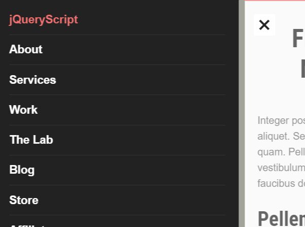
Flexpanel is an easy-to-implement, fully responsive, mobile-first, off-canvas push navigation with slide and reveal animations based on CSS3.
More features:
- Custom toggle button.
- Left or Right navigation panel.
- Allows to hide the navigation until the screen reaches a specific breakpoint.
How to use it:
1. Insert the minified version of the Flexpanel plugin into the HTML document.
<link rel="stylesheet" href="./css/flexpanel.min.css" />
<script src="/path/to/cdn/jquery.slim.min.js"></script>
<script src="./js/jquery.flexpanel.js"></script>
2. Create the HTML for the off-canvas push navigation.
<nav class="flexpanel">
  <div class="viewport-wrap">
    <div class="flex-btn"></div>
    <div class="viewport">
      <div class="navigation">
        <ul>
          <li class="active">Home</li>
          <li><a href="#">About</a></li>
          <li><a href="#">Services</a></li>
          <li><a href="#">Work</a></li>
          <li><a href="#">Blog</a></li>
          <li><a href="#">Contact</a></li>
        </ul>
      </div>
    </div>
  </div>
</nav>
3. Add the CSS class wrapper to the main content which will be pushed to the other side when the nav is opened.
<article id="wrapper">
  Main Content Here
</article>
4. Initialize the Flexpanel plugin on the nav element and done.
$('.flexpanel').flexpanel();
5. Customize the animation type. Default: 'slide'.
$('.flexpanel').flexpanel({
  animation: 'fade'
});
6. Set the direction from which the navigation slide into the screen. Default: 'right'.
$('.flexpanel').flexpanel({
  direction: 'left'
});
7. Set the breakpoint to reveal the navigation toggle button. Default: null.
$('.flexpanel').flexpanel({
  maxWidth: '768'
});
8. Default CSS selectors.
$('.flexpanel').flexpanel({
  wrapper: '#wrapper',
  button: '.flex-btn'
});
This awesome jQuery plugin is developed by dcooney. For more Advanced Usages, please check the demo page or visit the official website.


