Stylish Dropdown & Popover Plugin For jQuery - dropdown.js
| File Size: | 47.8 KB |
|---|---|
| Views Total: | 987 |
| Last Update: | |
| Publish Date: | |
| Official Website: | Go to website |
| License: | MIT |
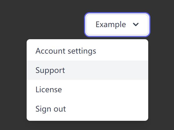
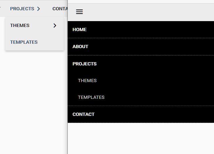
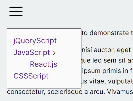
A lightweight jQuery plugin for creating responsive, popover-style dropdown menu with 12 position combinations.
How to use it:
1. Add jQuery library and the dropdown plugin's files to the page.
<link rel="stylesheet" href="/path/to/dropdown.css" />
<script src="/path/to/cdn/jquery.min.js"></script>
<script src="/path/to/dropdown.js"></script>
2. Create a new instance of the dropdown.
$(function(){
  let dropdownView = new Dropdown('dropdown-view');
});
3. The required HTML structure for the dropdown.
<div id="dropdown-view" class="mt-dropdown">

  <!-- Toggle Button -->
  <button data-mt-dropdown="dropdown-view"></button>

  <!-- Dropdown -->
  <div id="dropdown-view-menu"
    class="mt-dropdown-menu mt-dropdown-pb">
   <!-- Dropdown Content Here -->
  <div>

<div>
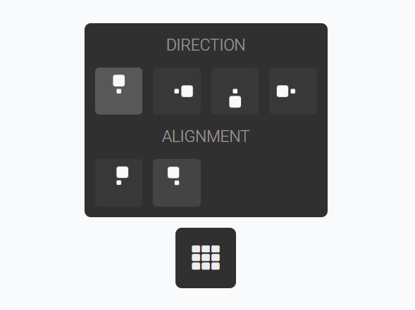
4. Customize the position & placement of the dropdown.
<!-- Bottom Center -->
<div id="dropdown-view-menu" class="mt-dropdown-menu mt-dropdown-pb">
  <!-- Dropdown Content Here -->
<div>

<!-- Bottom Left -->
<div id="dropdown-view-menu" class="mt-dropdown-menu mt-dropdown-pbs">
  <!-- Dropdown Content Here -->
<div>

<!-- Bottom Right -->
<div id="dropdown-view-menu" class="mt-dropdown-menu mt-dropdown-pbe">
  <!-- Dropdown Content Here -->
<div>

<!-- Top Center -->
<div id="dropdown-view-menu" class="mt-dropdown-menu mt-dropdown-pt">
  <!-- Dropdown Content Here -->
<div>

<!-- Top Left -->
<div id="dropdown-view-menu" class="mt-dropdown-menu mt-dropdown-pts">
  <!-- Dropdown Content Here -->
<div>

<!-- Top Right -->
<div id="dropdown-view-menu" class="mt-dropdown-menu mt-dropdown-pte">
  <!-- Dropdown Content Here -->
<div>

<!-- Right Center -->
<div id="dropdown-view-menu" class="mt-dropdown-menu mt-dropdown-pe">
  <!-- Dropdown Content Here -->
<div>

<!-- Right Top -->
<div id="dropdown-view-menu" class="mt-dropdown-menu mt-dropdown-pet">
  <!-- Dropdown Content Here -->
<div>

<!-- Right Bottom -->
<div id="dropdown-view-menu" class="mt-dropdown-menu mt-dropdown-peb">
  <!-- Dropdown Content Here -->
<div>

<!-- Left Center -->
<div id="dropdown-view-menu" class="mt-dropdown-menu mt-dropdown-ps">
  <!-- Dropdown Content Here -->
<div>

<!-- Left Top -->
<div id="dropdown-view-menu" class="mt-dropdown-menu mt-dropdown-pst">
  <!-- Dropdown Content Here -->
<div>

<!-- Left Bottom -->
<div id="dropdown-view-menu" class="mt-dropdown-menu mt-dropdown-psb">
  <!-- Dropdown Content Here -->
<div>
5. Customize the dropdown styles by overriding the default variables in the _variables.scss.
// Contents

$enablePositionMedia: false; // Position classes for different media
$enableRounded: false;       // Rounded classes
$enableRoundedMedia: false;  // Rounded classes for different media

// Class

$classBase: "mt-dropdown";
$classShow: 'show';

// Position

$directionValue: 100%;   // It is not recommended to change it
$directionIndent: .5rem;
$alignmentValue: 0%;     // It is not recommended to change it
$alignmentIndent: 0rem;

// Media breakpoints

$mediaBreakpoints: (
  sm: 576px,
  md: 768px,
  lg: 992px,
  xl: 1200px
);

// Others

$zIndexMenu: 1000;
$transitionDurationShow: .3s;
$borderRadius: .3rem;
Changelog:
2021-06-15
- CSS updated
This awesome jQuery plugin is developed by marcelotomazelli. For more Advanced Usages, please check the demo page or visit the official website.