Responsive Fullscreen Navigation Menu with jQuery and CSS3
| File Size: | 4.87 KB |
|---|---|
| Views Total: | 15579 |
| Last Update: | |
| Publish Date: | |
| Official Website: | Go to website |
| License: | MIT |
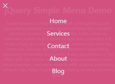
A simple responsive jQuery navigation plugin that allows you to reveal a fullscreen menu with an animated hamburger button powered by CSS3 transitions and transforms.
See also:
- Responsive fullscreen Overlay navigation with jQuery and Velocity.js
- Mic.com Style fullscreen navigation with jQuery and CSS3
- Lightweight & Customizable jQuery Full Page Navigation Plugin - fullnav.js
- Flexible fullscreen navigation Menu with jQuery and CSS3
- Responsive & Dynamic Full Screen navigation Plugin - fullpagenav
Basic usage:
1. Include the latest version of jQuery JavaScript library from Google CDN.
<script src="//ajax.googleapis.com/ajax/libs/jquery/2.1.1/jquery.min.js"> </script>
2. Create a fullscreen navigation menu using Html unordered list as shown below.
<div class="mobilenav">
  <li><a href="#">Home</a></li>
  <li><a href="#">Services</a></li>
  <li><a href="#">Contact</a></li>
  <li><a href="#">About</a></li>
  <li><a href="#">Blog</a></li>
</div>
3. Create a hamburger button to toggle the fullscreen navigation menu.
<a href="javascript:void(0)" class="icon">
<div class="hamburger">
  <div class="menui top-menu"></div>
  <div class="menui mid-menu"></div>
  <div class="menui bottom-menu"></div>
</div>
</a>
4. The CSS to style the navigation menu.
.menui {
  background: #fff;
  transition: 0.6s ease;
  transition-timing-function: cubic-bezier(.75, 0, .29, 1.01);
  margin-top: 10px;
  position: absolute;
}

.icon {
  z-index: 999;
  position: fixed;
  display: block;
  padding: 9px;
  height: 32px;
  width: 32px;
  margin: 0px;
  top: 0;
  left: 0;
}

.mobilenav {
  font-family: inherit;
  top: 0;
  left: 0;
  z-index: 999;
  display: none;
  position: fixed;
  width: 100%;
  height: 100%;
  background: #D2527F;
  opacity: 0.9;
}

.mobilenav li {
  list-style-type: none;
  text-align: center;
  padding: 10px;
}

.mobilenav li a {
  font-size: 150%;
  color: #fff;
  text-decoration: none;
  font-weight: 300;
  width: 100%;
}

.mobilenav li:first-child { margin-top: 60px; }
5. The CSS to style & animate the hamburger button.
.top-animate {
  background: #fff !important;
  top: 13px !important;
  -webkit-transform: rotate(45deg);
  transform: rotate(45deg);
}

.mid-animate { opacity: 0; }

.bottom-animate {
  background: #fff !important;
  top: 13px !important;
  -webkit-transform: rotate(-225deg);
  transform: rotate(-225deg);
}

.top-menu {
  top: 5px;
  width: 25px;
  height: 2px;
  border-radius: 10px;
  background-color: #F9A530;
}

.mid-menu {
  top: 13px;
  width: 25px;
  height: 2px;
  border-radius: 10px;
  background-color: #F9A530;
}

.bottom-menu {
  top: 21px;
  width: 25px;
  height: 2px;
  border-radius: 10px;
  background-color: #F9A530;
}
6. Active the fullscreen navigation menu with a little bit JavaScript.
$(document).ready(function () {
  $(".icon").click(function () {
    $(".mobilenav").fadeToggle(500);
    $(".top-menu").toggleClass("top-animate");
    $(".mid-menu").toggleClass("mid-animate");
    $(".bottom-menu").toggleClass("bottom-animate");
  });
});
This awesome jQuery plugin is developed by philipehsing. For more Advanced Usages, please check the demo page or visit the official website.


