Mobile-friendly hamburger Navigation With Search Field - jQuery Kite Menu
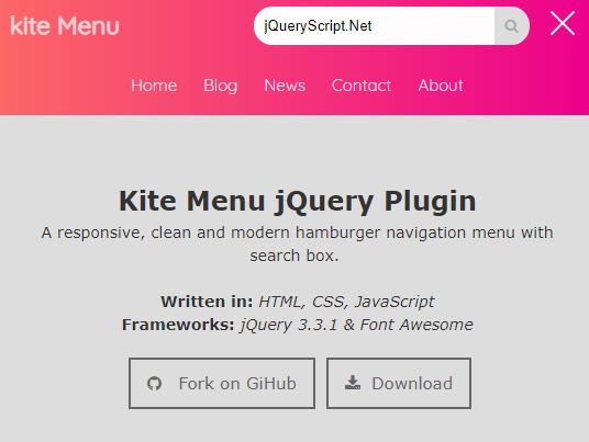
- Menu - 4913 ViewsKite Menu is a responsive, mobile-friendly navigation system that allows the user to toggle the navigation menu by clicking/tapping the hamburger button.
Kite Menu is a responsive, mobile-friendly navigation system that allows the user to toggle the navigation menu by clicking/tapping the hamburger button.
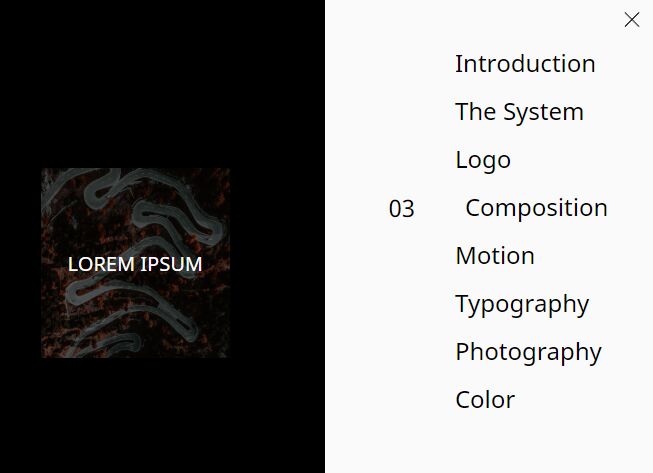
An awesome hamburger navigation concept that morphs the hamburger toggle button into a fullscreen overlay using JavaScript (jQuery) and CSS animations.
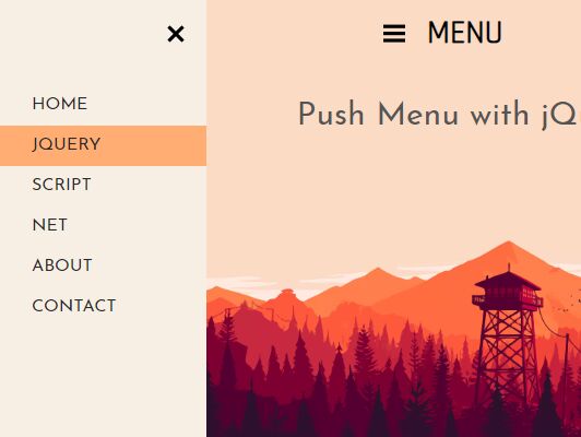
Yet another jQuery/CSS based push menu that enables a hamburger button to reveal an off-screen sidebar navigation while pushing the main content to the other side.
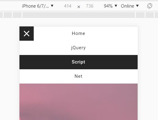
A fancy jQuery & CSS powered hamburger navigation that reveals a vertical accordion menu sliding from the edge of the screen when activated.
A fashion hamburger navigation concept that allows the user to toggle a responsive, fullscreen menu with a smooth slide animation based on GSAP's TweenMax library.
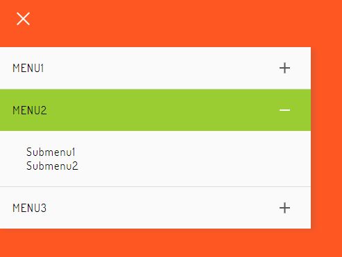
ggContentMenu is a jQuery plugin for creating mobile-compatible, SEO-friendly, multi-level off-canvas navigation with slide & fade animations.
A responsive, fullscreen, split hamburger toggle navigation for both desktop & mobile devices, inspired by Uber Rebrand 2018 Website.
Yet another responsive, mobile-friendly hamburger menu design for modern, cross-platform web applications.
Slide Menu is a variant of the Swipe Menu plugin that reveals the off-canvas navigation overlaying the main content instead of pushing it to the right.
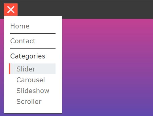
A fancy, multi-level, user- and mobile-friendly popup/dropdown menu with a hamburger toggle button, created with jQuery and CSS/CSS3.