Sliding hamburger Dropdown Menu With jQuery And CSS3
- Menu - 2729 ViewsAn easy jQuery based responsive site navigation that collapses horizontal menu items to a hamburger button when the maximum screen width is reached.
An easy jQuery based responsive site navigation that collapses horizontal menu items to a hamburger button when the maximum screen width is reached.
A cool site navigation system that enables a fixed hamburger button to toggle a fullscreen navigation menu sliding down from the top of your webpage.
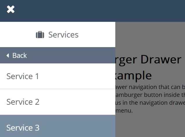
Yet another offcanvas style multi-level drawer navigation that can be opened and closed by clicking/tapping a hamburger button inside the navbar.
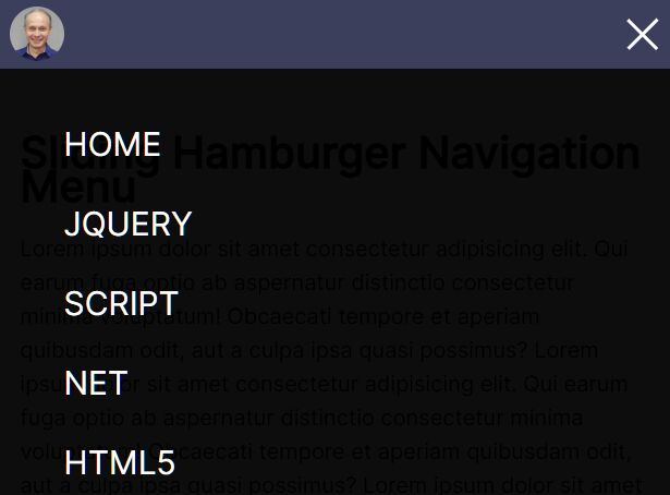
A mobile-first navigation system written in jQuery and CSS/CSS3 that morphs a hamburger toggle button into a fullscreen navigation menu when triggered.
A smooth one page scroll website template with a hamburger side navigation built with HTML, CSS, and a little jQuery.
A responsive, mobile-compatible navigation system that transforms the regular horizontal header navigation into a dropdown menu triggered by a hamburger toggle button.
A modern responsive navigation concept that automatically collapses the horizontal header menu into a hamburger navigation on small screen devices.
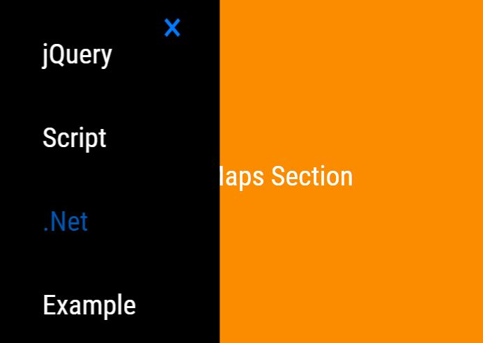
A pretty nice sliding menu written in jQuery/CSS that slides out from the toggle button and transforms the hamburger button into a close button when toggled.
A fancy responsive site/app navigation system that reveals a fullscreen navigation menu by clicking the hamburger toggle button. Built with HTML list, CSS/CSS3, and a little bit of JavaScript.
responsive-navbar.js is a responsive, mobile-first, jQuery based navigation system that smoothly slides up and down by tapping on the hamburger toggle button.