Animated Fullscreen Hamburger Navigation With jQuery
| File Size: | 2.13 KB |
|---|---|
| Views Total: | 2759 |
| Last Update: | |
| Publish Date: | |
| Official Website: | Go to website |
| License: | MIT |
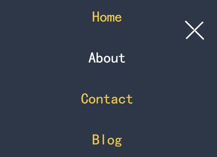
A cool site navigation system that enables a fixed hamburger button to toggle a fullscreen navigation menu sliding down from the top of your webpage.
Built with a little bit of jQuery and CSS flexbox, transition, and transform properties.
How to use it:
1. Insert the hamburger toggle button together with a nav list into the document.
<header>
  <div class="menu-toggler">
    <div class="bar half top"></div>
    <div class="bar"></div>
    <div class="bar half bottom"></div>
  </div>
  <nav>
    <ul class="nav-list">
      <li>
        <a href="#" class="nav-link">Home</a>
      </li>
      <li>
        <a href="#" class="nav-link">Blog</a>
      </li>
      <li>
        <a href="#" class="nav-link">Contact</a>
      </li>
      <li>
        <a href="#" class="nav-link">About</a>
      </li>
    </ul>
  </nav>
</header>
2. The primary CSS styles for the fullscreen navigation menu.
header {
  width: 100%;
  height: 100vh;
}

nav {
  width: 100%;
  height: 100vh;
  position: fixed;
  top: -100vh;
  z-index: 99;
  background-color: #444;
  border-bottom-right-radius: 100%;
  border-bottom-left-radius: 100%;
  transition: all 650ms cubic-bezier(1,0,0,1);
}

nav.open {
  top: 0;
  border-radius: initial;
}

.nav-list {
  width: 100%;
  list-style: none;
  height: 100%;
  display: flex;
  justify-content: center;
  align-items: center;
}

li {
  margin: 0 2rem;
}

.nav-link {
  font-family: cursive;
  font-size: 2rem;
  padding: 1rem;
}

.nav-link:hover, .nav-link:focus {
  color: #fff;
}
3. Stylize the hamburger toggler.
.menu-toggler {
  position: absolute;
  top: 5rem;
  right: 5rem;
  width: 4rem;
  height: 3rem;
  display: flex;
  flex-direction: column;
  justify-content: space-between;
  cursor: pointer;
  z-index: 999;
  transition: all 650ms ease-out;
}

.menu-toggler.open {
  transform: rotate(-45deg);
}

.bar {
  background-color: #fff;
  width: 100%;
  height: 4px;
  border-radius: 0.8rem;
}

.bar.half {
  width: 50%;
}

.bar.top {
  transform-origin: right;
  transition: transform 650ms cubic-bezier(0.54, -0.81, 0.57, 0.57);
}

.open .bar.top {
  transform: rotate(-450deg) translateX(0.8rem);
}

.bar.bottom {
  align-self: flex-end;
  transform-origin: left;
  transition: transform 650ms cubic-bezier(0.54, -0.81, 0.57, 0.57);
}

.open .bar.bottom {
  transform: rotate(-450deg) translateX(-0.8rem);
}
4. Lay out the menu items in vertical columns on mobile.
@media screen and (max-width: 768px) {
  .nav-list {
    flex-direction: column;
  }
  li {
    margin: 2rem 0;
  }
  .nav-link {
    font-size: 2.5rem;
  }
}
5. Enable the Fullscreen Hamburger Navigation by placing the following JavaScript snippets after jQuery library.
<script src="/path/to/cdn/jquery.slim.min.js"></script>
$(document).ready(function () {
  $('.menu-toggler').on('click', function () {
    $(this).toggleClass('open');
    $('nav').toggleClass('open');
  });
  $('nav .nav-link').on('click', function () {
    $('.menu-toggler').removeClass('open');
    $('nav').removeClass('open');
  });
});
This awesome jQuery plugin is developed by aromn. For more Advanced Usages, please check the demo page or visit the official website.