Modern Responsive Hamburger Navigation In jQuery
| File Size: | 7.57 KB |
|---|---|
| Views Total: | 3665 |
| Last Update: | |
| Publish Date: | |
| Official Website: | Go to website |
| License: | MIT |
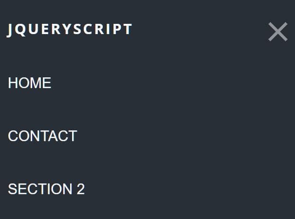
A modern responsive navigation concept that automatically collapses the horizontal header menu into a hamburger navigation on small screen devices.
Click/tap the hamburger button you will see an off-canvas menu sliding from the left of the screen and covering the whole page.
How to use it:
1. Code the HTML for the header navigation.
<header class="navigation">
  <a href="#" class="nav__trigger"><span class="nav__icon"></span></a>
  <nav class="nav">
    <ul class="nav__list">
      <li class="nav__item"><span class="company-name">Company Name</span></li>
      <li class="nav__item"><a class="nav__link" href="#">Home</a></li>
      <li class="nav__item"><a class="nav__link" href="#">Contact</a></li>
      <li class="nav__item"><a class="nav__link" href="#">About</a></li>
      <li class="nav__item"><a class="nav__link" href="#">Blog</a></li>
    </ul>
  </nav>
</header>
2. The necessary CSS styles for the navigation.
body.no-scroll {
  overflow: hidden;
}

.nav {
  position: fixed;
  width: 100%;
  height: auto;
  z-index: 5;
  transition: all 0.5s ease-in-out;
  font-weight: 400;
  background-color: #292f36;
}

.nav__list {
  display: flex;
  align-items: baseline;
  text-transform: uppercase;
  justify-content: space-around;
  flex-direction: row;
  padding: 1em 0.5em;
}

.nav__item {
  list-style-type: none;
}

.nav__link {
  font-size: 1.5em;
  text-decoration: none;
  color: #f7faff;
  opacity: 1;
  transition: opacity 0.5s ease-in-out;
}

.nav__link:hover {
  color: #f7faff;
}

/* hamburger trigger */
.nav__trigger {
  display: none;
  position: fixed;
  width: 30px;
  height: 25px;
  right: 100px;
  top: 50px;
  z-index: 200;
}

.nav__icon {
  display: inline-block;
  position: relative;
  width: 40px;
  height: 5px;
  background-color: #f7faff;
  transition-property: background-color, transform;
  transition-duration: 0.5s;
}

.nav__icon:before, .nav__icon:after {
  content: '';
  display: block;
  width: 40px;
  height: 5px;
  position: absolute;
  background: #f7faff;
  transition-property: margin, transform;
  transition-duration: 0.5s;
}

.nav__icon:before {
  margin-top: -10px;
}

.nav__icon:after {
  margin-top: 10px;
}

.nav__link {
  transition-delay: 500ms;
}

.nav--active .nav__link {
  opacity: 1;
}

.nav--active .nav {
  transition: all 300ms ease-in-out;
  transform: translateX(0);
}

.nav--active .nav__icon {
  background: rgba(0, 0, 0, 0);
}

.nav--active .nav__icon:before {
  margin-top: 0;
  transform: rotate(45deg);
}

.nav--active .nav__icon:after {
  margin-top: 0;
  transform: rotate(-45deg);
}

@media (max-width: 768px) {
  .nav__trigger {
    display: block;
    top: 50px;
    right: 30px;
  }

  .nav {
    transform: translateX(-100%);
    width: 100%;
    height: 100%;
    z-index: 100;
    opacity: 0;
  }

  .nav__item {
    text-align: left;
    padding: 30px 10px;
  }

  .nav__list {
    margin: 0;
    padding: 10px;
    flex-direction: column;
    align-items: flex-start;
  }

  .nav__link {
    opacity: 0;
  }
}
3. Include the necessary jQuery library at the bottom of the page.
<script src="/path/to/jquery.min.js"></script>
4. The JavaScript (jQuery script) to enable the hamburger trigger to toggle the fullscreen menu.
$('.nav__trigger',).on('click', function(e){

   // prevent default behavior
   e.preventDefault();

   // add nav--active class to nav icon
   $(this).parent().toggleClass('nav--active').show();

   // disable scroll behind nav
   $('body').toggleClass('no-scroll');

 });
5. Clicking/tapping on a link or anywhere in the navigation to close the menu and enable the page scroll.
$('.nav li, .nav').on('click', function(){
  $(".nav__trigger").parent().removeClass("nav--active");
  $(".nav__icon").removeClass("nav--active");
  $('body').removeClass('no-scroll');
});
This awesome jQuery plugin is developed by codywilliamson. For more Advanced Usages, please check the demo page or visit the official website.


