Responsive Off-canvas Navigation With Smooth Scroll Integration
| File Size: | 3.09 KB |
|---|---|
| Views Total: | 2540 |
| Last Update: | |
| Publish Date: | |
| Official Website: | Go to website |
| License: | MIT |
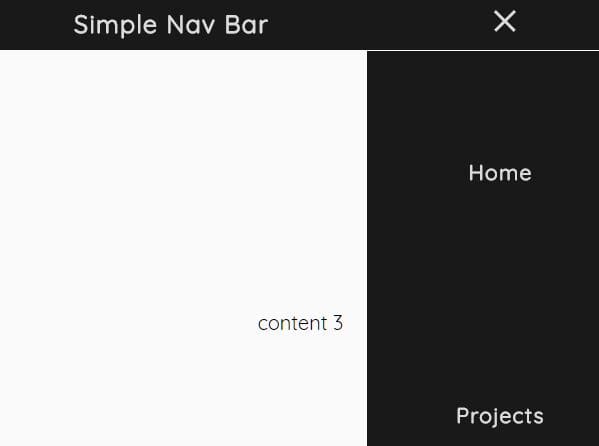
A sticky, responsive, mobile-friendly navigation system for your cross-platform web app which turns the regular navbar into an off-canvas side menu with a hamburger toggle button on the mobile device.
It also comes with a basic smooth scroll functionality that enables the user to smoothly scroll through your web app by clicking/tapping the menu items.
How to use it:
1. To get started, import the navMain.css and nav.js into the document.
<link rel="stylesheet" href="/path/to/navMain.css">
<script src="/path/to/jquery.min.js"></script>
<script src="/path/to/nav.js"></script>
2. Create a navbar containing the logo, hamburger toggle button, and anchor links pointing to the page sections within the document.
<nav class="navbar">
  <div class="logo">
    <h4>jQueryScript</h4>
  </div>
  <ul class="navlinks">
      <li><a href="#section1" class="scroll">Home</a></li>
      <li><a href="#section2" class="scroll">About</a></li>
      <li><a href="#section3" class="scroll">Contact</a></li>
  </ul>
  <div class = "navdropdown">
      <div class="line1"></div>
      <div class="line2"></div>
      <div class="line3"></div>
  </div>
</nav>
3. Add unique IDs to page sections as follows. That's it.
<div class="content" id="section1">
  Home
</div>
<div class="content" id="section2">
  About
</div>
<div class="content" id="section3">
  Contact
</div>
This awesome jQuery plugin is developed by Killian264. For more Advanced Usages, please check the demo page or visit the official website.


