Sliding Hamburger Dropdown Menu With jQuery And CSS3
| File Size: | 18.2 KB |
|---|---|
| Views Total: | 2897 |
| Last Update: | |
| Publish Date: | |
| Official Website: | Go to website |
| License: | MIT |
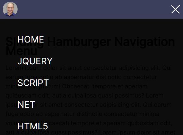
An easy jQuery based responsive site navigation that collapses horizontal menu items to a hamburger button when the maximum screen width is reached.
Clicking/tapping the hamburger button to reveal the collapsed menu items in a fullscreen dropdown pane, with a smooth sliding animation.
How to use it:
1. Create a header navigation from a nav list.
<header class="header">
  <div class="container">
    <div class="header__body">
      <a href="" class="header__logo">
      <img src="images/logo.jpeg" alt="logo">
      </a>
      <div class="header__burger">
        <span></span>
      </div>
      <nav class="header__menu">
        <ul class="header__list">
          <li>
            <a href="#" class="header__link">Home</a>
          </li>
          <li>
            <a href="#" class="header__link">jQuery</a>
          </li>
          <li>
            <a href="#" class="header__link">Script</a>
          </li>
          <li>
            <a href="#" class="header__link">Net</a>
          </li>
          <li>
            <a href="#" class="header__link">HTML5</a>
          </li>
          <li>
            <a href="#" class="header__link">CSS3</a>
          </li>
        </ul>
      </nav>
    </div>
  </div>
</header>
2. The main CSS styles for the header navigation.
.header {
  position: fixed;
  width: 100%;
  top: 0;
  left: 0;
  z-index: 50;
}

.header::before{
  content: '';
  position: absolute;
  top: 0;
  left: 0;
  width: 100%;
  height: 100%;
  background-color: rgb(60, 63, 92);
  z-index: 2;
}

.header__body {
  position: relative;
  display: flex;
  justify-content: space-between;
  height: 80px;
  align-items: center;
}

.header__logo{
  flex: 0 0 60px;
  border-radius: 50%;
  overflow: hidden;
  position: relative;
  z-index: 3;
}

.header__logo  img{
 max-width: 100%;
 display: block;
}

.header__burger{
  display: none;
}

.header__list {
  display: flex;
  position: relative;
  z-index: 2;
}

.header__list li{
  list-style: none;
  margin-left: 20px;
}

.header__link{
  color: #ffffff;
  text-transform: uppercase;
  font-size: 18px;
  text-decoration: none;
}
3. Apply CSS styles to the hamburger menu in the CSS media queries.
@media(max-width: 767px){

  .header__logo{
    flex: 0 0 40px;
  }

  .header__body {
    height: 50px;
  }

  .header__burger {
    display: block;
    position: relative;
    width: 30px;
    height: 20px;
    position: relative;
    z-index: 3;
  }

  .header__burger span {
    position: absolute;
    background-color: #ffffff;
    width: 100%;
    height: 2px;
    left: 0;
    top: 9px;
    transition: all 0.3s ease 0s;
  }

  .header__burger::before,
  .header__burger::after{
    content: '';
    background-color: #ffffff;
    position: absolute;
    width: 100%;
    height: 2px;
    left: 0;
    top: px;
    transition: all 0.3s ease 0s;
  }

  .header__burger::after{
    bottom: 0;
  }

  .header__burger.active::before {
    transform: rotate(45deg);
    top: 9px;
  }

  .header__burger.active::after {
    transform: rotate(-45deg);
    bottom: 9px;
  }

  .header__burger.active span {
    transform: scale(0);
  }

  .header__menu {
    position: fixed;
    top: -120%;
    left: 0;
    width: 100%;
    height: 100%;
    overflow: auto;
    transition: all 0.3s ease 0s;
    background-color: rgba(156, 163, 163, 0.959);
    padding: 70px 10px 20px 10px;

  }

  .header__menu.active {
     top: 0;
  }

  .header__list{
     display: block;
  }

  .header__list li{
     margin:0px 0px 20px 0px;
  }

  .header__link {
     font-size: 24px;
  }
}
4. Import the latest jQuery JavaScript library in the document.
<script src="/path/to/cdn/jquery.slim.min.js"></script>
5. Enable the hamburger button to toggle the dropdown menu.
$('.header__burger').click(function(event) {
  $('.header__burger, .header__menu').toggleClass('active')
})
6. Prevent body from scrolling when the hamburger navigation is activated. OPTIONAL.
$('.header__burger').click(function(event) {
  $('.header__burger, .header__menu').toggleClass('active')
  $('body').toggleClass('lock')
})
body.lock {
  overflow: hidden;
}
This awesome jQuery plugin is developed by mihmosi. For more Advanced Usages, please check the demo page or visit the official website.


