10 Best Responsive Menu Systems In jQuery/JavaScript/CSS (2026 Update)
What is responsive menu?
A responsive menu will automatically transform the regular horizontal site navigation into a responsive, mobile-friendly navigation menu for cross-platform websites and web apps.
Why you should use a responsive menu?
With the popularity of smartphones, more and more users browser website through mobile and tablet devices. And Google announced that Google predominantly uses the mobile version of the content for indexing and ranking.
In order to provide a better user experience, you might need a responsive menu system for your websites or web apps accoss the devices and platforms.
The best responsive menu
In this blog post you will find a list of 10 best Responsive Menu Systems implemented in jQuery, Vanilla JavaScript, or even Pure CSS/CSS3. I hope you like it.
Originally Published Nov 17 2017, updated Jan 17 2026
Table of contents:
jQuery Responsive Menu Plugins:
Responsive Dashboard Sidebar Menu Templates - DashNav
A set of responsive, mobile-friendly, multi-level sidebar navigation templates designed for dashboards & admin panels.
Features:
- Based on jQuery and Bootstrap 5.
- Custom scrollbar based on jQuery Perfect Scrollbar.
- Dark & Light themes.
- Compact & Full views.
- Auto collapses the sidebar into an off-canvas menu on mobile.

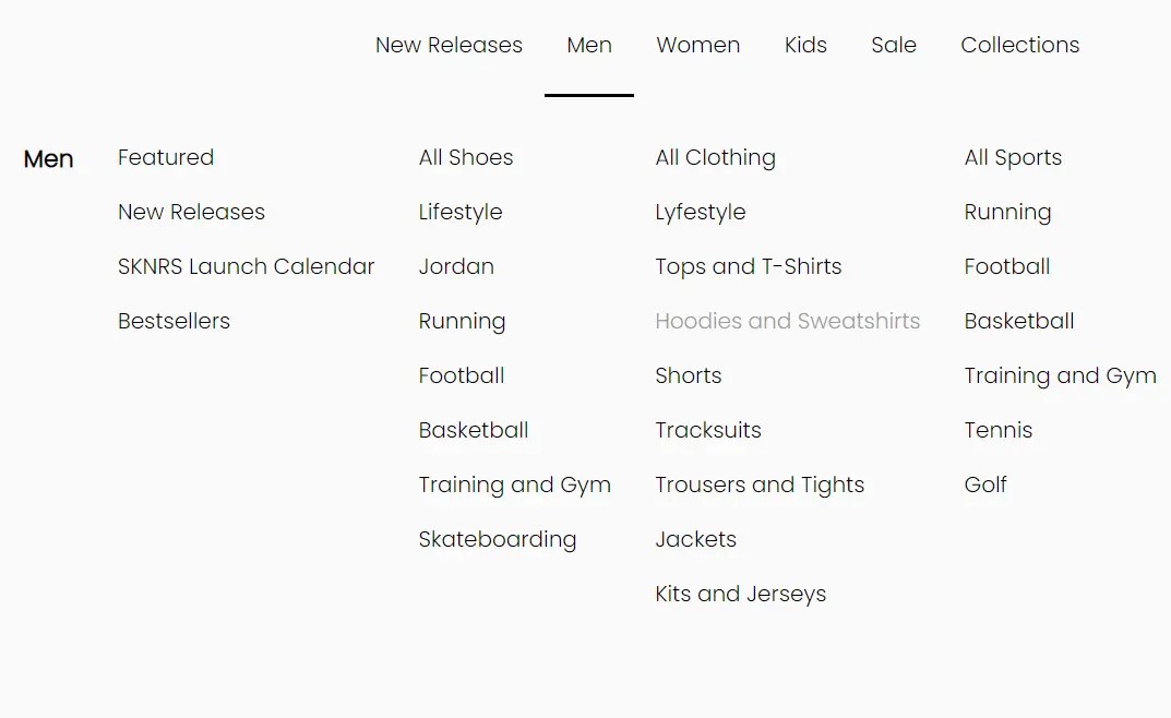
Modern Dropdown Mega Menu In jQuery And CSS3
A responsive, stylish, mobile-friendly mega menu (multi-column dropdown menu) built using JavaScript (jQuery), CSS/CSS3, and nested HTML lists.
The mega menu pushes horizontal menu items to a multi-level hamburger toggle menu when the maximum screen width is reached (min-width: 992px).

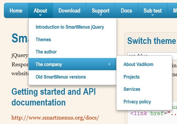
Responsive and Cross-platform jQuery Navigation Menu Plugin - Smart Menus
A jQuery Navigation Menu plugin for creating responsive and cross-platform multi-level dropdown menus for your site navigation. It comes with a lot of options for customizing your menus and supports all devices such as desktop, tablet, mobile, etc. Please resize the demo page to see how it works on mobile devices.
Features:
- Responsive and mobile-friendly
- Cross browser. Supports all major browsers.
- Vertical or horizontal menus
- Supports mega menu contents
- Supports events and methods
- Supports drop down animations
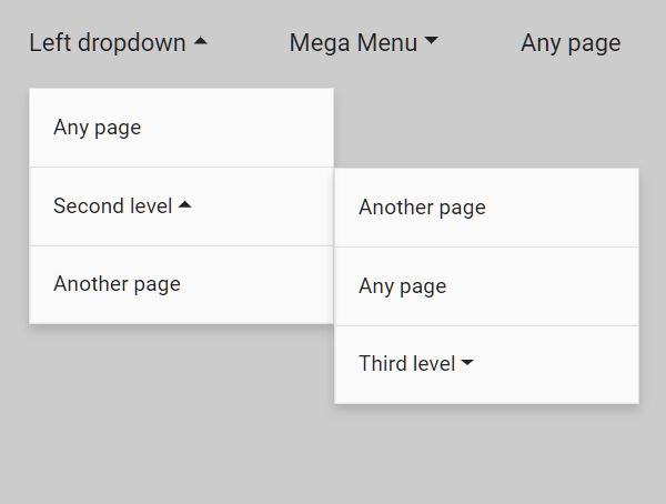
Cross-platform Multi-level Dropdown Menu - Vegas Nav
A JavaScript-powered cross-platform navigation system to help you create a responsive, mobile-friendly, multi-level dropdown navbar for your web app.
- Collapses the navbar into an off-canvas side nav on small screens.
- Supports desktop, laptop, tablet, and mobile.
- Supports multi-column mega menu.
- Ultra light and dead simple to use.
- Semantic and SEO-friendly. Built with nested HTML lists.
- Without 3rd-party dependencies (v3+).
- Scrollspy functionality (v3+).
Responsive Hamburger Menu With jQuery And TailwindCSS
A jQuery-powered responsive menu that transforms a standard navbar into a fullscreen hamburger toggle menu on small screens.
It is built with jQuery, Tailwind.css, and Font Awesome. Easy to integrate it into your existing project in just a minute.

Vanilla JS Responsive Menu Libraries:
Responsive Mega Menu In JavaScript
A modern, responsive mega menu template for online stores. Written in Pure JavaScript and CSS/CSS3.
When the screen size is smaller than 992px, the mega menu will be collapsed into a multi-level sidebar menu, which is togglable with a hamburger button.

Responsive Multi-level Sidebar Menu With JavaScript/CSS
A responsive sidebar menu with multi-level sub-menus written in plain JavaScript and CSS. The sidebar menu is displayed in Compact mode on page load and will expand to Full mode when hovering over.
It collapses the sidebar into an off-canvas navigation on mobile, and your visitors are able to reveal the menu by clicking the hamburger button.

Responsive Multi-level Dropdown Menu With JavaScript And CSS – ozmenu.js
A modern, clean, responsive, multi-level dropdown menu written in vanilla JavaScript and CSS.
The key feature of this dropdown menu is that it can automatically convert into an off-canvas side navigation on mobile devices, ensuring your website or web app remains easy to navigate and use on any device.
In addition, the menu supports multiple levels of dropdown items, which is great for content-rich websites with complex navigation structures.

Responsive Dropdown Mega Menu In JavaScript
A fully responsive, mobile-friendly dropdown mega navigation written in JavaScript, CSS, and Material Icons.
It automatically transforms the navbar into a vertical accordion menu with a hamburger button for a better experience on mobile devices.
WCAG Compliant Responsive Dropdown Navigation – accessible-menu
An accessible, WCAG compliant, fully responsive, multi-level, and mobile-friendly responsive dropdown navigation menu component written in pure JavaScript.

Bonus: Pure CSS Responsive Menus:
Transform Navbar Into Bottom Navigation
A mobile-friendly navigation system that transforms the site menu into a bottom navigation bar on small screens.

Responsive Pure CSS Dropdown Navigation Menu
A fully responsive, CSS-only navigation that breaks down into a hamburger dropdown menu when the viewport size is smaller than a breakpoint specified in the CSS3 media queries.

Conclusion:
Want more jQuery plugins or JavaScript libraries to create awesome Responsive Menus on the web & mobile? Check out the jQuery Responsive Menu and JavaScript/CSS Responsive Menu sections.
See also:
- Best Responsive Dropdown Menus
- Best Accordion Menu Components
- Best Circle Menu Plugins
- Best Mega Menu Systems
- Best Off-canvas Mobile Menus
- Best Floating Action Button (Popup Menu) Plugins
- Best Fullscreen Navigation Plugins
- Best JavaScript & CSS Responsive Menus
- Best Mobile-friendly Off-canvas Navigation Systems
- Best Vue.js Menu Components To Improve App Navigation Experience