10 Best Responsive Dropdown Menus In JavaScript & CSS (2026 Update)
If you are running a large cross-platform site and have a lot of content, then you might need a responsive multi-level dropdown menu to organize and display categories and featured content/products on both desktop and mobile.
In this article you will browse through the top 10 responsive, mobile-friendly, and multi-level dropdown menus built with jQuery and/or pure JavaScript/CSS. I hope you like it.
Originally Published May 10, 2019, updated Jan 17 2026
Table of contents:
jQuery Dropdown Menu Plugins:
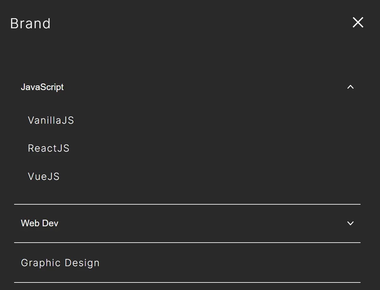
Modern Dropdown Mega Menu In jQuery And CSS3
A responsive, stylish, mobile-friendly mega menu (multi-column dropdown menu) built using JavaScript (jQuery), CSS/CSS3, and nested HTML lists.
The mega menu pushes horizontal menu items to a multi-level hamburger toggle menu when the maximum screen width is reached (min-width: 992px).
>
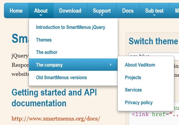
Responsive and Cross-platform jQuery Navigation Menu Plugin - Smart Menus
A jQuery Navigation Menu plugin for creating responsive and cross-platform multi-level dropdown menus for your site navigation. It comes with a lot of options for customizing your menus and supports all devices such as desktop, tablet, mobile, etc. Please resize the demo page to see how it works on mobile devices.
Features:
- Responsive and mobile-friendly
- Cross browser. Supports all major browsers.
- Vertical or horizontal menus
- Supports mega menu contents
- Supports events and methods
- Supports drop down animations
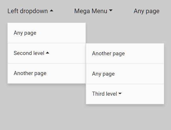
Cross-platform Multi-level Dropdown Menu - Vegas Nav
A JavaScript-powered cross-platform navigation system to help you create a responsive, mobile-friendly, multi-level dropdown navbar for your web app.
- Collapses the navbar into an off-canvas side nav on small screens.
- Supports desktop, laptop, tablet, and mobile.
- Supports multi-column mega menu.
- Ultra light and dead simple to use.
- Semantic and SEO-friendly. Built with nested HTML lists.
- Without 3rd-party dependencies (v3+).
- Scrollspy functionality (v3+).
Responsive Dropdown Menu With jQuery And CSS Flexbox - Fluid Menu
Fluid Menu is a semantic, SEO-friendly, mobile-ready and multi-level dropdown menu plugin built with jQuery, CSS flexbox, and Font Awesome iconic font.
The dropdown menu expands and collapses menu items gracefully when your window is resized, adapting to different screen sizes, while preserving its usability and aesthetics.

Mobile-friendly Multi-level Dropdown Navigation With jQuery
A simple yet customizable jQuery plugin for creating a responsive multi-level dropdown menu on your site. It has the ability to automatically convert the horizontal navbar into a mobile-friendly vertical accordion menu on small screens for better readability.

Vanilla JS Dropdown Menu Libraries:
Responsive Multi-level Dropdown Menu With JavaScript And CSS – ozmenu.js
A modern, clean, responsive, multi-level dropdown menu written in vanilla JavaScript and CSS.
The key feature of this dropdown menu is that it can automatically convert into an off-canvas side navigation on mobile devices, ensuring your website or web app remains easy to navigate and use on any device.
In addition, the menu supports multiple levels of dropdown items, which is great for content-rich websites with complex navigation structures.

WCAG Compliant Responsive Dropdown Navigation – accessible-menu
An accessible, WCAG compliant, fully responsive, multi-level, and mobile-friendly responsive dropdown navigation menu component written in pure JavaScript.

Responsive Accessible Dropdown Menu Template with Vanilla JavaScript
A minimalist, responsive, accessible navigation system implemented in vanilla JavaScript.
It focuses on a navigation layout enhanced with dropdown menus that support accessibility through appropriate ARIA attributes and focus trapping.
You can use it as a template for websites that require accessible, mobile-friendly menu navigation.
Features:
- Responsive design with hamburger menu for mobile (under 768px)
- Dropdown navigation that works consistently across desktop and mobile
- Accessibility-focused with aria attributes (aria-expanded, aria-hidden, aria-label)
- Focus trapping with Tab/Shift+Tab
- ESC key support for closing navigation
- Built with pure vanilla JavaScript (no dependencies)
- Uses grid-template-rows for smooth open/close animations
Pure CSS Dropdown Menus:
Create A Multi-Level Drop Down Menu with Pure CSS
A flat designed multi-level drop down menu built with plain Html markup and pure CSS.

Pure CSS Mobile-compatible Responsive Dropdown Menu
A pure CSS responsive menu created by andornagy that automatically changes to a toggleable dropdown menu at a specified breakpoint based on CSS3 media queries.

Conclusion:
Want more jQuery plugins or JavaScript libraries to create awesome dropdown menus on the web & mobile? Check out the jQuery Dropdown Menu and JS/CSS Dropdown Menu sections.
See also:
- Best Responsive Menu jQuery Plugins
- Best Off-canvas Mobile Menus
- Best Accordion Menu Components
- Best Circle Menu Plugins
- Best Mega Menu Systems
- Best Floating Action Button (Popup Menu) Plugins
- Best Fullscreen Navigation Plugins
- Best Floating Action Button (Popup Menu) Plugins
- Best JavaScript & CSS Responsive Menus
- Best Mobile-friendly Off-canvas Navigation Systems
- Best Vue.js Menu Components To Improve App Navigation Experience