Cross-platform Multi-level Dropdown Menu - Vegas Nav
| File Size: | 209 KB |
|---|---|
| Views Total: | 15675 |
| Last Update: | |
| Publish Date: | |
| Official Website: | Go to website |
| License: | MIT |
Vegas Nav is a JavaScript-powered cross-platform navigation system to help you create a responsive, mobile-friendly, multi-level dropdown navbar for your web app.
More Features:
- Collapses the navbar into an off-canvas side nav on small screens.
- Supports desktop, laptop, tablet, and mobile.
- Supports multi-column mega menu.
- Ultra light and dead simple to use.
- Semantic and SEO-friendly. Built with nested HTML lists.
- Without 3rd-party dependencies (v3+).
- Scrollspy functionality (v3+).
See It In Action:
See Also:
How to use it:
1. Load the core stylesheet vgnav.css and theme CSS vgnav-theme.css in the document.
<link href="/path/to/dist/vgnav.css" rel="stylesheet" />
<link href="/path/to/demo/css/vgnav-theme.css" rel="stylesheet" />
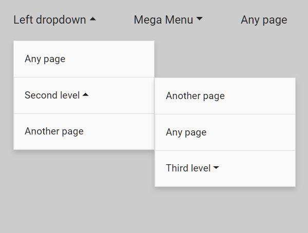
2. Create a multi-level dropdown navbar from nested HTML lists as follows:
<nav class="vg-nav">
  <ul class="vg-nav-wrapper">
    <li class="active">
      <a href="/">Home page</a>
    </li>
    <li class="dropdown">
      <a href="#">Left dropdown</a>
      <ul class="left">
        <li><a href="/">Any page</a></li>
        <li class="dropdown">
          <a href="#">Second level</a>
          <ul class="left">
            <li><a href="/">Another page</a></li>
            <li><a href="/">Any page</a></li>
            <li class="dropdown">
              <a href="#">Third level</a>
              <ul class="left">
                <li><a href="/">Any page</a></li>
                <li><a href="/">Another page</a></li>
              </ul>
            </li>
          </ul>
        </li>
        <li><a href="/">Another page</a></li>
      </ul>
    </li>
    <li class="dropdown-mega">
      <a href="/">Mega Menu</a>
      <div class="dropdown-mega-container">
        <div class="row">
          <div class="col-md-4 text-left">
            Left
          </div>
          <div class="col-md-4 text-center">
            Center
          </div>
          <div class="col-md-4 text-right">
            Right
          </div>
        </div>
      </div>
    </li>
    <li class="dropdown">
      <a href="#">Right dropdown</a>
      <ul class="right">
        <li><a href="/">Any page</a></li>
        <li class="dropdown">
          <a href="#">Second level</a>
          <ul class="right">
            <li><a href="/">Another page</a></li>
            <li><a href="/">Any page</a></li>
            <li class="dropdown">
              <a href="#">Third level</a>
              <ul class="right">
                <li><a href="/">Any page</a></li>
                <li><a href="/">Another page</a></li>
              </ul>
            </li>
          </ul>
        </li>
        <li><a href="/">Another page</a></li>
      </ul>
    </li>
  </ul>
</nav>
3. Load the main JavaScript vgnav.min.js at the end of the document. Note that the plugin has removed jQuery dependency since v3.0.
<script src="/path/to/dist/vgnav.umd.js"></script>
4. Initialize the plugin and done.
new VGNav({
    // options
});
5. Determine at which breakpoint the navbar will be collapsed into a hamburger button that enables the visitor to toggle the off-canvas menu.
- xxl: Extra large
- xl: Desktop and laptop
- lg: Tablet landscape
- md: Tablet portrait
- sm: Smartphone landscape
- xs: Smartphone portrait
new VGNav({
    expand: 'lg',
});
5. Make the off-canvas side nav slide in from the left side of the screen instead.
new VGNav({
    sidebar: {
      placement: 'left',
      clone: null,
      width: 250
    }
});
6. Open the dropdown menus on hover instead of click.
new VGNav({
    isHover: true
});
7. Determine the location of the nav. Default: 'horizontal'.
new VGNav({
    placement: 'vertical'
});
8. Add a custom heading for mobile navigation.
let vg_nav = new VGNav('#myNav',{
    mobileTitle: 'Navigation'
});
9. Customize the toggle element.
new VGNav({
    toggle: '<span class="default"></span>'
});
10. Customize the hamburge button.
new VGNav({
    expand: 'lg',
    mobileTitle: 'Mobile Title',
    hamburger: '<svg id="ham-menue" viewBox="0 0 100 100"><path class="line line1" d="M 20,29.000046 H 80.000231 C 80.000231,29.000046 94.498839,28.817352 94.532987,66.711331 94.543142,77.980673 90.966081,81.670246 85.259173,81.668997 79.552261,81.667751 75.000211,74.999942 75.000211,74.999942 L 25.000021,25.000058"></path><path class="line line2" d="M 20,50 H 80"></path><path class="line line3" d="M 20,70.999954 H 80.000231 C 80.000231,70.999954 94.498839,71.182648 94.532987,33.288669 94.543142,22.019327 90.966081,18.329754 85.259173,18.331003 79.552261,18.332249 75.000211,25.000058 75.000211,25.000058 L 25.000021,74.999942"></path></svg>'
});
11. Move links to the drop-down menu if the total width of all links is greater than the main container..
new VGNav({
    move: true,
});
Changelog:
- JS Update
- JS Update
v3.2.14 (2024-01-31)
- Update
v3.2.13 (2023-10-25)
- Auto positioning of the drop-down list (default: true)
- Bugs fixed
v3.2.11 (2023-09-21)
- Update
v3.2.9 (2023-08-14)
- Update
v3.2.8 (2023-07-26)
- Bugfix
v3.2.7 (2023-07-20)
- Bugfix
v3.2.7 (2023-07-13)
- Bugfix
v3.2.5 (2023-06-29)
- Bugfix
v3.2.0/1 (2023-02-11)
- Bugfix
v3.1.9 (2023-01-13)
- Bugfix
v3.1.6 (2022-12-17)
- Bugfix
v3.1.5 (2022-12-13)
- Bugfix
v3.1.4 (2022-11-17)
- automatic transfer of links to the drop-down menu if the total width of all links is greater than the main container. The "move" parameter has been introduced
v3.1.1 (2022-11-10)
- automatically move links to the drop-down menu if the total width of all links is greater than the main container. The "move" parameter has been introduced
v3.1.0 (2022-09-27)
- custom hamburger and fixes
v3.0.8 (2022-07-14)
- fix isHover
v3.0.6 (2022-06-292)
- Removed scrollspy functionality
v3.0.5 (2022-06-22)
- Bugfix
v3.0.0 (2022-06-22)
- Completely rewritten, bugs fixed.
- Added VGSidebar and VGSpy plugin
v2.0.5 (2022-06-06)
- Export Public Api
v2.0.4 (2022-05-18)
- Update
v2.0.3 (2021-07-22)
- Added heading for mobile navigation. Specify in the settings {mobileTitle: 'Navigation'}
v2.0.2 (2020-11-21)
- Update
v2.0.1 (2020-11-14)
- Changed plugin markup
v2.0.0 (2020-11-09)
- Changed plugin markup
- Added callbacks
- Fixed bugs
v1.1.5 (2020-07-25)
- Minor bugs fixed
v1.1.4 (2020-07-06)
- Fixed for Firefox
2020-06-29
- Bugs fixed
2020-06-03
- Minor bugs fixed
2020-05-09
- Bugfix
2020-03-25
- Toggle customization
- Minor bugs fixed
2020-03-18
- Bugfix
2020-03-17
- Open submenus on hover
2020-03-10
- Fixed bugs.
2020-03-05
- Added left menu.
2020-03-03
- Updated sidebar width
This awesome jQuery plugin is developed by vegas-dev. For more Advanced Usages, please check the demo page or visit the official website.


