Responsive Multi-level Navigation For Bootstrap 4 - k-responsive-menu
| File Size: | 967 KB |
|---|---|
| Views Total: | 9690 |
| Last Update: | |
| Publish Date: | |
| Official Website: | Go to website |
| License: | MIT |
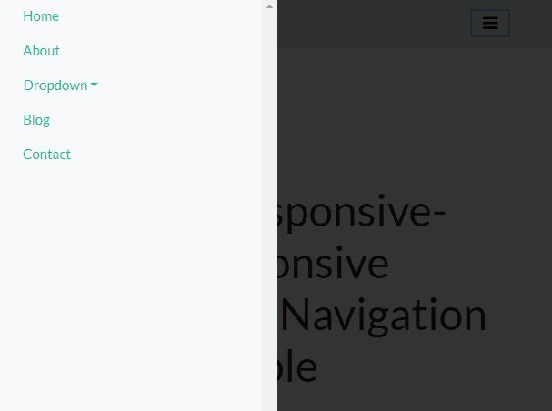
k-responsive-menu is a simple, responsive, multi-level, cross-platform and mobile-friendly navigation jQuery plugin for Bootstrap 4 framework.
The plugin converts the normal horizontal or vertical Bootstrap 4 navigation into a multi-level dropdown or push menu on small devices.
More examples:
How to use it:
1. To use this plugin, you first need to load jQuery library and Bootstrap 4 framework in the html file.
<link rel="stylesheet" href="https://stackpath.bootstrapcdn.com/bootstrap/4.1.0/css/bootstrap.min.css" integrity="sha384-9gVQ4dYFwwWSjIDZnLEWnxCjeSWFphJiwGPXr1jddIhOegiu1FwO5qRGvFXOdJZ4" crossorigin="anonymous">
<script src="https://code.jquery.com/jquery-3.3.1.min.js" integrity="sha384-tsQFqpEReu7ZLhBV2VZlAu7zcOV+rXbYlF2cqB8txI/8aZajjp4Bqd+V6D5IgvKT" crossorigin="anonymous"></script>
<script src="https://cdnjs.cloudflare.com/ajax/libs/popper.js/1.14.0/umd/popper.min.js" integrity="sha384-cs/chFZiN24E4KMATLdqdvsezGxaGsi4hLGOzlXwp5UZB1LY//20VyM2taTB4QvJ" crossorigin="anonymous"></script>
<script src="https://stackpath.bootstrapcdn.com/bootstrap/4.1.0/js/bootstrap.min.js" integrity="sha384-uefMccjFJAIv6A+rW+L4AHf99KvxDjWSu1z9VI8SKNVmz4sk7buKt/6v9KI65qnm" crossorigin="anonymous"></script>
2. Load the jQuery k-responsive-menu plugin's JavaScript and Stylesheet in the html file.
<link href="dist/css/k-responsive-menu.css" rel="stylesheet">
<script src="dist/js/k-responsive-menu.js"></script>
3. Create a multi-level Bootstrap navigation as these:
<header class="bg-light">
  <div class="k-menu-bar container">
    <div id="logo" class="mr-auto"></div>
    <button k-toggle-for="#example" class="k-button-toggle navbar-toggler">MENU</button>
  </div>
  <div id="example" class="container">
    <div k-menu-map-to="#logo" class="k-logo navbar-brand">jQueryScript</div>
    <ul class="nav">
      <li class="nav-item"><a href="#" class="nav-link">Home</a></li>
      <li class="nav-item"><a href="#" class="nav-link">About</a></li>
      <li class="nav-item dropdown"><a id="navbarDropdown" href="#" role="button" data-toggle="dropdown" aria-haspopup="true" aria-expanded="false" class="nav-link dropdown-toggle">Dropdown</a>
        <div aria-labelledby="navbarDropdown" class="dropdown-menu"><a href="#" class="dropdown-item">Action</a><a href="#" class="dropdown-item">Another action</a>
          <div class="dropdown-divider"></div><a href="#" class="dropdown-item">Something else here</a>
        </div>
      </li>
      <li class="nav-item"><a href="#" class="nav-link">Blog</a></li>
      <li class="nav-item"><a href="#" class="nav-link">Contact</a></li>
    </ul>
  </div>
</header>
4. Call the plugin on the Bootstrap navigation and done.
$('#example').kResponsiveMenu();
5. Set the menu type (horizontal or vertical).
$('#example').kResponsiveMenu({
  menuType: 'vertical' // default: horizontal
});
6. Add a custom icon to the trigger element.
$('#example').kResponsiveMenu({

  // uses Font Awesome
  menuIcon: '<i class="fa fa-bars"></i>'

});
7. Customize the animation speed when you toggle the navigation.
$('#example').kResponsiveMenu({

  // slow, fast, 200
  animationSpeed: 'slow'

});
8. Create an off-canvas push menu instead of dropdown.
$('#example').kResponsiveMenu({

  // right, left
  menuPush: null,

  // fixed
  menuPushPosition: 'absolute',

  // px, %, rem
  menuPushWidth: '100%',

  // shows background overlay
  menuBackDrop: false

});
9. Specify the breakpoint.
$('#example').kResponsiveMenu({

  // 'xs', 'sm', 'md', 'lg', 'xl', 480
  resizeWidth: 768

});
10. Whether to make the navigation float.
$('#example').kResponsiveMenu({

  menuFloat: true

});
11. Available event handlers.
$('#example').kResponsiveMenu({

  onResize: null,
  onComplete: null,
  onChange: null,
  onClick: null,
  onBegin: null,
  onHover: null

});
Changelog:
2018-06-29
- v4.0.1
This awesome jQuery plugin is developed by baonguyenyam. For more Advanced Usages, please check the demo page or visit the official website.


