Responsive Hamburger Dropdown Menu With jQuery And CSS3
| File Size: | 9.45 KB |
|---|---|
| Views Total: | 4108 |
| Last Update: | |
| Publish Date: | |
| Official Website: | Go to website |
| License: | MIT |
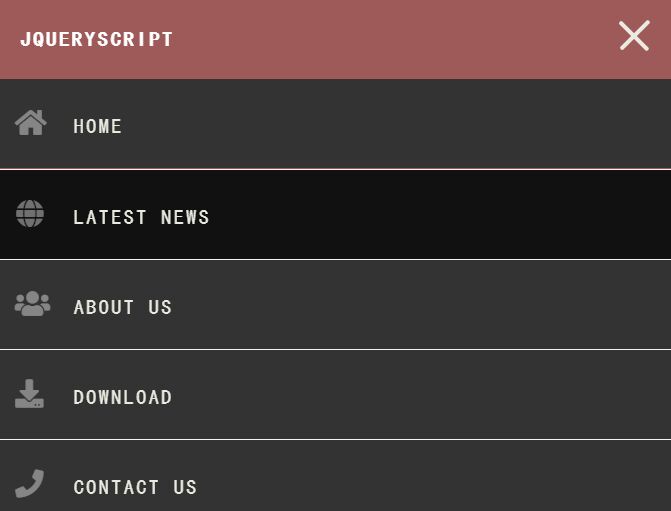
A responsive, mobile-compatible navigation system that transforms the regular horizontal header navigation into a dropdown menu triggered by a hamburger toggle button.
Written in JavaScript (jQuery) and CSS flexbox, transition, transform, media query properties.
How to use it:
1. Create a header navigation for your webpage.
<header>
  <section id="nav">
    <div class="wrapper">
      <nav class="site-nav">
        <h1 class="logo">Site Logo</h1>
        <div class="menu-toggle">
          <div class="hamburger"></div>
        </div>
        <ul class="open desktop">
          <li><a href="#!" id="one">Home</a></li>
          <li><a href="#!">Latest News</a></li>
          <li><a href="#!">About us</a></li>
          <li><a href="#!">Download</a></li>
          <li><a href="#!">Contact us</a></li>
        </ul>
      </nav>
    </div>
  </section>
</header>
2. The basic styles for the hamburger dropdown menu.
#nav {
  width: 100%;
  margin: 0 auto;
  background: #f04343;
}

.wrapper {
  width: 100%;
  max-width: 960px;
  margin: 0 auto;
}

nav {
  margin: 0;
  padding: 0;
}

nav ul {
  display: flex;
  flex-direction: column;
  list-style-type: none;
  padding: 0;
  margin: 0;
  display: none;
}

nav ul.opening {
  display: block;
  height: 30px;
}

nav li {
  border-bottom: 1px solid #f6f4e2;
}

nav li:last-child {
  border-bottom: none;
}

nav a {
  color: #EBEBD3;
  background: #333;
  display: block;
  padding: 1.5em 4em 1.5em 1em;
  text-transform: uppercase;
  text-decoration: none;
}

nav a:hover,
nav a:focus {
  background: #111;
}
3. Style the hamburger menu toggler.
.menu-toggle {
  position: absolute;
  padding: 0.8em;
  top: 1em;
  right: .5em;
  cursor: pointer;
}

.hamburger,
.hamburger::before,
.hamburger::after {
  content: '';
  display: block;
  background: #EBEBD3;
  height: 3px;
  width: 2em;
  border-radius: 3px;
  -webkit-transition: all ease-in-out 350ms;
  transition: all ease-in-out 350ms;
}

.hamburger::before {
  -webkit-transform: translateY(-7px);
          transform: translateY(-7px);
}

.hamburger::after {
  -webkit-transform: translateY(4px);
          transform: translateY(4px);
}

.open .hamburger {
  -webkit-transform: rotate(45deg);
          transform: rotate(45deg);
}

.open .hamburger::before {
  display: none;
}

.open .hamburger::after {
  -webkit-transform: translateY(-1px) rotate(-90deg);
          transform: translateY(-1px) rotate(-90deg);
}
4. Style the regular horizontal navigation in the media queries.
@media (min-width: 780px) {

  .menu-toggle {
    display: none;
  }

  nav ul {
    display: flex;
    flex-direction: row;
    justify-content: flex-end;
  }

  nav li {
    flex: 1 1 auto;
    border: none;
  }

  nav li a {
    padding: 1.5em 1.3em 1.5em 1.3em;
    margin: 0;
    border: none;
    background-color: #f04343;
  }

  nav a:hover,nav a:focus {
      background-color: rgba(255,255,255,.10);
  }

  nav {
    display: flex;
    flex-direction: row;
    justify-content: space-between;
    text-align: center;
    background-color: #f04343;
  }

}
5. Insert the necessary jQuery JavaScript library into the document.
<script src="/path/to/jquery.slim.min.js"></script>
6. Make the hamburger button to toggle the dropdown menu when needed.
$.noConflict();
jQuery(document).ready(function($) {
  $('.menu-toggle').on('click', function() {
    $('ul').slideToggle();
    $(this).toggleClass('open');
  });
});
This awesome jQuery plugin is developed by stenlidrumer. For more Advanced Usages, please check the demo page or visit the official website.


