Hamburger Popup Menu With jQuery And CSS3
| File Size: | 2.34 KB |
|---|---|
| Views Total: | 4202 |
| Last Update: | |
| Publish Date: | |
| Official Website: | Go to website |
| License: | MIT |
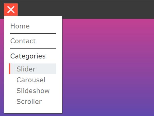
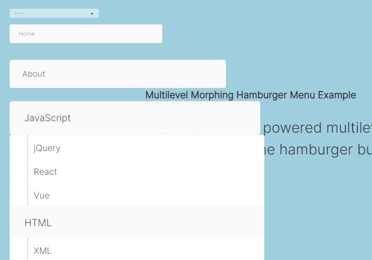
A fancy, multi-level, user- and mobile-friendly popup/dropdown menu with a hamburger toggle button, created with jQuery and CSS/CSS3.
How to use it:
1. Create the HTML for the popup/dropdown menu.
<span id="menu-cnt">
  <li class="menu-item">
    <a href="#" class="item-link">Home</a>
  </li><hr/>
  <li class="menu-item"><a href="#" class="item-link">Contact</a></li><hr/>
  <li class="menu-item">Categories<br/>
    <a href="#" class="sub-link">Slider</a><br/>
    <a href="#" class="sub-link">Carousel</a><br/>
    <a href="#" class="sub-link">Slideshow</a><br/>
    <a href="#" class="sub-link">Scroller</a><br/>
  </li>
</span>
2. Create the hamburger menu toggle.
<nav>
  <span id="menu-ctn">
    <li class="menu-bars"></li>
  </span>
</nav>
3. The necessary CSS/CSS3 rules.
:root {
 --coal: #3A3A3A;
 --snow: #ECEFF1;
 --apple: #FF4D3A;
}

nav {
  height: 60px;
  background: var(--coal);
}

#menu-ctn {
  position: relative;
  top: 10px;
  margin: 0 16px;
  height: 40px;
  background: var(--apple);
  width: 44px;
  display: inline-block;
}

a { cursor: pointer; }

#menu-cnt {
  opacity: 0;
  transform: translate(16px, -10px) scale(0.7);
  background: #FFF;
  padding: 20px;
  box-shadow: 1px 2px 1px var(--coal);
  visibility: none;
  display: inline-block;
}

.menu-bars {
  height: 4px;
  width: 30px;
  list-style: none;
  background: var(--snow);
  margin: 0 7px;
  position: relative;
  top: 18px;
  transition: 0.4s all ease-in;
}

.menu-item, a.item-link {
  list-style: none;
  text-decoration: none;
  z-index: 1;
  background: transparent;
  width: 100%;
  display: inline-block;
}

a.sub-link {
  padding: 5px 20px;
  display: inline-block;
  width: 100%;
  text-decoration: none;
}

a.sub-link:nth-of-type(1) { margin-top: 12px; }

hr { border: 1px solid var(--coal); }

.crossed { background: var(--apple); }

.dropped {
  opacity: 1 !important;
  transform: translate(16px, -10px) !important;
  visibility: visible !important;
}

.menu-bars::before, .menu-bars::after {
  content: '';
  position: absolute;
  height: 4px;
  width: 30px;
  list-style: none;
  background: var(--snow);
}

.menu-bars::before { transform: translateY(-10px); }

.menu-bars::after { transform: translateY(10px); }

.crossed::before { animation: rotate-top-bar 0.4s forwards; }

.crossed::after { animation: rotate-bottom-bar 0.4s forwards; }

.hamburger::before { animation: rotate-top-bar-2 0.4s reverse; }

.hamburger::after { animation: rotate-bottom-bar-2 0.4s reverse; }

/* EVENT HANDLERS */

.menu-item:hover, a.item-link:hover { color: var(--coal); }

a.sub-link:hover {
  background: var(--snow);
  box-shadow: -4px 0 0 var(--apple);
}
4. The CSS keyframes for the hamburger animation.
@keyframes
rotate-top-bar {  40% {
 transform: translateY(0);
}
 100% {
 transform: translateY(0) rotate(45deg);
}
}

@keyframes
rotate-bottom-bar {  40% {
 transform: translateY(0);
}
 100% {
 transform: translateY(0) rotate(-45deg);
}
}

@keyframes
rotate-top-bar-2 {  40% {
 transform: translateY(0);
}
 100% {
 transform: translateY(0) rotate(45deg);
}
}

@keyframes
rotate-bottom-bar-2 {  40% {
 transform: translateY(0);
}
 100% {
 transform: translateY(0) rotate(-45deg);
}
}
This awesome jQuery plugin is developed by Rahul_V7. For more Advanced Usages, please check the demo page or visit the official website.