Responsive Multi-level Mega Menu Plugin - jQuery dmenu
| File Size: | 170 KB |
|---|---|
| Views Total: | 19964 |
| Last Update: | |
| Publish Date: | |
| Official Website: | Go to website |
| License: | MIT |
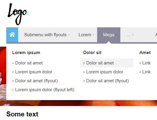
dmenu is a jQuery plugin for creating a responsive, multi-level and multi-column mega menu that hides the overflowing navigation items in a vertical dropdown with a toggle control.
Licensed under the CC-BY-4.0 license.
How to use it:
1. Include the necessary jQuery JavaScript library and the dmenu plugin's files on the webpage.
<link rel="stylesheet" href="jquery.dmenu.css">
<script src="https://code.jquery.com/jquery-3.3.1.min.js"
        integrity="sha384-tsQFqpEReu7ZLhBV2VZlAu7zcOV+rXbYlF2cqB8txI/8aZajjp4Bqd+V6D5IgvKT"
        crossorigin="anonymous"></script>
<script src="jquery.dmenu.js"></script>
2. The basic HTML structure for the mega menu.
<nav id="menu">
  <ul>
    <li class="SubmenuTabs IconHidden">
      <a href="#">Tabs</a>
      <ul>
        <li class="SubmenuMega">
          <a href="#">Lorem ipsum dolor</a>
          <ul>
            <li>
              <a href="#">Lorem ipsum dolor</a>
              <ul>
                <li><a href="#">Lorem ipsum dolor</a></li>
                <li><a href="#">Dolor sit amet</a></li>
                <li><a href="#">Lorem ipsum dolor</a></li>
              </ul>
            </li>
            <li>
              <div style="background-image: url(img/2.jpg)"></div>
              <a href="#">Dolor sit amet</a>
              <ul>
                <li><a href="#">Lorem ipsum dolor</a></li>
                <li><a href="#">Dolor sit amet</a></li>
                <li><a href="#">Lorem ipsum dolor</a></li>
              </ul>
            </li>
          </ul>
        </li>
        <li class="SubmenuMega">
          <a href="#">Dolor sit</a>
          <ul>
            <li class="Selected">
              <a href="#">Lorem ipsum</a>
              <ul>
                <li><a href="#">Lorem</a></li>
                <li><a href="#">Ipsum dolor dolor sit amet</a></li>
                <li><a href="#">Lorem ipsum dolor</a></li>
              </ul>
            </li>
            <li>
              <a href="#">Dolor sit amet</a>
              <ul>
                <li><a href="#">Lorem ipsum</a></li>
                <li><a href="#">Dolor sit</a></li>
              </ul>
            </li>
            <li>
              <a href="#">Lorem ipsum</a>
              <ul>
                <li><a href="#">Lorem</a></li>
                <li><a href="#">Ipsum dolor dolor sit amet</a></li>
                <li><a href="#">Lorem ipsum dolor</a></li>
              </ul>
            </li>
          </ul>
        </li>
        <li>
          <a href="#">Ipsum dolor</a>
          <ul>
            <li><a href="#">Lorem ipsum dolor sit</a></li>
            <li><a href="#">Dolor sit amet</a></li>
          </ul>
        </li>
        <li>
          <a href="#">Link</a>
          <ul>
            <li><a href="#">Lorem ipsum dolor</a></li>
            <li><a href="#">Dolor sit amet</a></li>
            <li><a href="#">Lorem ipsum dolor</a></li>
          </ul>
        </li>
      </ul>
    </li>
  </ul>
</nav>
3. Default CSS classes:
- Selected: Makes the item (and all parent items) appear "selected".
- AlignRight: Aligns a main item to the right.
- IconHidden: Uses the icon as a fallback for when the menu is too small for all items to fit.
- SubmenuAlignRight: Aligns the submenu to the right. Note: submenus are aligned automatically to fit within the viewport.
- SubmenuFullwidth: Makes the submenu fill up the full width of the menu.
- SubmenuMega: Turns the submenu into a mega menu.
- SubmenuTabs: Turns the submenu into a tabs menu.
- SubmenuAlignRight: Aligns the sub-submenu to the right. Note: sub-submenus are aligned automatically to fit within the viewport.
- SubmenuInline: Makes the sub-submenu appear inline.
4. Initialize the mega menu with options. All possible options.
- menu.align: Aligns the main items to the left, right, center or justify.
- menu.border: Adds a border (bottom) to the bottom of the menu.
- menu.logo: Styles a logo in the menu (if present).
- item.bg: Adds a background to main items onHover.
- item.border: Adds a border (bottom) to main items onHover.
- item.subindicator: Adds a subindicator to main items.
- submenu: Required for submenus.
- submenu.arrow: Adds an arrow that points to the main item.
- submenu.border: Adds a border (top) to submenus.
- submenu.shadow: Adds a shadow to submenus.
- subitem.bg: Adds a background to subitems onHover.
- subitem.border: Adds a border between subitems.
$('#menu').dmenu({
  menu  : {
    logo      : true,
    align     : 'right'
  },
  item  : {
    bg        : true,
    border      : false,
    subindicator  : true,

    fit     : [
      {
        items     : null,
        fitter    : 'icon-hide',
        order   : 'all'
      },
      {
        items     : null,
        fitter    : 'icon-only',
        order   : 'all'
      },
      {
        items     : ':not(.dm-item_align-right)',
        fitter    : 'submenu',
        order   : 'rtl'
      },
      {
        items     : ':not(.dm-item_align-right)',
        fitter    : 'hide',
        order   : 'rtl'
      }
    ]
  },
  submenu : {
    arrow     : false,
    border      : false,
    shadow      : true
  },
  subitem : {
    bg        : true,
    border      : false
  }

});
This awesome jQuery plugin is developed by FrDH. For more Advanced Usages, please check the demo page or visit the official website.


