Mobile-friendly Hamburger Menu In jQuery And CSS3
| File Size: | 3.99 KB |
|---|---|
| Views Total: | 17119 |
| Last Update: | |
| Publish Date: | |
| Official Website: | Go to website |
| License: | MIT |
Yet another responsive, mobile-friendly hamburger menu design for modern, cross-platform web applications.
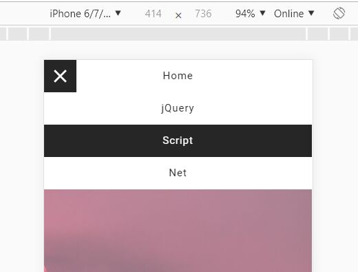
Click on the hamburger button to toggle a horizontal (desktop) or vertical (mobile) menu that slides out from the left of the screen.
Created with jQuery, HTML, and CSS/CSS3.
How to use it:
1. Create the HTML for the hamburger button.
<div class="menu">
  <span></span>
</div>
2. Create a nav list for the hamburger menu.
<nav class="navbar-menu">
  <ul class="menu-listing">
    <li><a href="#">Home</a></li>
    <li><a href="#">jQuery</a></li>
    <li><a href="#">Script</a></li>
    <li><a href="#">Net</a></li>
    <li><a href="#">Contact</a></li>
    <li><a href="#">About</a></li>
    ...
  </ul>
</nav>
3. The main CSS/CSS3 for the hamburger menu.
.navbar-menu {
  background-color: #fafafa;
  position: absolute;
  top: 0;
  left: 0;
  width: 100%;
  height: 50px;
  transform: translateX(-100%);
  transition: 0.5s;
}

.navbar-menu.active { transform: translateX(0);transition: 0.5s; }

.navbar-menu .menu-listing { padding: 0;margin: 0;text-align: right; }

.menu-listing li { display: inline-block; }

.menu-listing li a {
  background-color: #fff;
  color: #262626;
  display: block;
  font-size: 1rem;
  height: 50px;
  line-height: 50px;
  padding: 0 20px;
  letter-spacing: 1px;
  text-decoration: none;
  transition: 0.5s;
}

.menu-listing li a:hover { background-color: #262626;color: #fff;transition: 0.5s; }
4. The main CSS/CSS3 to create a hamburger button.
.menu {
  position: fixed;
  top: 0;
  left: 0;
  background-color: #262626;
  height: 50px;
  width: 50px;
  cursor: pointer;
  transition: 0.3s;
  z-index: 9999;
}

.menu span {
  position: absolute;
  height: 3px;
  width: 25px;
  background-color: #fff;
  top: 50%;
  left: 50%;
  transform: translate(-50%,-50%);
  transition: 0.3s;
}

.menu span:before {
  content: '';
  position: absolute;
  top: -8px;
  background-color: #fff;
  height: 3px;
  width: 25px;
  transition: 0.3s;
}

.menu span:after {
  content: '';
  position: absolute;
  top: 8px;
  background-color: #fff;
  height: 3px;
  width: 25px;
  transition: 0.3s;
}

.menu.active span { background-color: transparent; }

.menu.active span:before { transform: rotate(45deg);top: 0; }

.menu.active span:after { transform: rotate(-45deg);top: 0; }
5. Make the hamburger menu responsive & mobile friendly using CSS media queries.
@media only screen and (max-width:767px) {

  .navbar-menu { height: auto;z-index: 1; }

  .menu-listing li { display: block; }

  .navbar-menu .menu-listing { text-align: center; }

}
6. Insert the latest jQuery library into the document.
<script src="https://code.jquery.com/jquery-3.3.1.slim.min.js" integrity="sha384-q8i/X+965DzO0rT7abK41JStQIAqVgRVzpbzo5smXKp4YfRvH+8abtTE1Pi6jizo" crossorigin="anonymous"></script>
7. Enable the hamburger button to toggle the hamburger menu using the jQuery's toggleClass method.
$(".menu").click(function() {
  $(".menu").toggleClass("active");
  $(".navbar-menu").toggleClass("active");
});
This awesome jQuery plugin is developed by mohitgithub3443. For more Advanced Usages, please check the demo page or visit the official website.