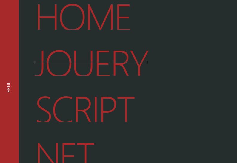
Fashion Fullscreen Hamburger Navigation With jQuery And GSAP
| File Size: | 1.23 MB |
|---|---|
| Views Total: | 2574 |
| Last Update: | |
| Publish Date: | |
| Official Website: | Go to website |
| License: | MIT |
A fashion hamburger navigation concept that allows the user to toggle a responsive, fullscreen menu with a smooth slide animation based on GSAP's TweenMax library.
Dependencies:
How to use it:
1. Load the necessary files in the document.
<!-- Bootstrap -->
<link rel="stylesheet" href="https://stackpath.bootstrapcdn.com/bootstrap/4.1.3/css/bootstrap.min.css">
<script src="https://stackpath.bootstrapcdn.com/bootstrap/4.1.3/js/bootstrap.min.js"></script>
<script src="https://stackpath.bootstrapcdn.com/bootstrap/4.1.3/js/bootstrap.bundle.min.js"></script>

<!-- icons -->
<link href="https://fonts.googleapis.com/icon?family=Material+Icons" rel="stylesheet">

<!-- Jquery -->
<script src="https://code.jquery.com/jquery-3.3.1.js"></script>

<!-- Greensock -->
<script src="https://cdnjs.cloudflare.com/ajax/libs/gsap/2.0.2/TweenMax.min.js"></script>
2. Create the HTML for the fullscreen navigation.
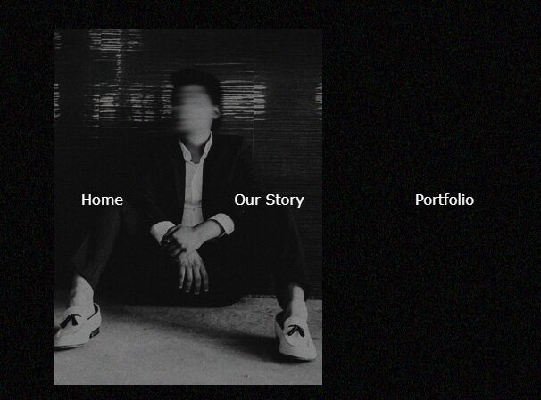
<div class="menu">
  <div class="row">
    <div class="col-lg overlay">
      <div class="nav">
          <ul>
            <li>Home</li>
            <li>About</li>
            <li>Portfolio</li>
            <li>Contact</li>
          </ul>
      </div>
    </div>
  </div>
</div>
3. Create a hamburger button to toggle the fullscreen navigation.
<div class="menu-btn">
  <button type="button"><i class="material-icons">menu</i></button>
</div>
4. Style the background overlay when the navigation is opened
.overlay:before {
  animation: grain 1s steps(10) infinite;
  background-image: url(grains.png);
  content: "";
  height: 300%;
  left: -50%;
  opacity: 0.48;
  position: fixed;
  top: -110%;
  width: 300%;
}

@keyframes grain {
  0%, 100% { transform: translate(0, 0); }
  10% { transform: translate(-5%, -10%); }
  20% { transform: translate(-15%, 5%); }
  30% { transform: translate(7%, -25%); }
  40% { transform: translate(-5%, 25%); }
  50% { transform: translate(-15%, 10%); }
  60% { transform: translate(15%, 0%); }
  70% { transform: translate(0%, 15%); }
  80% { transform: translate(3%, 35%); }
  90% { transform: translate(-10%, 10%); }
}
5. Style the hamburger button.
.menu-btn {
  position: fixed;
  margin: 1.2em;
  right: 0;
  z-index: 1;
}

button {
  border: none;
  background: none;
}

button:focus {
  outline: none !important;
}

i {
  outline: none;
  padding: 0.8em;
  color: #fff;
  border: 1px solid #000;
  background: #000;
  border-radius: 50%;
}
6. The main CSS styles for the fullscreen navigation.
ul {
  position: absolute;
  top: 50%;
  left: 50%;
  transform: translate(-50%, -50%);
  list-style: none;
  margin: 0;
  padding: 0;
}

li {
  font-family: Poppins;
  display: inline-block;
}

li:not(:last-child) {
  margin-right: 120px;
}

li:first-child:hover::before {
  content: "";
  z-index: -1;
  width: 300px;
  height: 400px;
  display: block;
  position: absolute;
  top: -180px;
  left: -30px;
  background: url(hover_one.jpg);
  transition: 1s;
  animation: fade-in 2s ease-in-out;
}

li:nth-child(2):hover::before {
  content: "";
  z-index: -1;
  width: 300px;
  height: 400px;
  display: block;
  position: absolute;
  top: -180px;
  left: -30px;
  background: url(hover_two.jpg);
  transition: 1s;
  animation: fade-in 2s ease-in-out;
}

li:nth-child(3):hover::before {
  content: "";
  z-index: -1;
  width: 300px;
  height: 400px;
  display: block;
  position: absolute;
  top: -180px;
  left: -30px;
  background: url(hover_three.jpg);
  transition: 1s;
  animation: fade-in 2s ease-in-out;
}

li:nth-child(4):hover::before {
  content: "";
  z-index: -1;
  width: 300px;
  height: 400px;
  display: block;
  position: absolute;
  top: -180px;
  left: -30px;
  background: url(hover_four.jpg);
  transition: 1s;
  animation: fade-in 2s ease-in-out;
}

@keyframes fade-in {
  0% {
      opacity: 0;
      top: -160px;
  }
  50% {
      opacity: 1;
      top: -180px;
  }
  100% {
      opacity: 1;
      top: -180px;
  }
}

@media(max-width: 900px) {
  li {
      text-align: center;
      display: block !important;
      margin: 0 !important;
      padding: 20px 0;
  }

  li:hover::before {
      width: 0 !important;
  }
}
7. The jQuery script to enable the fullscreen navigation.
var myNav = new TimelineMax({paused: true});

myNav.to(".overlay", 1.6, {

  top: 0,
  ease: Expo.easeInOut

});

myNav.staggerFrom(".menu ul li", 1, {y: 100, opacity: 0, ease: Expo.easeOut}, 0.1);

myNav.reverse();
$(document).on("click", ".menu-btn", function() {
  myNav.reversed(!myNav.reversed());
});

myNav.reverse();
$(document).on("click", "li", function() {
  myNav.reversed(!myNav.reversed());
});
This awesome jQuery plugin is developed by codegridweb. For more Advanced Usages, please check the demo page or visit the official website.