Animated Mobile Tab Bar Navigation With jQuery And CSS/CSS3
| File Size: | 3.92 KB |
|---|---|
| Views Total: | 7467 |
| Last Update: | |
| Publish Date: | |
| Official Website: | Go to website |
| License: | MIT |
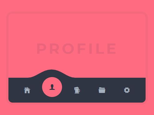
An animated mobile tab bar navigation that enables the user to switch between navigation items with a wave effect using jQuery, SVG, and CSS transform & transition properties.
How to use it:
1. Create the tab bar navigation from a nav list.
<nav>
  <ul class="list-wrap">
    <li data-color="#eccc68" title="Home">
      Home
    </li>
    <li data-color="#ff6b81" title="Profile">
      Profile
    </li>
    <li data-color="#7bed9f" title="Get a beer!">
      Beer
    </li>
    <li data-color="#70a1ff" title="Files">
      Files
    </li>
    <li data-color="#dfe4ea" title="Settings">
      Settings
    </li>
  </ul>
</nav>
2. Add a SVG based wave to the navigation.
<div class="wave-wrap">
  <svg version="1.1" id="wave" xmlns="http://www.w3.org/2000/svg" xmlns:xlink="http://www.w3.org/1999/xlink" viewBox="0 0 119 26">
    <path class="path" d="M120.8,26C98.1,26,86.4,0,60.4,0C35.9,0,21.1,26,0.5,26H120.8z"/>
  </svg>
</div>
3. The core CSS & CSS3 styles for the tab bar navigation.
.wave-wrap {
  position: relative;
  width: 100%;
  height: 33px;
  overflow: hidden;
  margin-bottom: 0;
}

.wave-wrap #wave {
  position: absolute;
  width: 150px;
  transform-origin: bottom;
  transform: scaleY(0.8);
  transition: all 0.6s cubic-bezier(0.23, 1, 0.32, 1);
}

.wave-wrap #wave .path {
  fill: #2f3542;
}

.list-wrap {
  display: flex;
  width: 100%;
  height: 80px;
  background: #2f3542;
  list-style: none;
  justify-content: space-around;
  padding: 0 20px;
}

.list-wrap li {
  cursor: pointer;
  position: relative;
  width: 100%;
  height: 100%;
  display: flex;
  justify-content: center;
  align-items: center;
  transition: all 0.6s cubic-bezier(0.23, 1, 0.32, 1);
}

.list-wrap li i {
  position: relative;
  font-size: 1.5em;
  color: #a4b0be;
  z-index: 5;
  transition: all 0.6s cubic-bezier(0.23, 1, 0.32, 1);
}

.list-wrap li:before {
  content: "";
  position: absolute;
  background: green;
  height: 80%;
  width: 80%;
  left: 10%;
  top: 10%;
  border-radius: 50%;
  z-index: 0;
  transform: scale(0);
  transition: all 0.6s cubic-bezier(0.23, 1, 0.32, 1);
}

.list-wrap li.active {
  margin-top: -10px;
}

.list-wrap li.active i {
  color: #2f3542;
}

.list-wrap li.active:before {
  transform: scale(1);
}
4. Import the necessary jQuery library.
<script src="https://code.jquery.com/jquery-3.3.1.min.js" integrity="sha384-tsQFqpEReu7ZLhBV2VZlAu7zcOV+rXbYlF2cqB8txI/8aZajjp4Bqd+V6D5IgvKT" crossorigin="anonymous"></script>
5. The jQuery script to activate the tab bar navigation.
// set the first nav item as active
var dis = $(".list-wrap li").eq(0);

function align(dis){

  // get index of item
  var index = dis.index() + 1;

  // add active class to the new item
  $(".list-wrap li").removeClass("active");
  dis.delay(100).queue(function() {
    dis.addClass('active').dequeue();
  });

  // move the wave
  var left = index * 80 - 98;

  $("#wave").css('left', left);

}

// align the wave
align(dis);

// align the wave on click
$(".list-wrap li").click(function(){
  dis = $(this);

  align(dis);
});
This awesome jQuery plugin is developed by Tobias Glaus. For more Advanced Usages, please check the demo page or visit the official website.