Radial/Pie Menu Control Built With jQuery And CSS3
| File Size: | 4.62 KB |
|---|---|
| Views Total: | 10227 |
| Last Update: | |
| Publish Date: | |
| Official Website: | Go to website |
| License: | MIT |
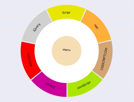
An elegant radial menu control (aka. round menu, circle menu, pie menu) built with JavaScript (jQuery) and CSS & CSS3.
How to use it:
1. Create the menu content which will be hidden by default.
<div class ="hidden" id="menu1">
  <h1>Menu 1</h1>
</div>
<div class ="hidden" id="menu2">
  <h1>Menu 2</h1>
</div>
<div class ="hidden" id="menu3">
  <h1>Menu 3</h1>
</div>
<div class ="hidden" id="menu4">
  <h1>Menu 4</h1>
</div>
<div class ="hidden" id="menu5">
  <h1>Menu 5</h1>
</div>
<div class ="hidden" id="menu6">
  <h1>Menu 6</h1>
</div>
<div class ="hidden" id="menu7">
  <h1>Menu 7</h1>
</div>
<div class ="visible" id="menu8">
  <h1>Menu</h1>
  <p class="menudesc">Main Menu</p>
</div>
2. Create the html for the pie menu consist of several pie slices around the main menu.
<nav class="menunav">
  <ul class="circle">
    <li class="coconut light slice">
      <label for="ococonut" class="circle over" id="1">Menu 1</label>
    </li>
    <li class="vanilla light slice">
      <label for="ovanilla" class="circle over" id="2">Menu 2</label>
    </li>
    <li class="orange light slice">
      <label for="oorange" class="circle over" id="3">Menu 3</label>
    </li>
    <li class="almond light slice">
      <label for="oalmond" class="circle"><span class="over" id="4">Menu 4</span></label>
    </li>
    <li class="grape light slice">
      <label for="ogrape" class="circle"><span class="over" id="5">Menu 5</span></label>
    </li>
    <li class="blackberry dark slice">
      <label for="oblackberry" class="circle" ><span class="over" id="6">Menu 6</span></label>
    </li>
    <li class="cherry dark slice">
      <label for="ocherry" class="circle" ><span class="over" id="7">Menu 7</span></label>
    </li>
    <li class="unsel circle">
      <label for="unsel" class="clicky menuname">Menu</label>
    </li>
    <li class="middle circle"></li>
  </ul>
</nav>
3. The necessary CSS & CSS3 styles for the pie menu.
.circle, .circle:before, .circle:after {
  border-radius: 50%;
}
.menunav {
  position: absolute;
  display: block;
  left: 20%;
  margin: 5em auto;
  min-width: 10em;
  width: 50%;
  max-width: 30em;
}
.menunav ul {
  position: relative;
  padding: 50%;
  max-width: 0;
  max-height: 0;
  list-style: none;
}
.menunav li {
  position: absolute;
}
.slice {
  overflow: hidden;
  position: absolute;
  top: 0;
  left: 0;
  width: 50%;
  height: 50%;
  transform-origin: 100% 100%;
}
/* Cell orientation */
.coconut {
  transform: rotate(13deg) skewX(40deg);
}
.vanilla {
  transform: rotate(64.43deg) skewX(40deg);
}
.orange {
  transform: rotate(115.86deg) skewX(40deg);
}
.almond {
  transform: rotate(167.29deg) skewX(40deg);
}
.grape {
  transform: rotate(218.71deg) skewX(40deg);
}
.blackberry {
  transform: rotate(270.14deg) skewX(40deg);
}
.cherry {
  transform: rotate(321.57deg) skewX(40deg);
}
.menunav label {
  cursor: pointer;
}
.slice label {
  display: block;
  width: 200%;
  height: 200%;
  transform: skew(-40deg) rotate(-65deg);
  line-height: 1.9;
  text-align: center;
}
.slice label span {
  display: block;
}
.slice label:hover {
  color: white;
  border: 2px solid black;
  transition: all 0.5s ease;
}
.circle .menuname:hover {
  color: white;
  transition: color 0.5s ease;
}
.menudesc {
  width: 280px;
}
/* Cell background colors */
.coconut label, .ococonut:checked ~ nav .unsel {
  background: #D0D0D0;
}
.vanilla label, .ovanilla:checked ~ nav .unsel {
  background: #e6e600;
}
.orange label, .oorange:checked ~ nav .unsel {
  background: #ffb038;
}
.almond label, .oalmond:checked ~ nav .unsel {
  background: #d3a573;
}
.grape label, .ogrape:checked ~ nav .unsel {
  background: #ace600;
}
.blackberry label, .oblackberry:checked ~ nav .unsel {
  background: #cc0099;
}
.cherry label, .ocherry:checked ~ nav .unsel {
  background: #ff0000;
}
.slice label {
  font-weight: 700;
  line-height: 5;
}
.circle label {
  font-weight: 700;
  line-height: 5;
}
.slice p {
  width: 100px;
  margin-left: 185px;
}
.unsel {
  z-index: 2;
  top: 34%;
  left: 34%;
  width: 32%;
  height: 32%;
  text-align: center;
  background-color: wheat;
}
.unsel label {
  display: block;
  width: 100%;
  height: 100%;
  line-height: 9;
}
.middle {
  z-index: 1;
  top: 15%;
  left: 15%;
  width: 70%;
  height: 70%;
  text-align: center;
  background-color: white;
}
.menunav {
  position: absolute;
  left: 50%;
}
.visible {
  display: block;
  position: absolute;
  margin: 250px 0 0 250px;
}
.hidden {
  display: none;
}
.visible ul {
  list-style-type: none;
}
.visible details ul {
  list-style-type: square;
}
.visible a {
  font-size: 120%;
  text-decoration: none;
  color: purple;
}
.Reseau a {
  font-size: 160%;
}
.Reseau a:hover {
  color: red;
}
.circle label span {
  -webkit-transform: rotate(-180deg);
  -moz-transform: rotate(-180deg);
  -o-transform: rotate(-180deg);
  transform: rotate(-180deg);
}
4. Import the latest version of jQuery library into the document.
<script src="https://code.jquery.com/jquery-3.3.1.slim.min.js" integrity="sha384-q8i/X+965DzO0rT7abK41JStQIAqVgRVzpbzo5smXKp4YfRvH+8abtTE1Pi6jizo" crossorigin="anonymous"></script>
5. The main JavaScript (jQuery script) to enable the pie menu. Copy and paste the following snippets into your document, after the jQuery library.
$(document).ready(function() {
  var previous = document.getElementById("menu8");
  var original = "menu";
  var toOpen = "";
  var over;

  var delay = function (elem, callback) {
    var timeout = null;
    timeout = setTimeout(function() {
      if(over) {
        callback(elem);
      }
    }, 150);

    $(elem).mouseout(function() {
      over = false;
      clearTimeout(timeout);
    });
  };

  $(".over").mouseenter(function(event) {
    over = true;
    delay(document.getElementById(event.target.id), function(context) {
      toOpen = document.getElementById(original.concat(context.id));
      openMenu(toOpen);
      previous = toOpen;
    });
  });

  $(".clicky").click(function() {
    openMenu(document.getElementById("menu8"));
    previous = document.getElementById("menu8");
  });

  function openMenu(context) {
    closeMenu(previous);
    $(context).toggleClass("visible");
    $(context).toggleClass("hidden");
  }

  function closeMenu(context) {
    $(context).toggleClass("visible");
    $(context).toggleClass("hidden");
  }
});
This awesome jQuery plugin is developed by Arnaumes. For more Advanced Usages, please check the demo page or visit the official website.