Basic Responsive Overlay Menu With jQuery And CSS3
| File Size: | 4.8 KB |
|---|---|
| Views Total: | 4144 |
| Last Update: | |
| Publish Date: | |
| Official Website: | Go to website |
| License: | MIT |
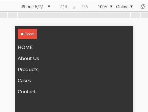
A basic responsive menu jQuery plugin that converts the regular horizontal menu into a fullscreen overlay navigation on mobile devices.
Click the hamburger button to toggle the navigation sliding from the left or right-hand side of the screen.
Built with JavaScript (jQuery), Font Awesome, and CSS3 transitions/transforms.
How to use it:
1. Load the Font Awesome and basicResponsiveMenu.css in the head section of the document.
<link rel="stylesheet" href="https://netdna.bootstrapcdn.com/font-awesome/4.7.0/css/font-awesome.min.css">
<link rel="stylesheet" href="dist/css/basicResponsiveMenu.css">
2. Create a nav list for the site navigation.
<nav class="response--main-navigation">
  <ul class="response--site-menu">
    <li><a href="#">HOME</a></li>
    <li><a href="#">Jobs</a></li>
    <li><a href="#">Products</a></li>
    <li><a href="#">About</a></li>
    <li><a href="#">Contact</a></li>
  </ul>
</nav>
3. Attach the plugin to the navigation. That's it.
$(function(){
  $('.response--main-navigation').basicResponsiveMenu();
});
4. Enable/disable the sliding animation. Default: true.
$(function(){
  $('.response--main-navigation').basicResponsiveMenu({
    animate: true
  });
});
5. Set the sliding direction. Default: right.
$(function(){
  $('.response--main-navigation').basicResponsiveMenu({
    slideDir: 'left'
  });
});
6. Set the animation speed in milliseconds. Default: 250.
$(function(){
  $('.response--main-navigation').basicResponsiveMenu({
    slideSpeed: 500
  });
});
7. Set the responsive breakpoint in pixels.
$(function(){
  $('.response--main-navigation').basicResponsiveMenu({
    browserWidth: 768
  });
});
This awesome jQuery plugin is developed by Katrine-Marie. For more Advanced Usages, please check the demo page or visit the official website.


