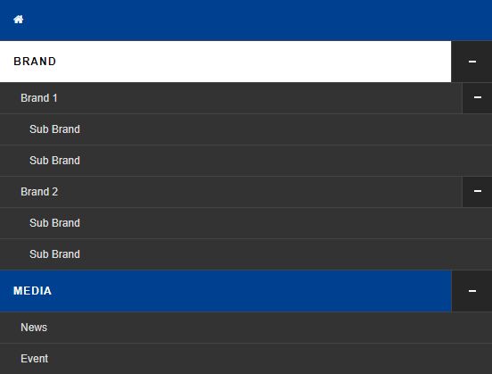
responsive Multi-level Navigation For Bootstrap 4 - k-responsive-menu
- Menu - 9604 Viewsk-responsive-menu is a simple, responsive, multi-level, cross-platform and mobile-friendly navigation jQuery plugin for Bootstrap 4 framework.
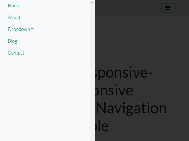
k-responsive-menu is a simple, responsive, multi-level, cross-platform and mobile-friendly navigation jQuery plugin for Bootstrap 4 framework.
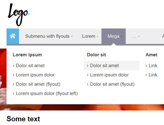
dmenu is a jQuery plugin for creating a responsive, multi-level and multi-column mega menu that hides the overflowing navigation items in a vertical dropdown with a toggle control.
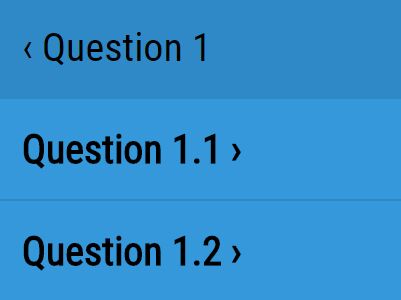
Slyder is a lightweight jQuery plugin used for creating a responsive drawer navigation with a sliding effect, similar to the Facebook's drill down menu.
A jQuery based responsive navigation system that collapses the regular horizontal menu into an expanding hamburger menu on small screen (mobile) devices.
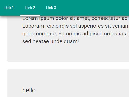
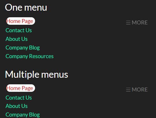
The Simple menu jQuery plugin lets you create a responsive, sticky, multi-functional, in-page navigation menu for your long webpages.
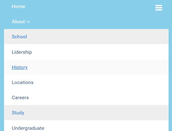
A jQuery based responsive mega menu that automatically collapses the regular multi-level dropdown menu into a mobile-friendly toggle menu in mobile view.
This is a small jQuery script that helps you create a responsive, mobile-friendly, multi-level dropdown (for desktop) & toggle (for mobile) menu for cross-platform webpages.
flexmenu2 is an easy, lightweight, cross-browser jQuery responsive menu plugin that transforms the traditional navigation into a toggleable dropdown menu on mobile (small screen) devices.
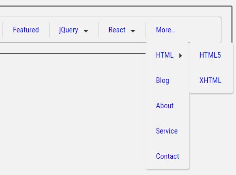
jQuery Moremenu is a jQuery based responsive menu solution that automatically collapses overflowing menu items into a 'More menu' dropdown when the menu is too long to fit into a horizontal navbar.
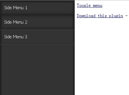
sidr is a jQuery plugin that make it easy to create responsive side menus with cool themes on your web page.