Sticky Exanding Hamburger Menu With jQuery And CSS3
| File Size: | 4.94 KB |
|---|---|
| Views Total: | 7311 |
| Last Update: | |
| Publish Date: | |
| Official Website: | Go to website |
| License: | MIT |
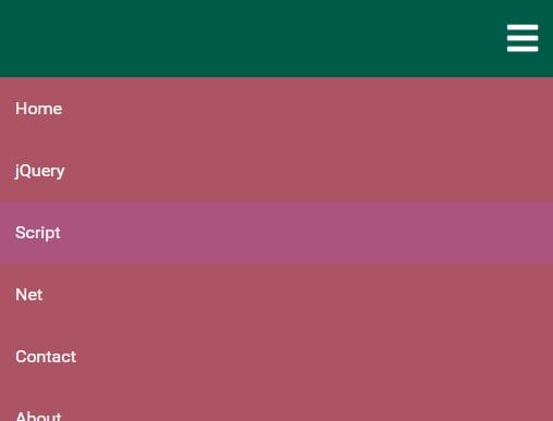
A jQuery based responsive navigation system that collapses the regular horizontal menu into an expanding hamburger menu on small screen (mobile) devices.
How to use it:
1. The hamburger toggle button requires the latest Font Awesome iconic font.
<link rel="stylesheet"
      href="https://use.fontawesome.com/releases/v5.0.10/css/all.css"
      integrity="sha384-+d0P83n9kaQMCwj8F4RJB66tzIwOKmrdb46+porD/OvrJ+37WqIM7UoBtwHO6Nlg"
      crossorigin="anonymous">
2. Create a standard site navigation from an unordered list.
<nav>
  <div class="menu-bars">
    <i class="fas fa-bars fa-2x"></i>
  </div>
  <ul>
    <li><a href="#">Home</a></li>
    <li><a href="#">jQuery</a></li>
    <li><a href="#">Script</a></li>
    <li><a href="#">Net</a></li>
    <li><a href="#">Contact</a></li>
    <li><a href="#">About</a></li>
  </ul>
</nav>
3. The primary CSS styles for the navigation when running on the desktop.
nav ul{
  width: 100%;
  background-color: #ac5463;
  overflow: hidden;
  color: #fff;
  padding: 0;
  text-align: center;
  margin: 0;
  transition: all 1s ease-in-out;
}

nav ul li{
  display: inline-block;
  padding: 20px;
}

nav ul li a{
  text-decoration: none;
  color: inherit;
}

nav ul li:hover {
  background-color: #ac5480;
}

.menu-bars{
  width: 100%;
  background-color: #005c48;
  text-align: right;
  box-shadow: border-box;
  padding: 20px 0px;
  cursor: pointer;
  color: #fff;
  display: none;
}

.menu-bars .fas{
  margin-right: 20px;
}
4. The CSS rules for the expanding hamburger menu when running on the mobile. Override the max-width value to specify the breakpoint you prefer.
@media screen and (max-width: 812px){

  nav ul{
    max-height: 0px;
    position: fixed;
    top: 4.5em;
  }

  nav ul li{
    box-sizing: border-box;
    width: 100%;
    padding: 15px;
    text-align: left;
  }

  .menu-bars{
    display: block;
    position: fixed;
    top: 0;
  }

  .showing{
    max-height: 20em;
    position: fixed;
    top: 4.5em;
  }

}
5. Load the latest version of jQuery JavaScript library at the end of the document.
<script src="https://code.jquery.com/jquery-3.3.1.min.js"
        integrity="sha384-tsQFqpEReu7ZLhBV2VZlAu7zcOV+rXbYlF2cqB8txI/8aZajjp4Bqd+V6D5IgvKT"
        crossorigin="anonymous">
</script>
6. Show/hide the expanding hamburger menu by toggling the CSS classes with jQuery.
$(document).ready(function(){
  $(".menu-bars").on("click", function(){
    $("nav ul").toggleClass("showing");
  });

  $("nav ul li").on("click", function(){
    $("nav ul").removeClass("showing");
  });
});
This awesome jQuery plugin is developed by vgarmy. For more Advanced Usages, please check the demo page or visit the official website.


